
Scope
Gol Gol Layer Colour Observation #5: Stage 1 provides an opportunity for an audience to witness the Pigment Red (PR) generic colour classification in the artists’ watercolours and engage with the artist to identify the inherent qualities of coloured pigments. This observational study was presented to the public at Concordia Gallery as part of the Lakebed Exhibition at Newington College, Stanmore.
GGLCO #5 Stage 1 shows each PR whilst in a wet state. The inherent qualities that are observed are beauty of colour (intensity or brilliance, depth), transparency and opacity, and settling (gravitational pull) of the coloured pigment particle.
In summary, the Gol Gol Layer Colour Observation #5.1:
observed the physical behaviours (movement and settling) of the colourants (pigments classified as colour generic code PR)
identified changes in colour saturation and settling
recorded visual data about the physical interaction between each red colourant and the surface
is a time-based installation that visually evidences the actions and physical presence of PR.
Materials
25 x glass cylinders (90cm h x 15cm w)[1]
Five plinths to hold five glass cylinders on each plinth
acrylic rods (75cm long) for stirring the colour after experiment #4
25 bulldog clips to hold paper to glass cylinder
small plastic containers each with a number clearly labelled 1–25
water[2] filled to 10cm from the top of the cylinder (approx. 15 litres)
25 x 5ml of red pigment.[3] (One of each PR. See table 2 in New Studies of my thesis. Footnotes provide key information about terminology. These composition tables have been redeveloped by me from records published or information provided by chemists. They have all been in the public domain at one time.)[4]

Figure 2. First day of the Gol Gol Layer Colour Observation #5. Pigment Red in wet state. It is already evident that there is settling occurring in the fourth cylinder from the left, Cadmium Red. Photo by Natalie O’Connor.

Figure 3. GGLCO #5 before Pigment Red colourant is added.
Procedure

Figure 4. Design and colour guide for installation.
Arrange plinths one metre from the window wall and a 60cm gap between each plinth. This placement maximises natural light and provides a space for the artist to conduct the study whereby the audience can see what is happening and can interact with the artist.
Place five cylinders on each plinth. Fill cylinders with water 10cm from the top (refer to figures 1 and 2).
Prepare 25 small plastic containers each with a number clearly labelled 1–25. Thoroughly mix 5ml of each of the 25 red pigments (from Winsor & Newton Watercolours in 5ml tubes) and 20ml of water in each of the containers. This creates the colourant, which will allow for easier dispersion of colour into each of the large cylinders filled with water.
Pour each colourant into a cylinder. Observe each falling colourant as it disperses. Document each colourant’s movement as it disperses into the water. This part of the experiment was done as a special preview for the audience on the opening night of the Lakebed Exhibition. It was important for the audience to have an opportunity to witness this part of the experiment and make their own observations.
Using an acrylic rod, agitate the colour completely so the colour is evenly dispersed and saturated from the top of the cylinder to the bottom.
Allow colour to settle. Observe and document changes in each cylinder throughout the week.
After 100 hours, observe each colour’s saturation from the top to the bottom of the cylinder.
The video offers a short insight into the demonstration of the pigments Cadmium Scarlet and the Cadmium-Free Scarlet being placed into the cylinder of water for the first time.

Figure 5. Hand-painted gradations of each of the PR in GGLCO #5. This chart was displayed as part of the installation, along with selected pigments and the composition and permanency reference guide as seen.

Figure 6. GGLCO #5 just after the pigment was placed into cylinders of water and agitated till dispersed. Photo by Natalie O’Connor.
Cadmium Scarlet and the Cadmium Free Scarlet pigments observed in Australia for the first time.
Observations and Reflection after 100 hours
Each cylinder was filled with colourant while the audience observed. As these were very tall, I had to climb on a stepping stool to be able to disperse the colourant slowly enough to be able to observe the changes. Some of the colourant was heavier and did not mix as easily and, therefore, required a little extra water from the cylinder to ensure that all the colourant was mixed into the cylinder of water. Some colours moved slowly through the water, like volcanic explosions in slow motion filling the vessel with saturated colour. A few colours fell quickly to the bottom and had to be encouraged to disperse evenly from the top to the bottom of the cylinder.
The quickest colour to settle was Potter’s Pink and the second was Cadmium Red. Each of the cadmium-free colours looked initially similar but, after a week, showed a notable intensity that was stronger. The Cadmium-Free Scarlet also revealed a warmer undertone, closer to orange, in the pigment/solid particles that settled to the bottom of the cylinder.
The process raised questions about the relationship between transparency, brilliance, and depth and whether these could be identified more easily by observing the installation. I had to consider what each red pigment might do when I placed the paper substrate into each colourant.
It is unclear whether 100 hours were needed to achieve the aims of this observational study; the paper could have been placed into the cylinders on the first day of the exhibition so that the visitors could witness the process. It would also have been useful to ask exhibition visitors to assess each red colourant. Documenting the changes was difficult with the light and reflections. Using a white backdrop could have produced digital images for colour comparisons and visual documentation.
Initially, I wanted to use distilled water as I was concerned about impurities that could have an adverse effect on pigments. I habitually use distilled water in my studio practice. It was logistically too difficult to carry this much water to a second-floor location, so the nearest bathroom became the source for the water. Tap water is most used by artists as the vehicle for their watercolours and thus impurities would be present in most cases.
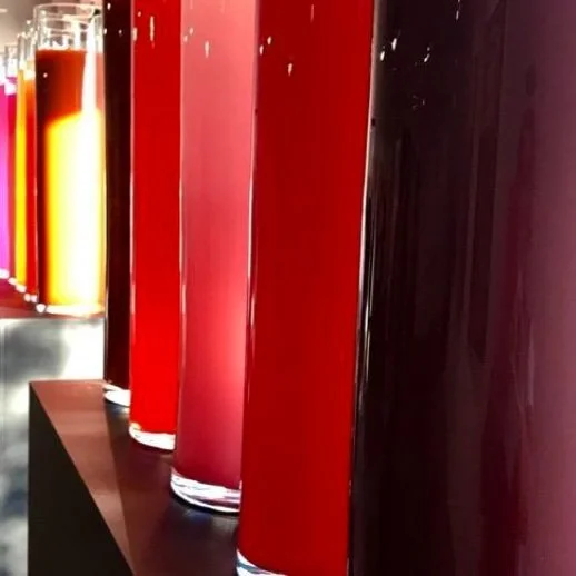
Figure 7. GGLCO #5 photographed on 25.10.18.

Figure 8. GGLCO #5 photographed on 2.11.18.
Footnotes
[1] Cylinders obtained from IKEA some variations in glass thickness exist. Overall height and diameter are all the same. Any variations would have a very minimal impact if at all on the experimental results.
[2] Water used was from the tap at the Concordia Gallery. It would be preferable to use distilled or deionised water, but a decision was made that this was cost prohibitive and access to the observation area presented some logistical health and safety issues.
[3] All red pigments, including prototype cadmium-free colours, were provided by Colart Innovation and Development Labs from the Winsor and Newton Professional Watercolour Range, as seen in image below.
[4] This hand-painted colour chart is a vital reference guide for painters as it indicates the pigment’s hue, transparency, and colour strength. These references provide a visual understanding of each pigment’s physical and working properties when it is in a wet state and, after evaporation, a dry stable paint film.
Create Your Own Hand-Painted Winsor & Newton Watercolour Palette.
I developed the ‘Create your own hand-painted watercolour colour chart’ in 2016 for Winsor & Newton Australia. This included a template with a dot of real colour available in the Professional Watercolour Range, with an accompanying key of pigment characteristics. On the alternate side, technical advice and information was provided that refers to the inherent qualities of coloured pigments and how they are identified on the tube labelling system.