Margot Magazine - The Colour Issue: RED featuring Natalie O’Connor
Photos by Eryca Green and Text by Laura Neilson
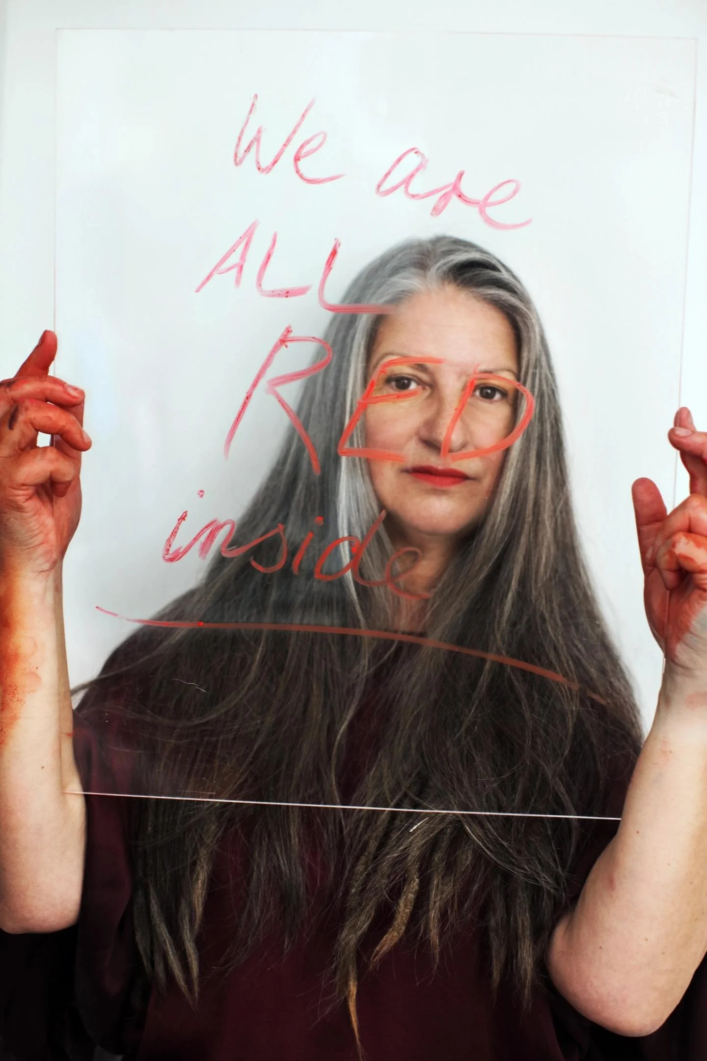
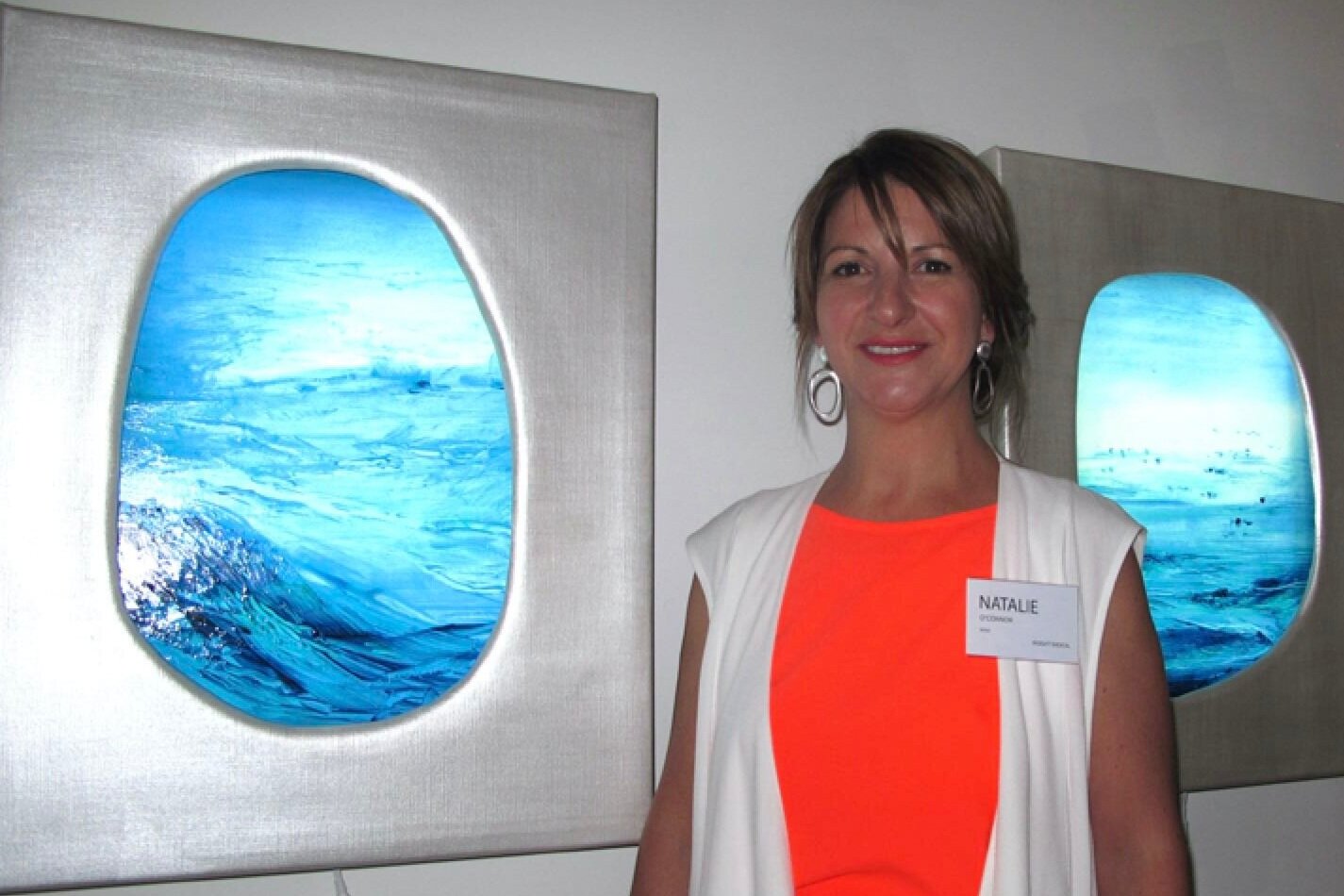
For Artist Natalie O’Connor,
red is more than a colour
but a primordial element that’s endured since the beginning of mankind
Is there any single color more provocative than red? Not as far as the eye can see. In all its various shades and hues, red is a color that confronts. It refuses to be ignored, invariably evoking reaction across an expansive emotional spectrum.
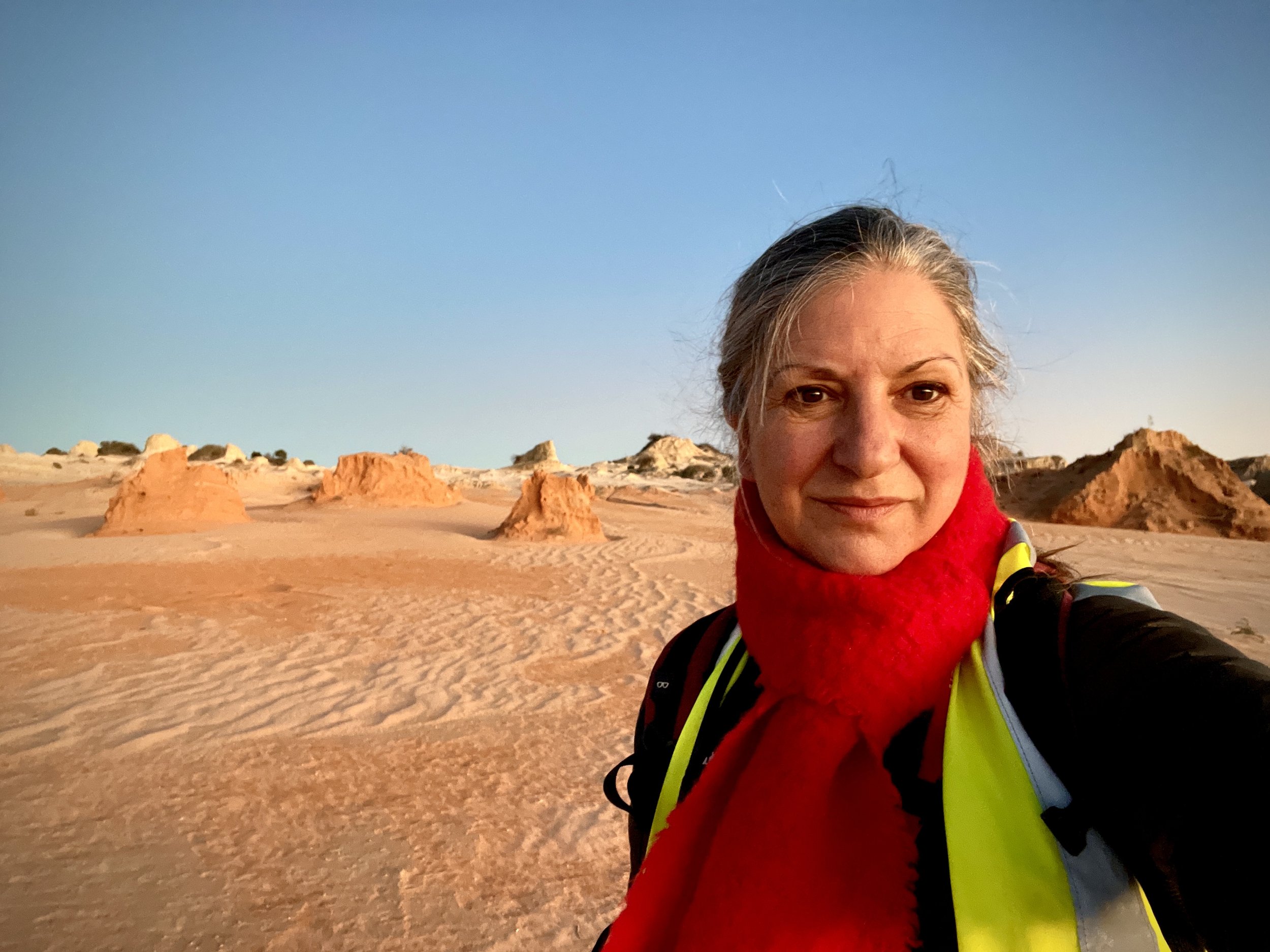
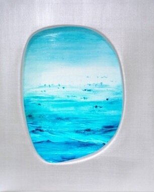
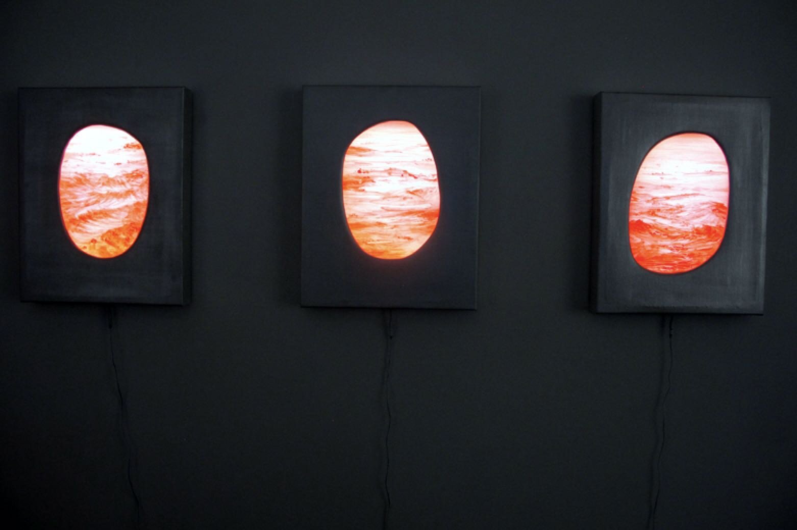
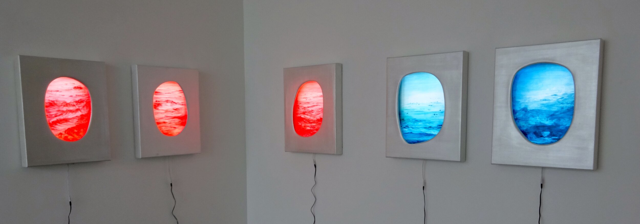
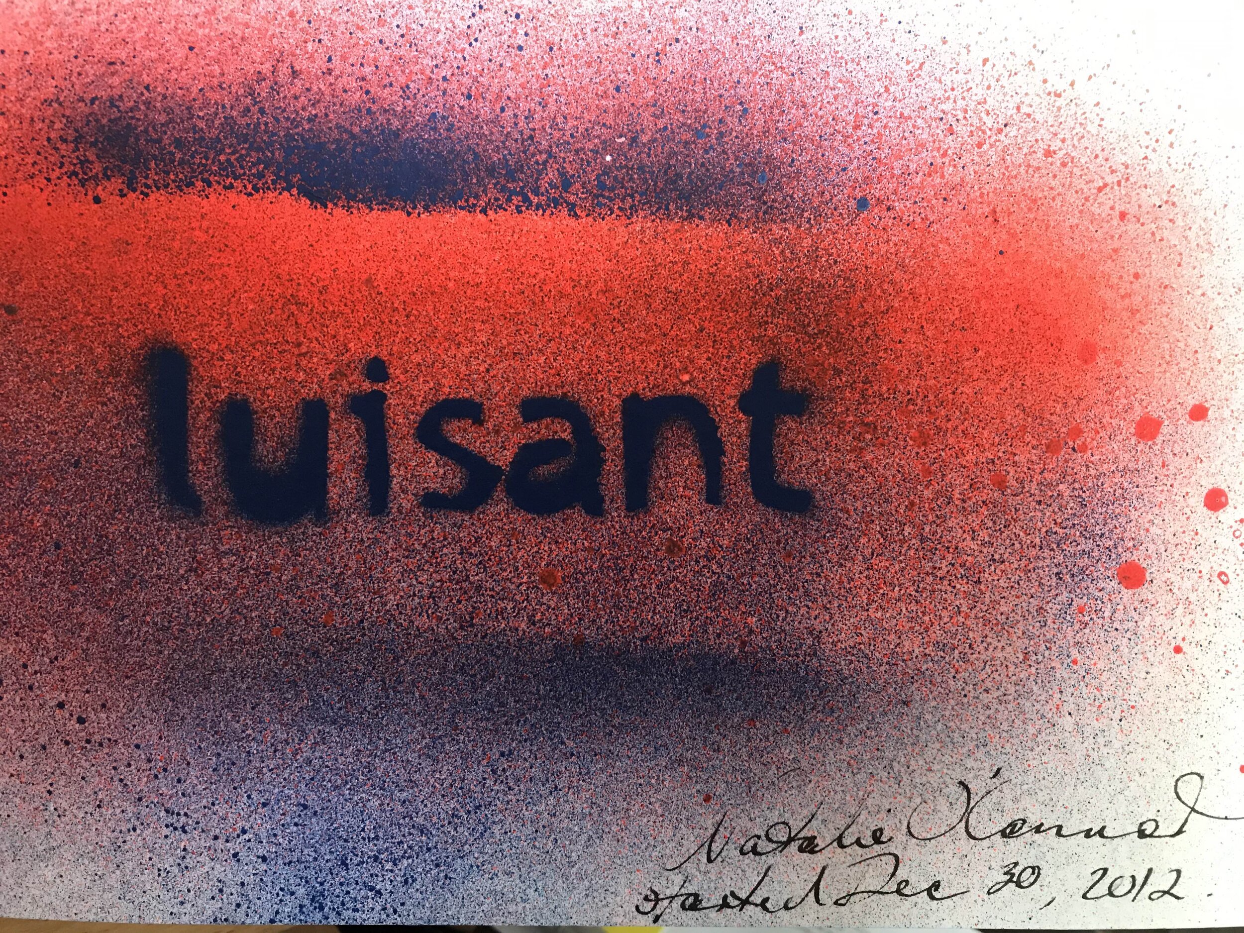
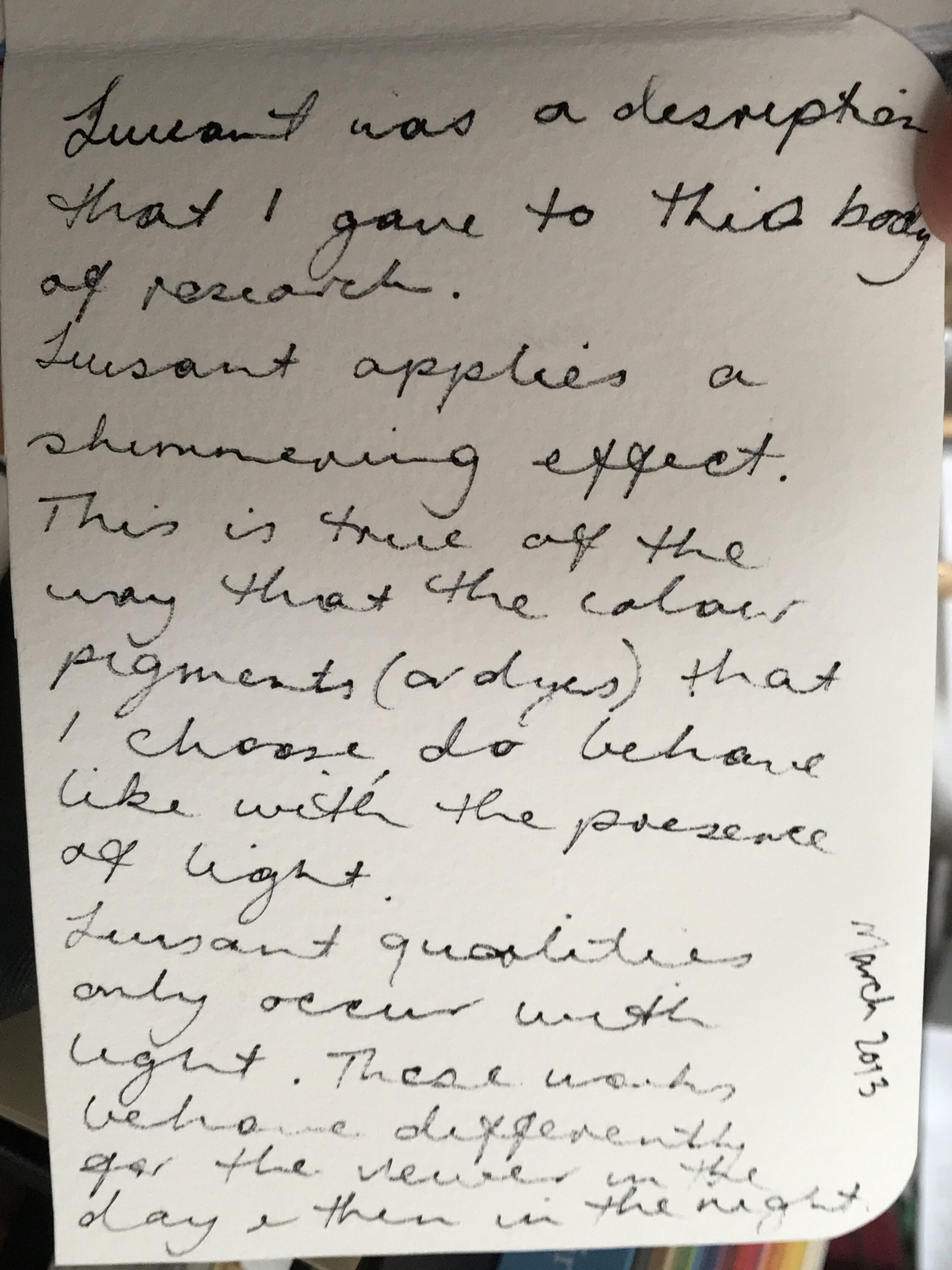
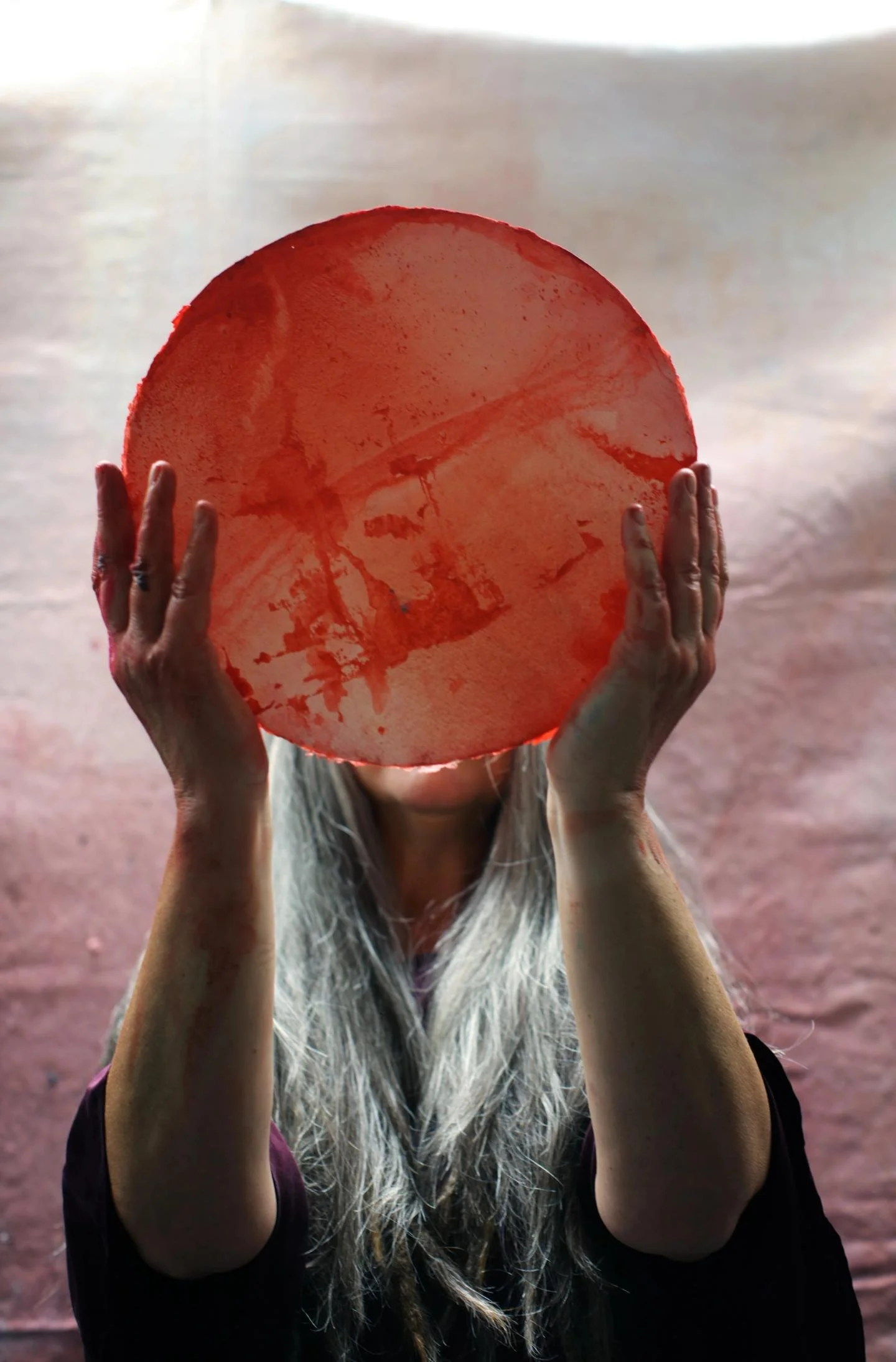
The Sydney-based artist and researcher Natalie O’Connor didn’t intend to write her recent thesis on colour theory, short-titled “The Nature of Redness,” about this particular pigment, but as she told us, “red chose me.” And while she can reflect back on an early love-hate relationship with the colour, it was ultimately a series of visits to Australia’s Mungo National Park in the Willandra Lakes World Heritage Area that inevitably turned curiosity into calling.
I’ve lived in, I think, 34 homes in my lifetime—a lot when I was really young. My parents flipped houses. My dad was a builder, and he would buy an old bomb and do it up— work up on it, sell it and keep going. I’m one of three girls, and because our bedrooms were just going to be demolished, we were allowed to paint on the walls, and do whatever and express ourselves.
I can remember an artwork I did when I was 10. I did this painting in a kids watercolor-type paint of a gum tree. And I can remember thinking, ‘The color’s not right,’ because I didn't see the tree trunk as just brown. I knew that it was this myriad of colors, and so my whole aim was to try and capture the essence of the gum tree that I saw in front of me. And it's probably the first work where I knew that I was observing color as I truthfully saw it.
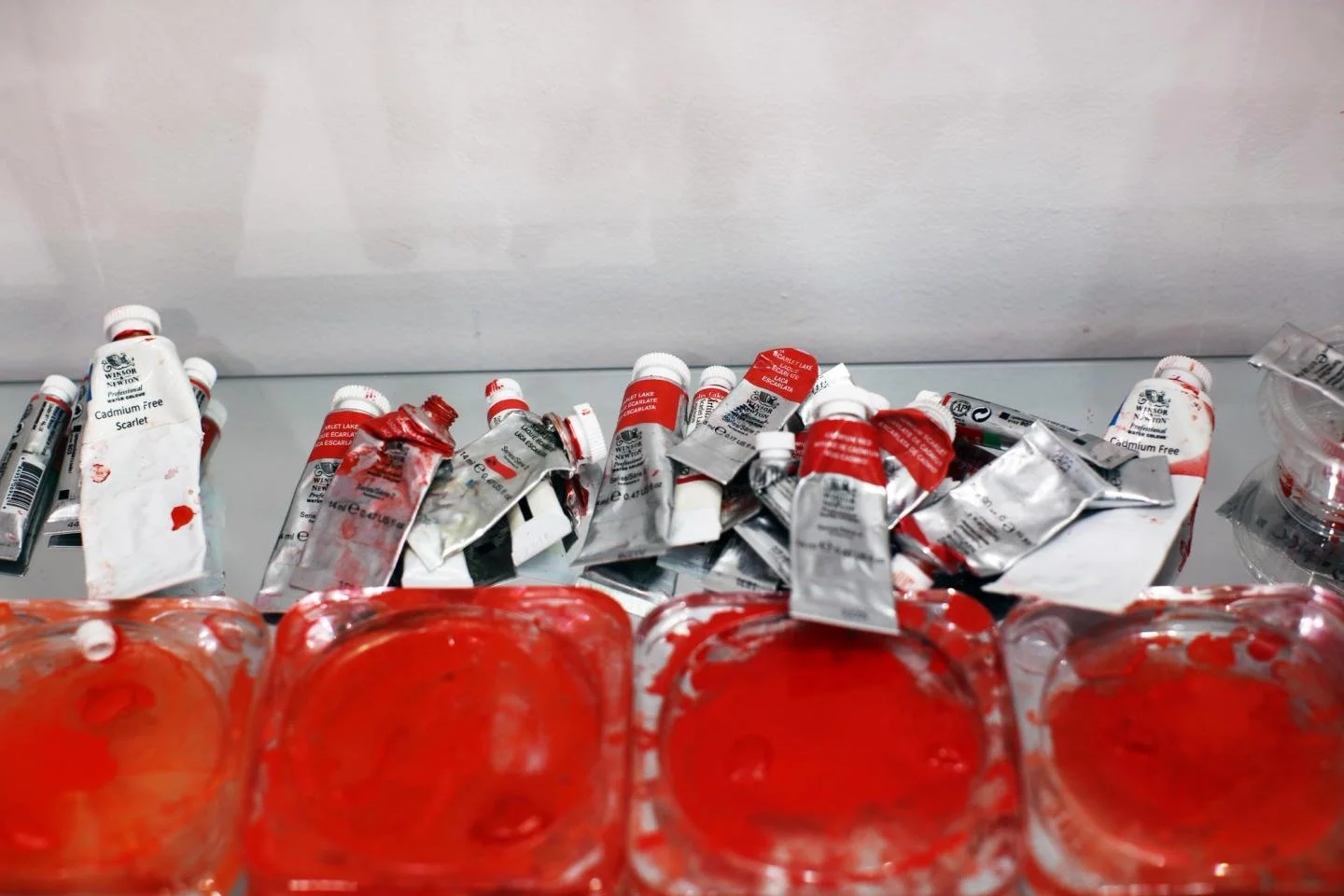
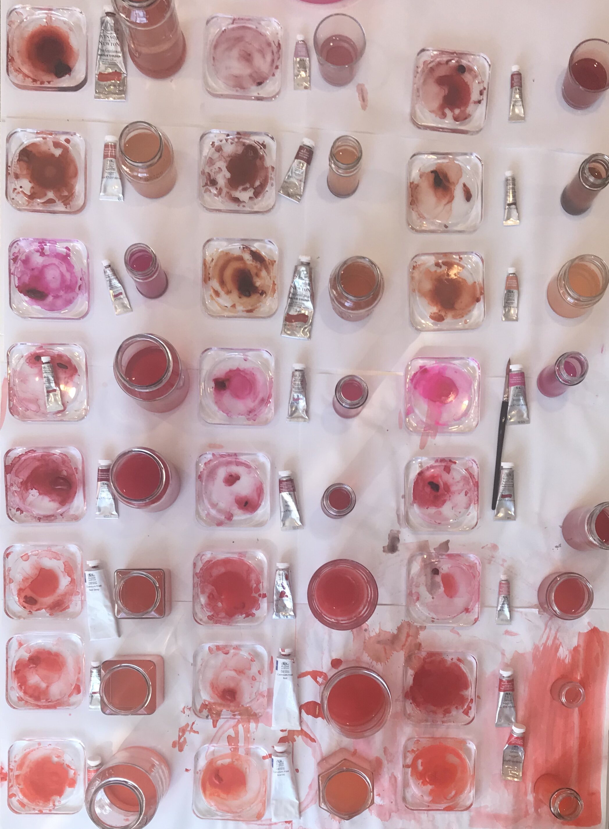
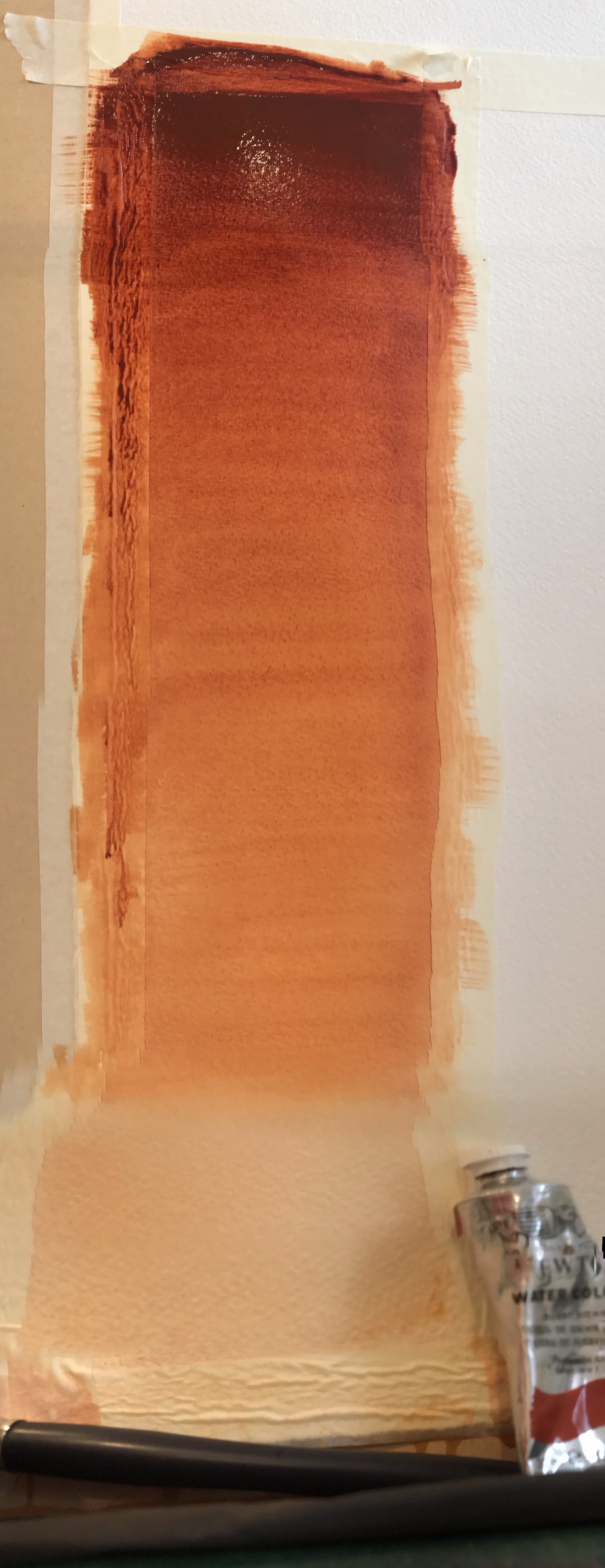
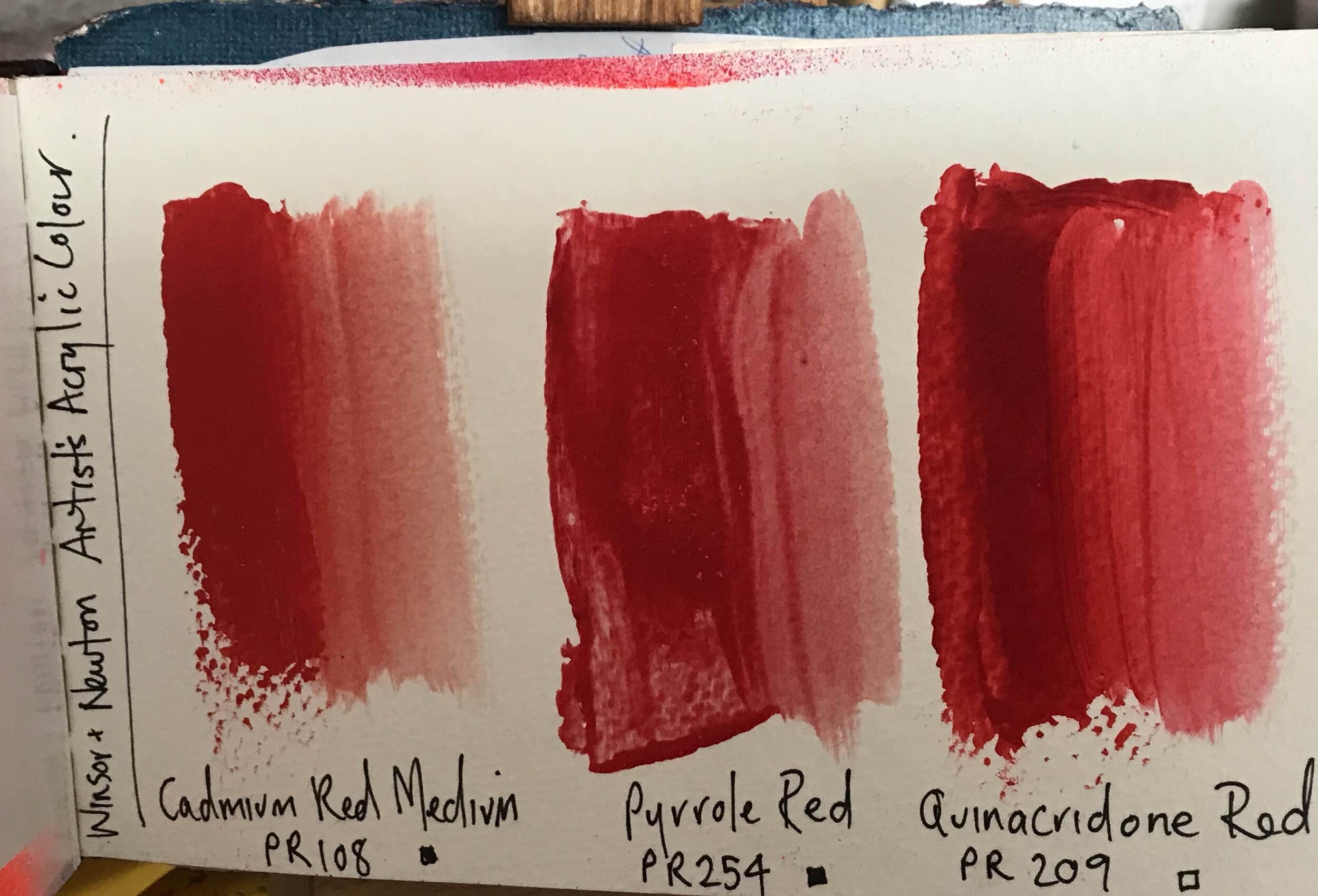
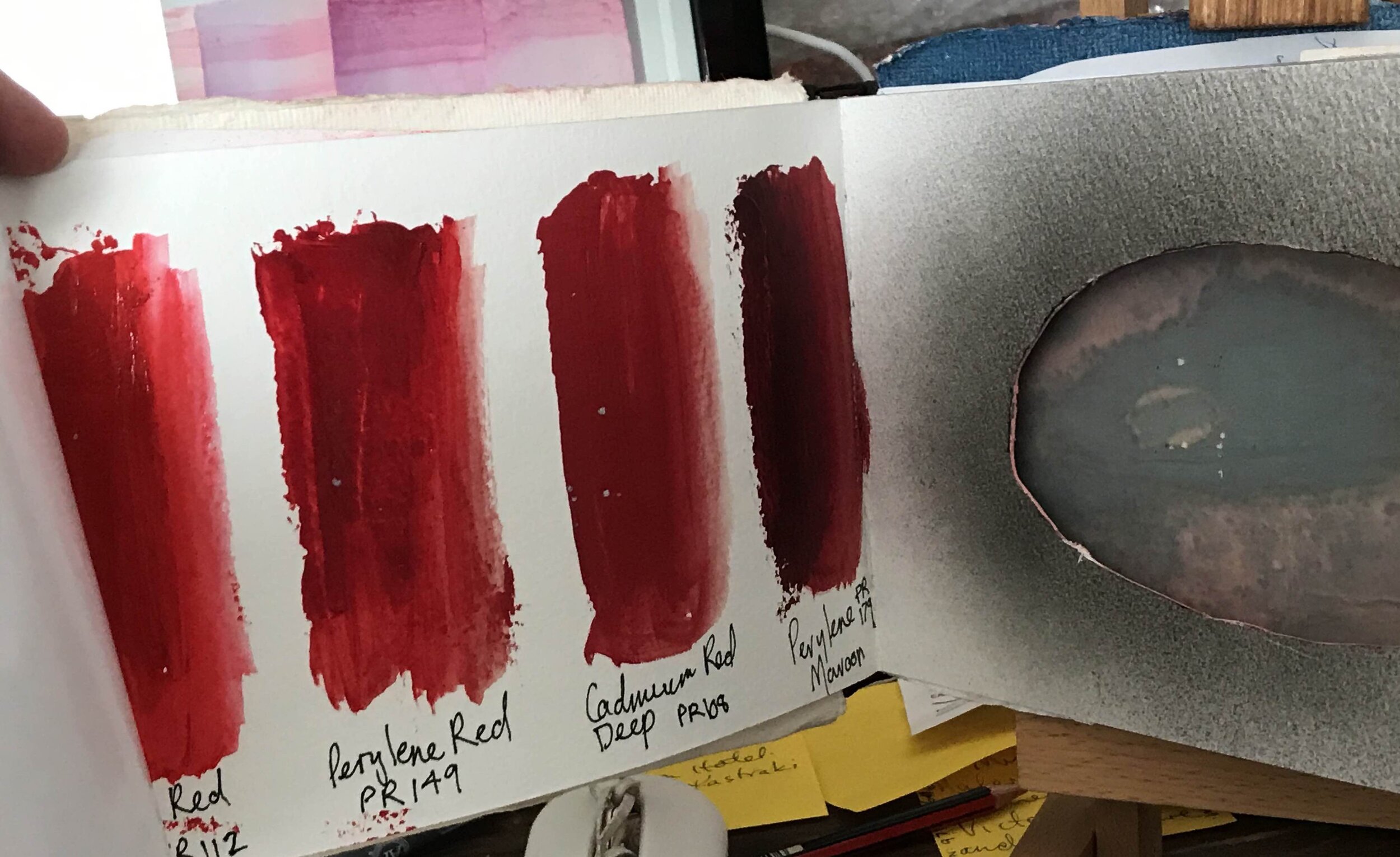
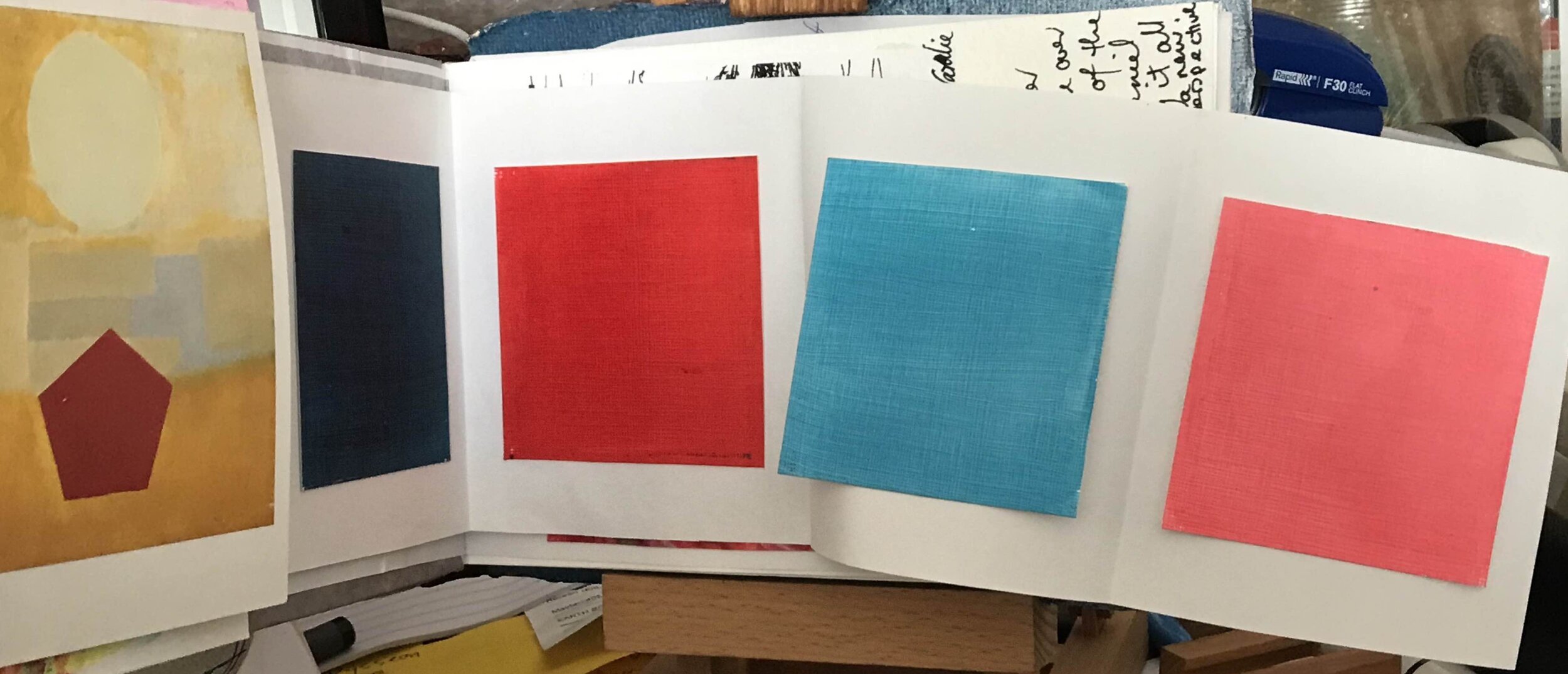
“I got my first paint box when I was 11. It was a Winsor & Newton paint box. That became the precursor of almost my whole life—working from that paint box, trying to understand it.”
When I was 13, I decided that I was going to be an art teacher. I went around to all the universities in Sydney to work out which would be the best one for me. It was quite difficult to get into art school, because they didn't have many places in those days. And I just worked doggedly hard, and made sure I had a portfolio ready, and I got in. I can still remember the first lecture that I sat in on, when they were addressing all the new students, and this person said, ‘You came here because you have a passion for art. You also want to teach that art, so if you're going to be teaching that profession, keep art within you completely.’
“That became my sole ambition: not to become a teacher who had forgotten the artist within her, and to keep that practice going. It’s a really difficult challenge for teachers.”
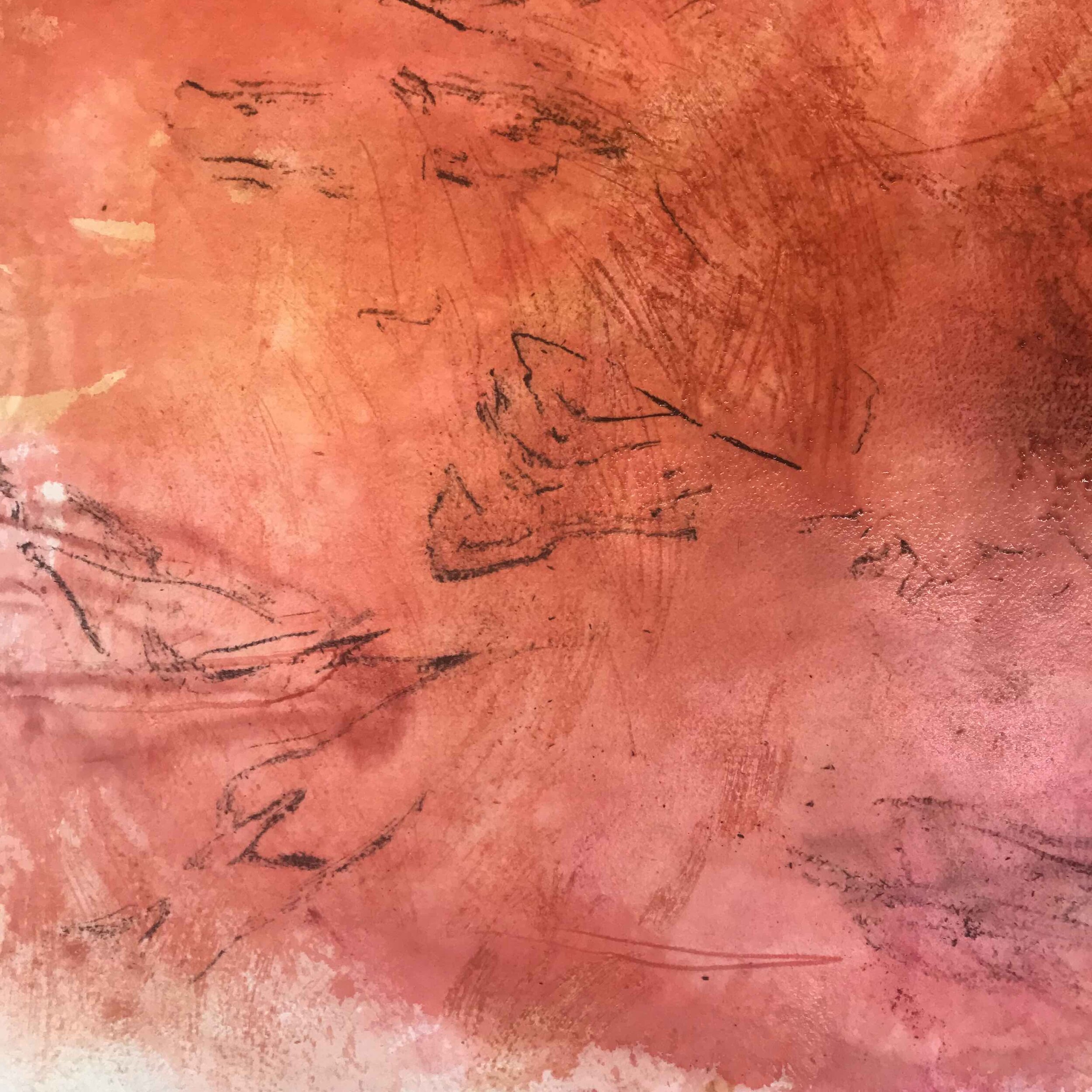
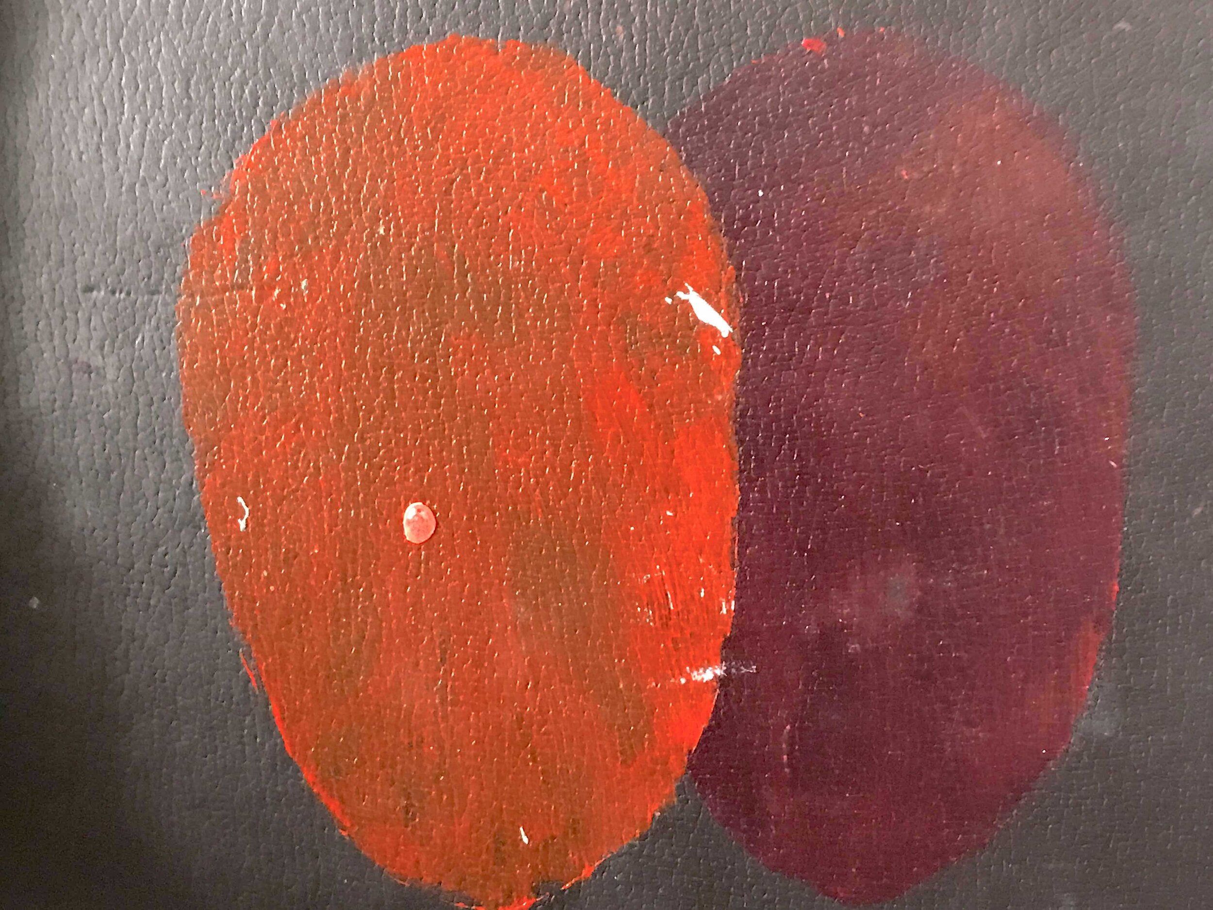
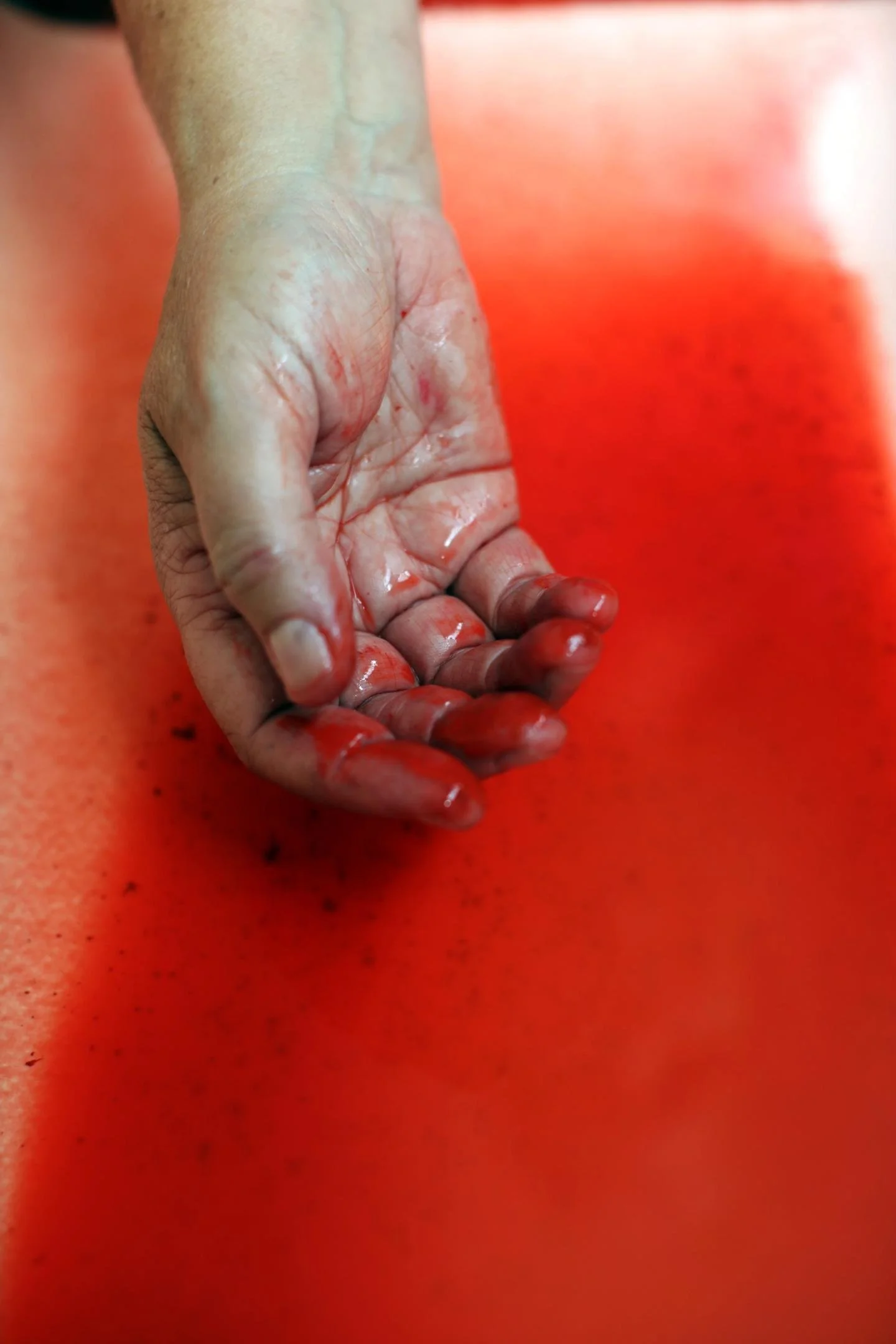
I always say red chose me—and I believe that. There were pivotal points where I can see that it’s all interconnected. I remember, during my training, being required by a teacher to paint all my canvases red before starting figure drawings. At the time, I found the white canvas liberating, while the red one felt like an interruption. So I’ve always had a kind of love-hate relationship with red.

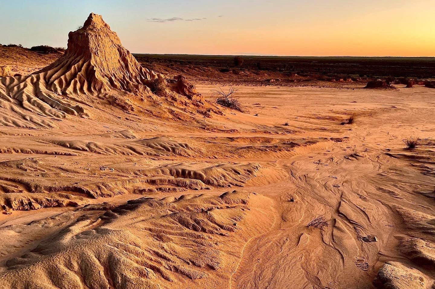
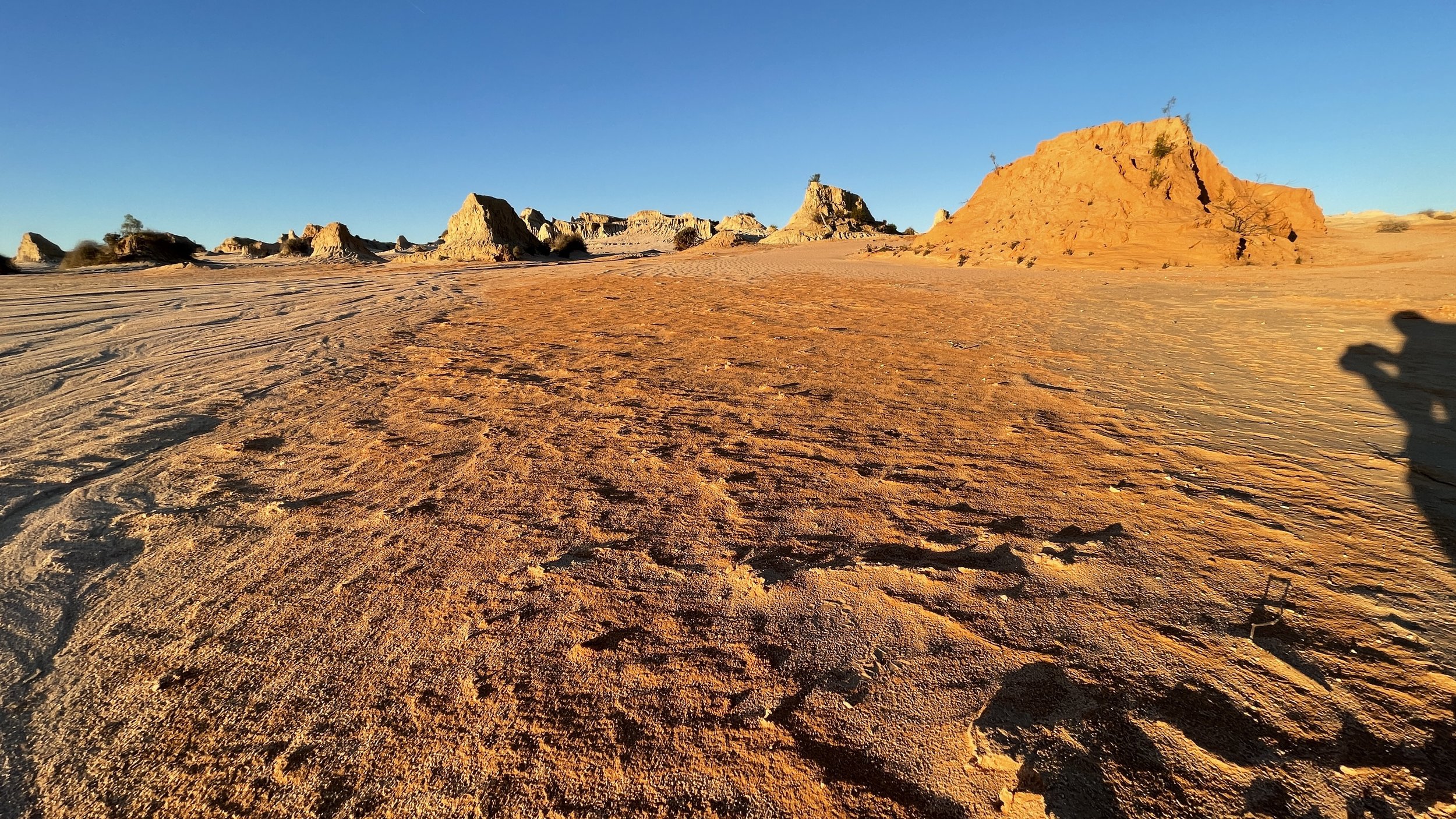
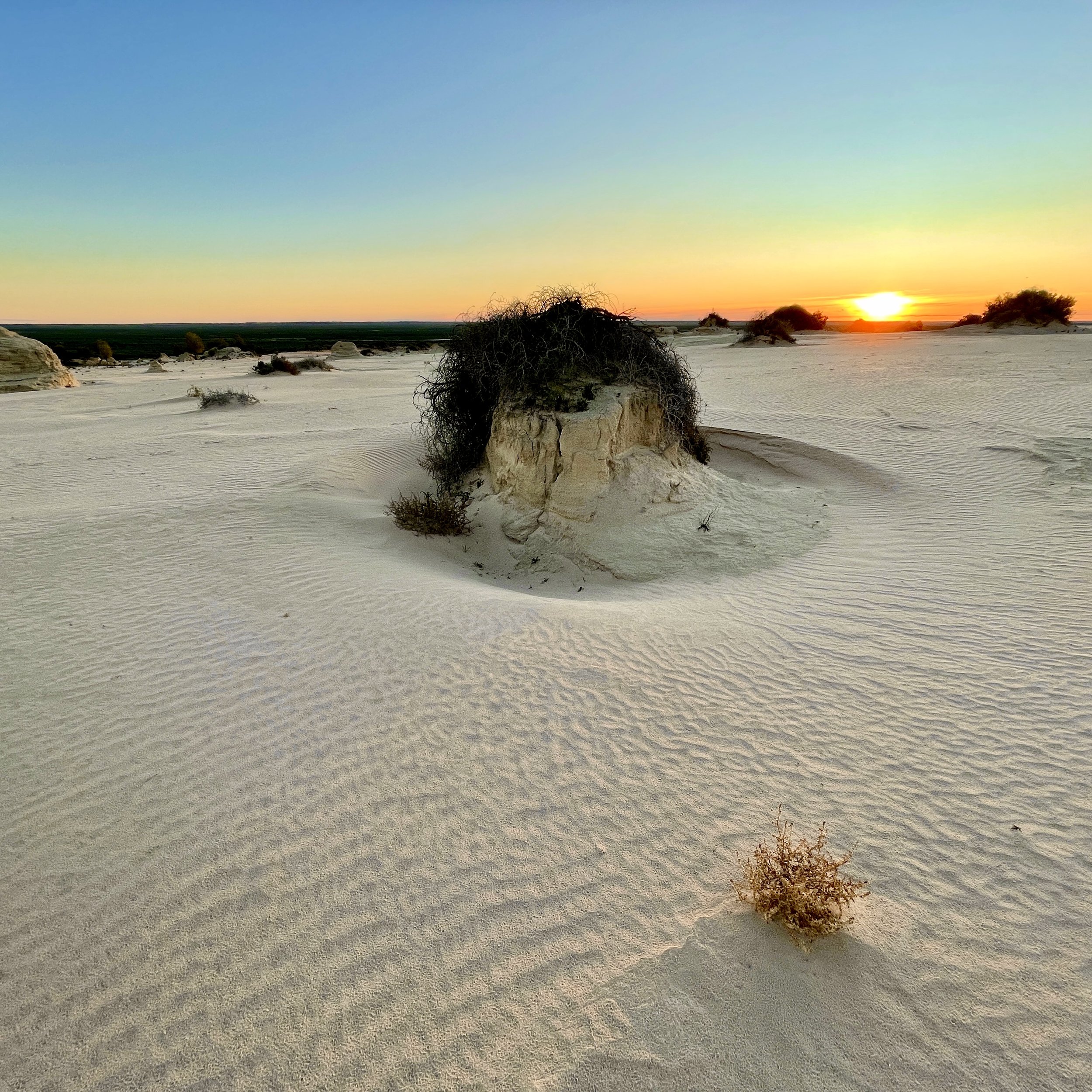
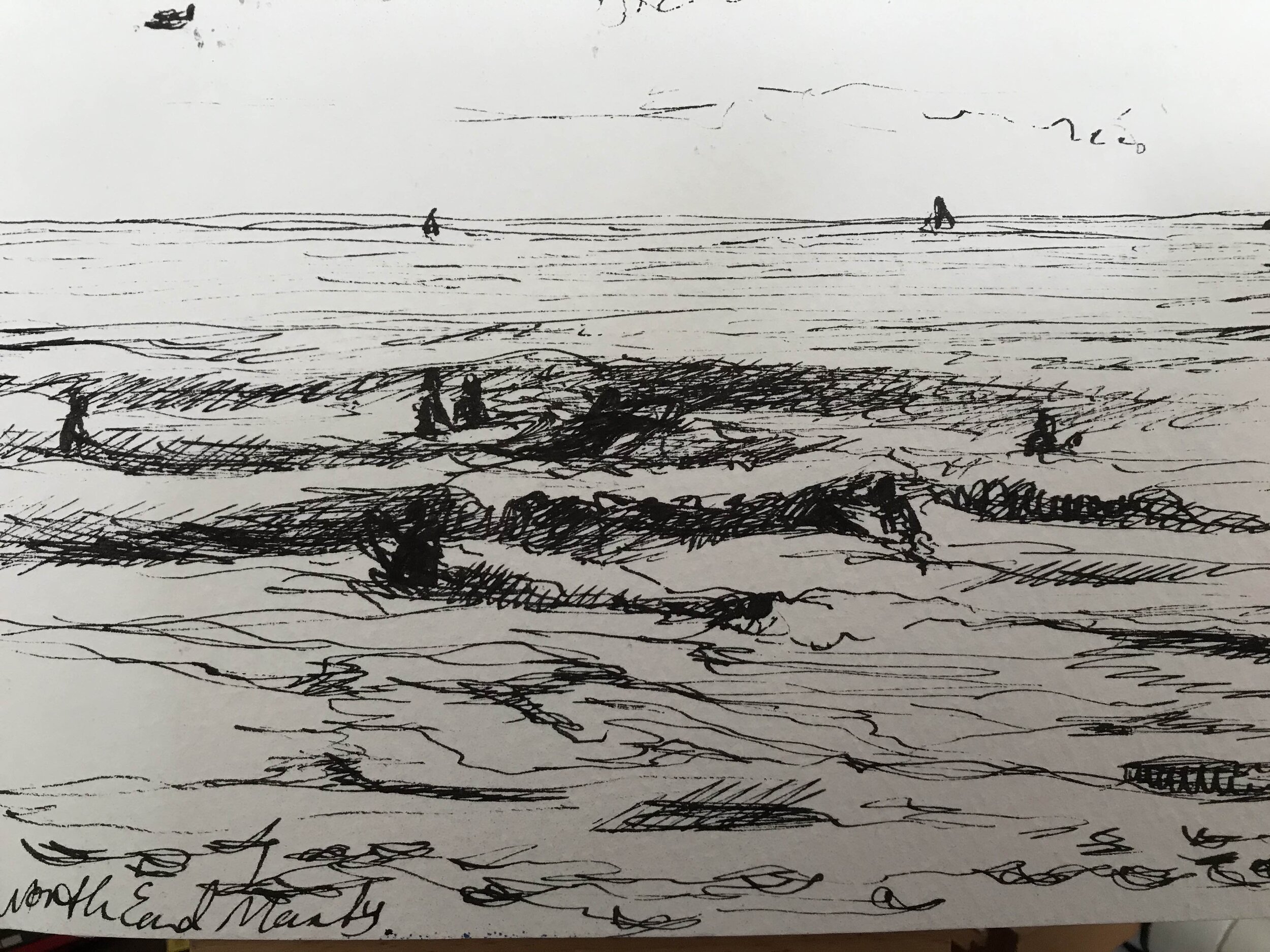
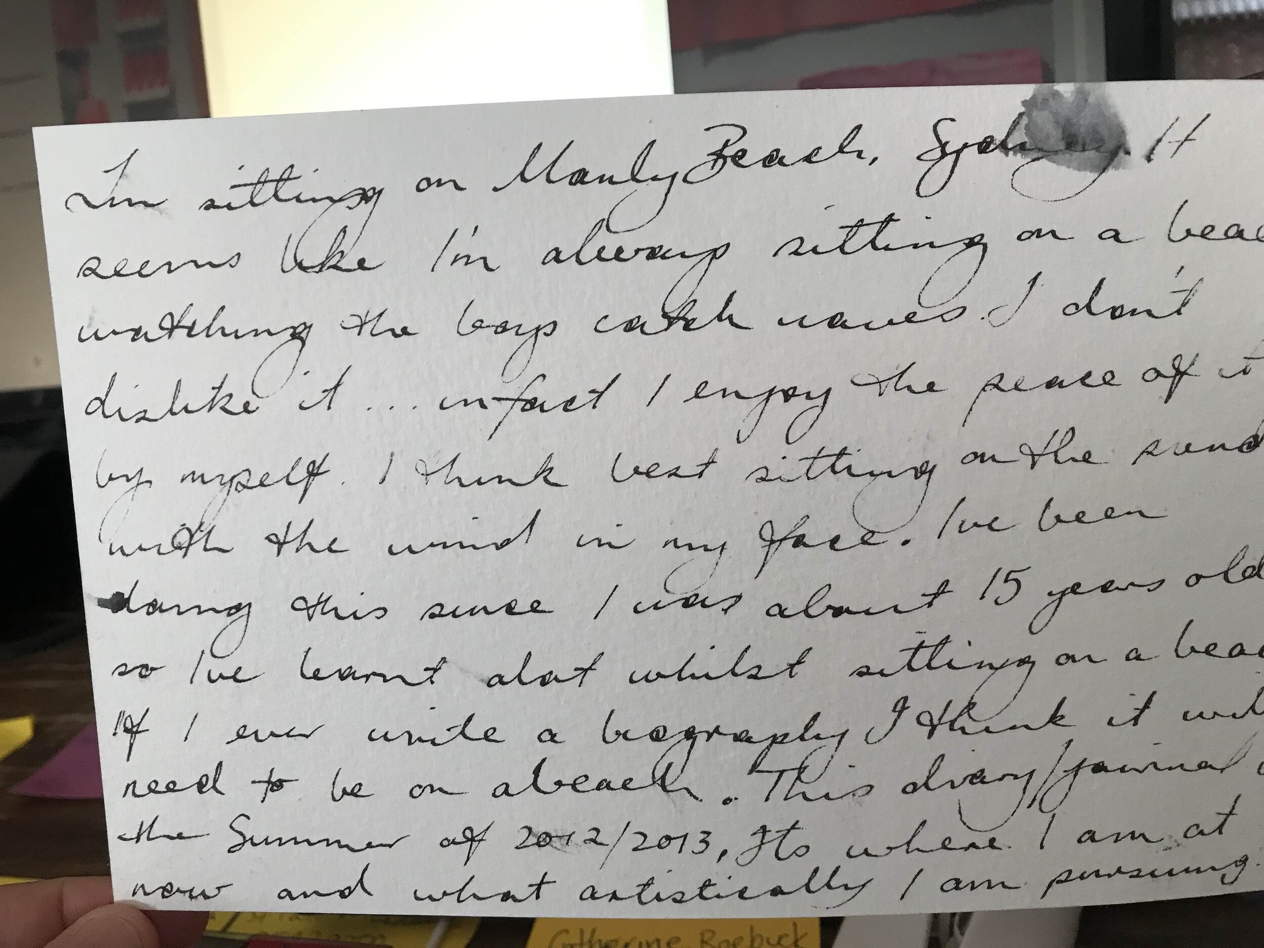
I had a friend who said, ‘You must come out to Mungo.’ I knew that it was in the outback, and I'd spent some time in the center of Australia, but I hadn't been to this particular area. Its significance is that it has the oldest known cremation on the planet there. It’s a unique place because it's a world heritage site, and its cultural heritage, and connection to Aboriginal people here in Australia is really significant.
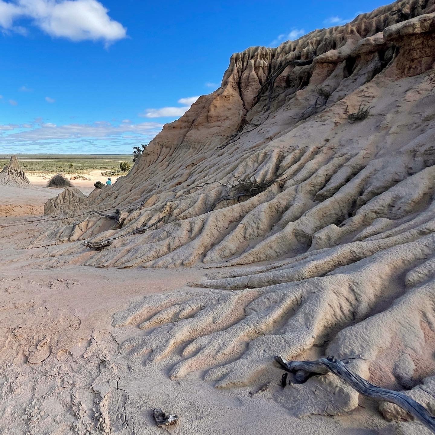
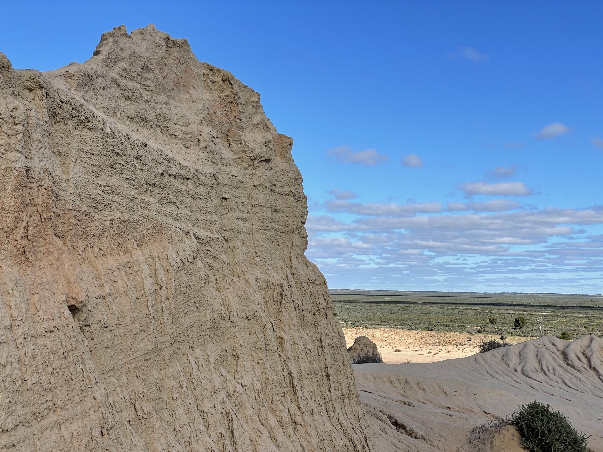
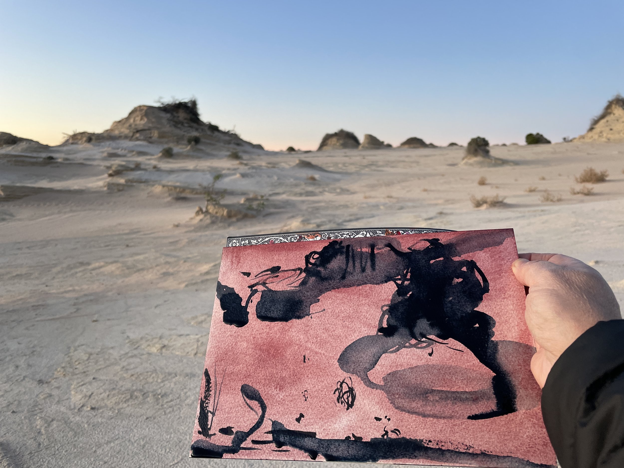
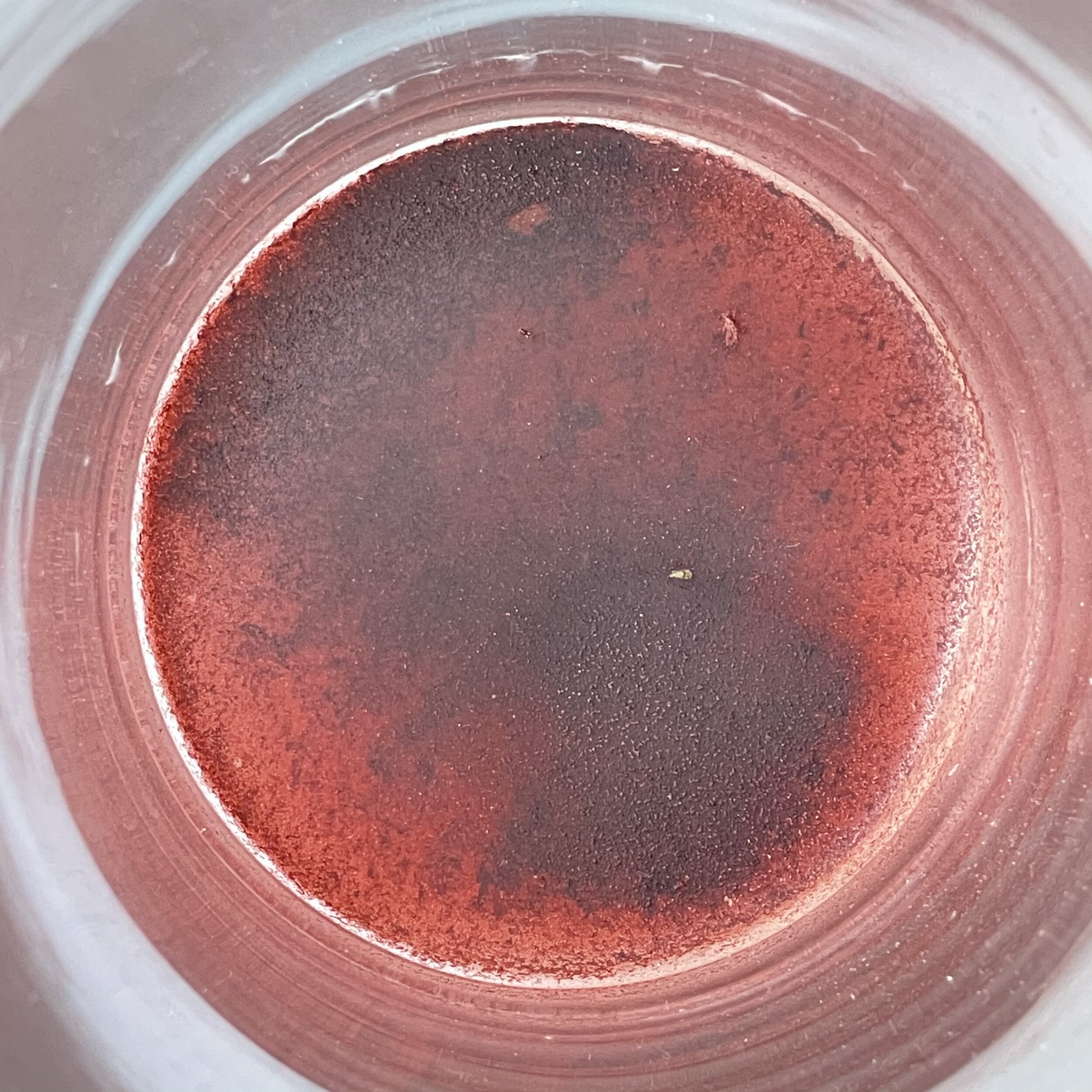
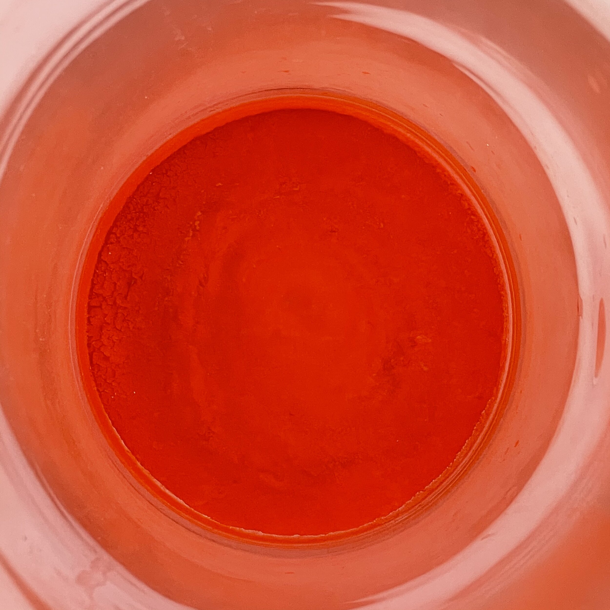
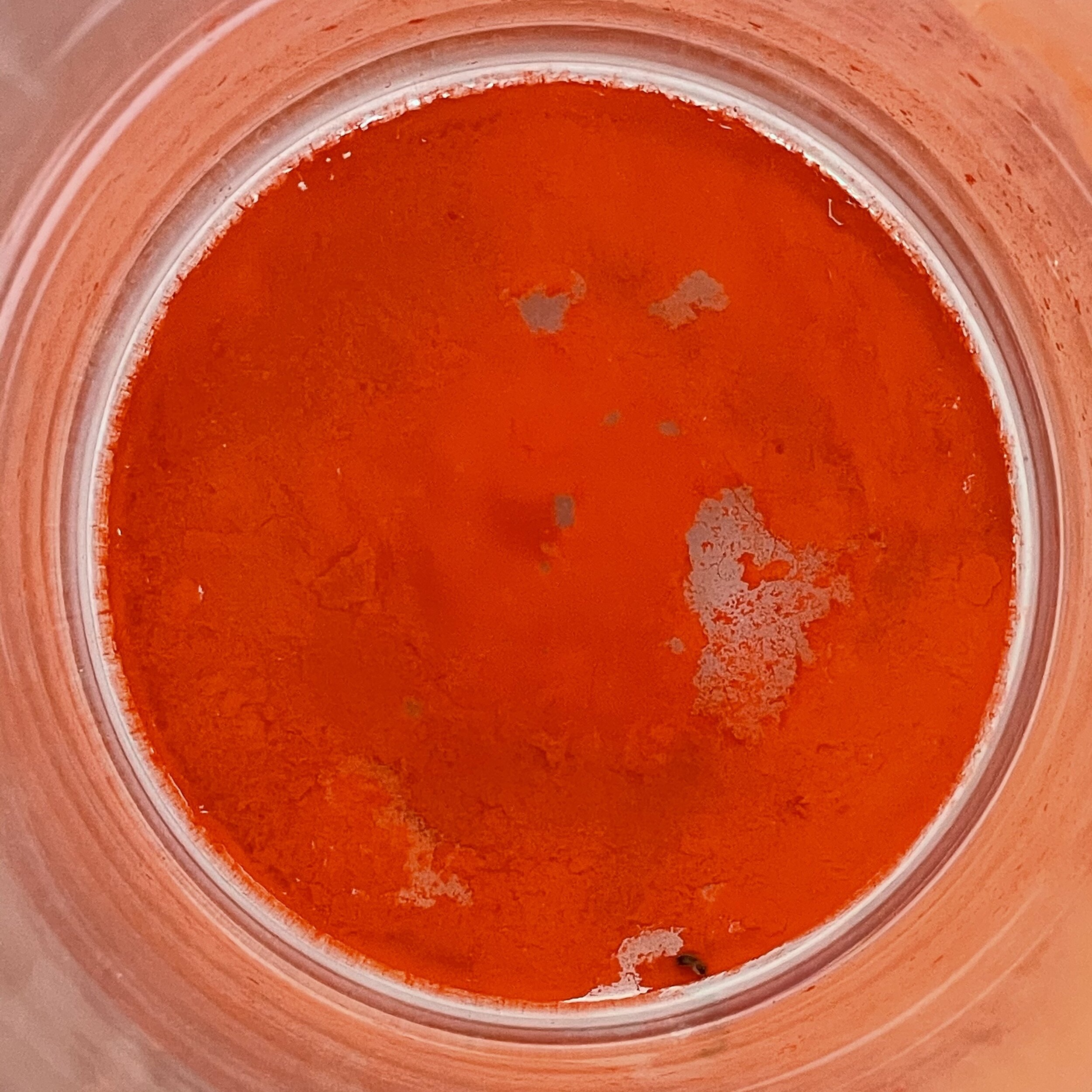
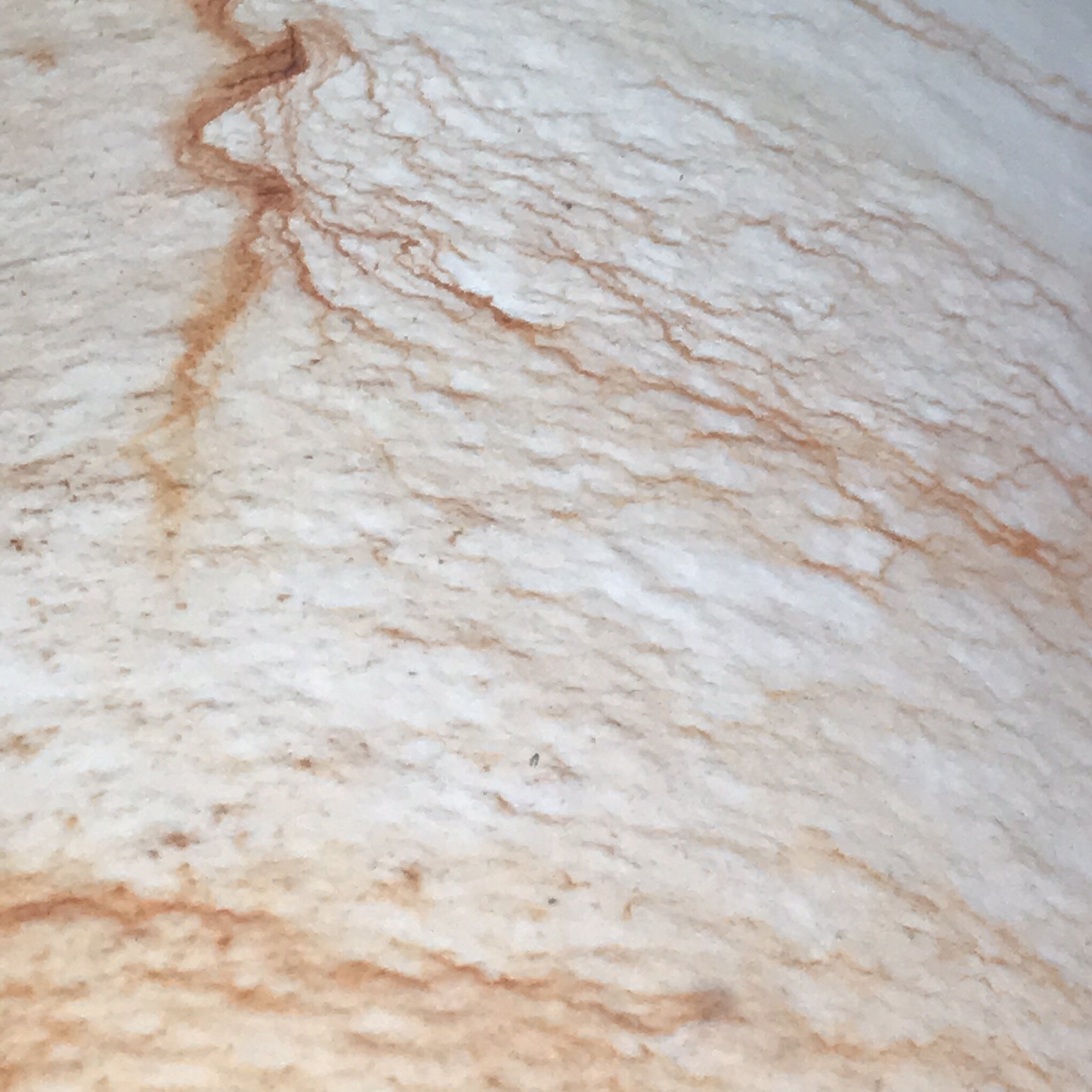
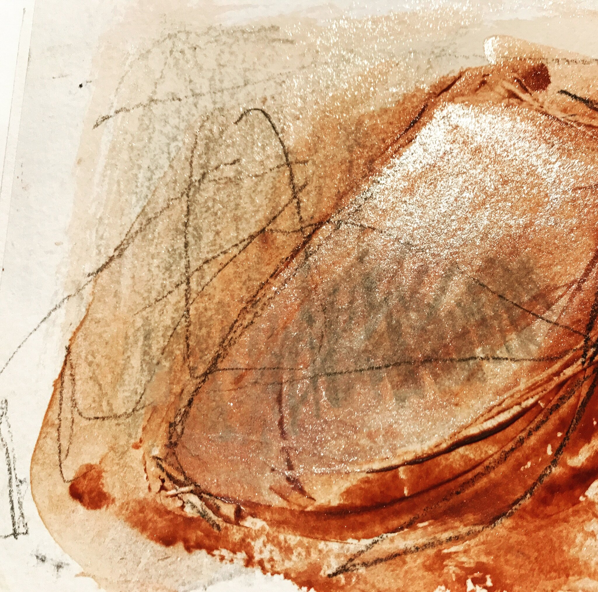
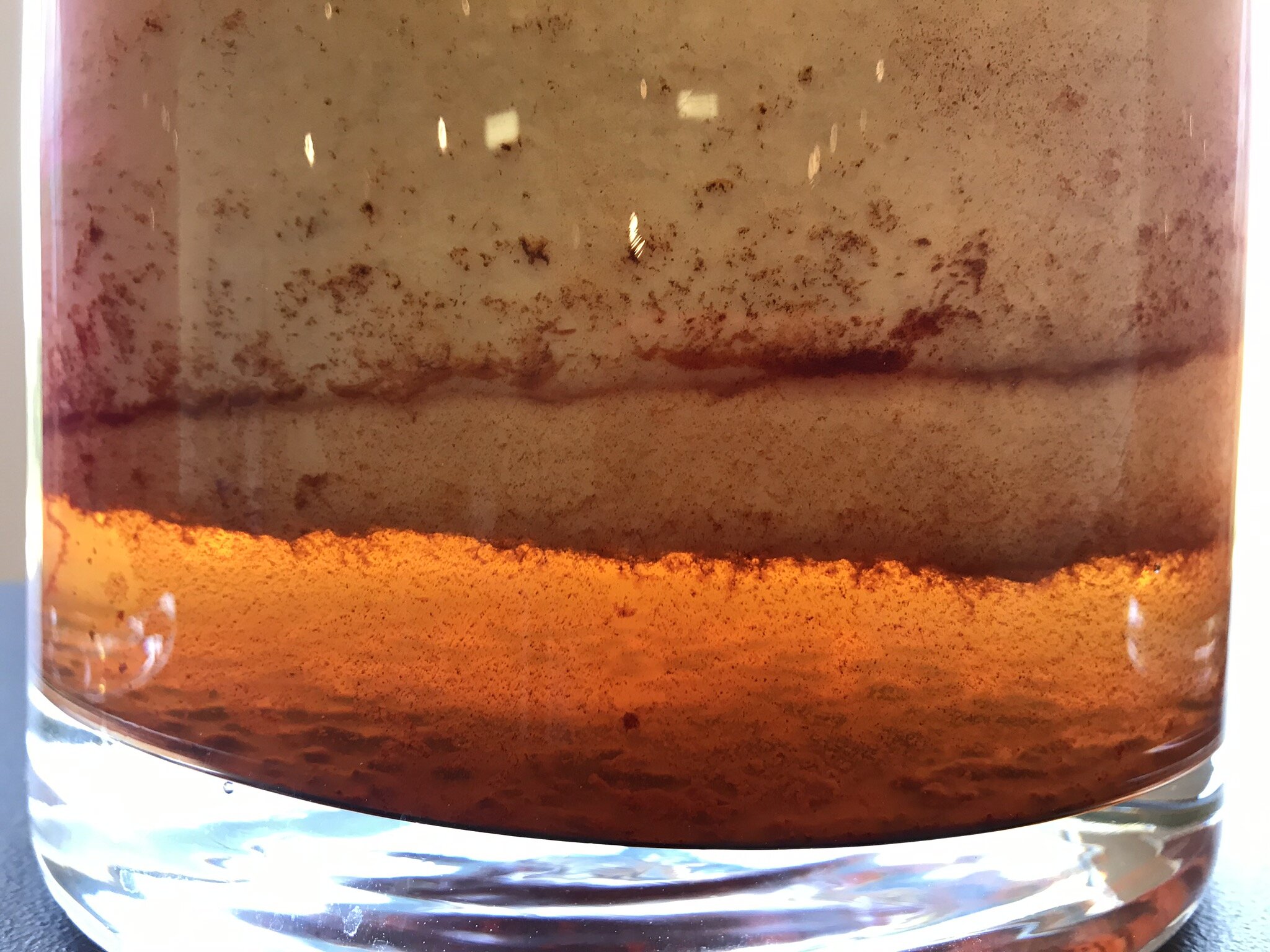
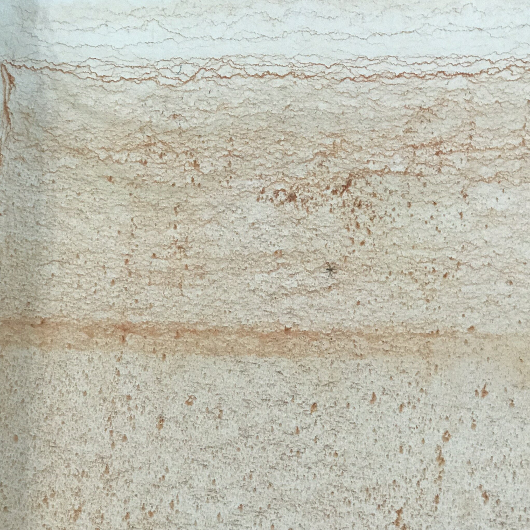
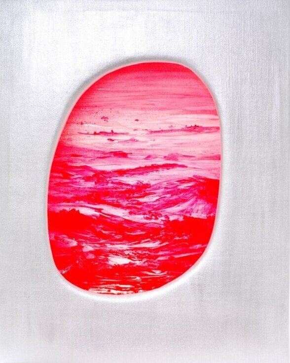
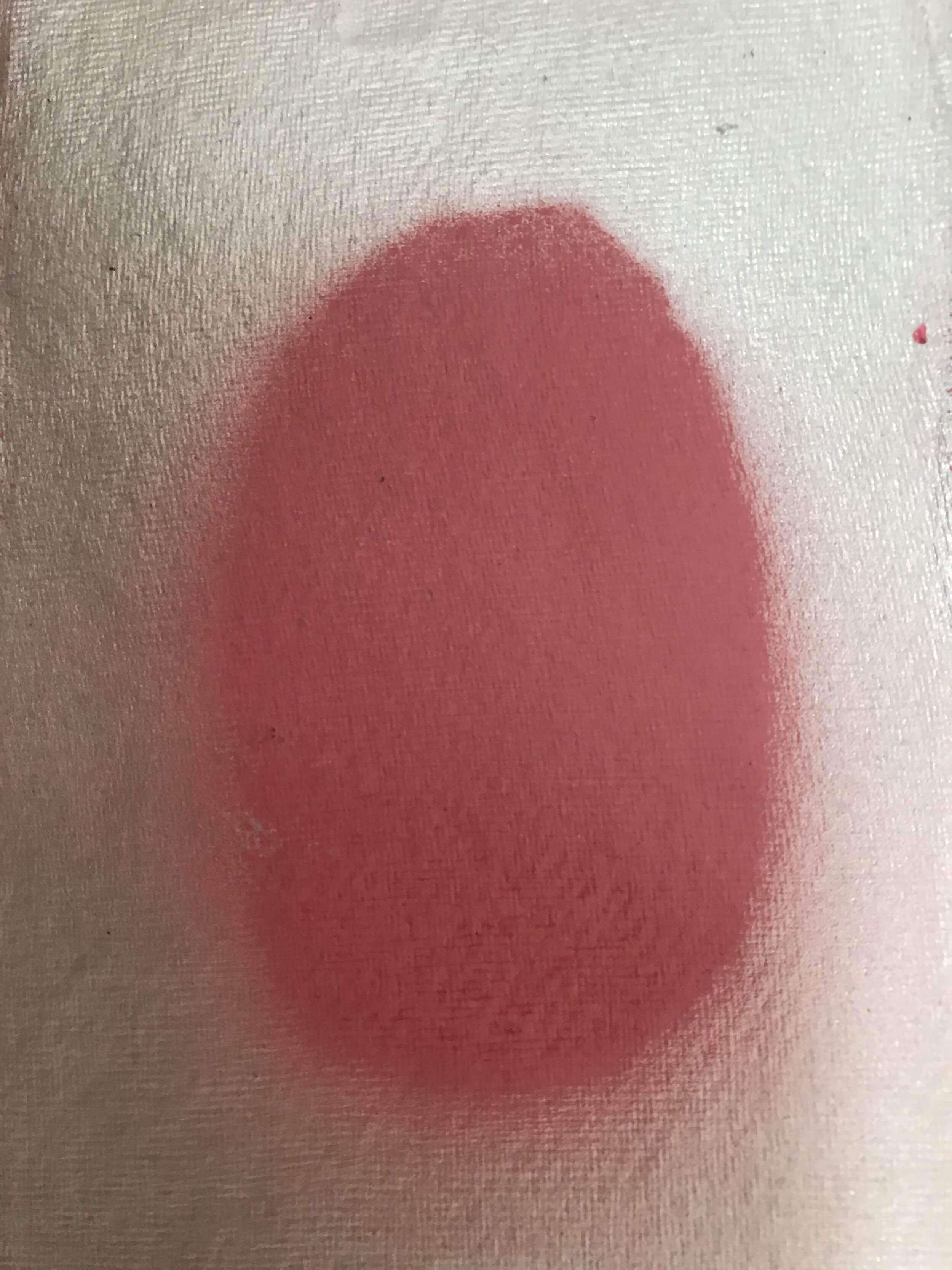
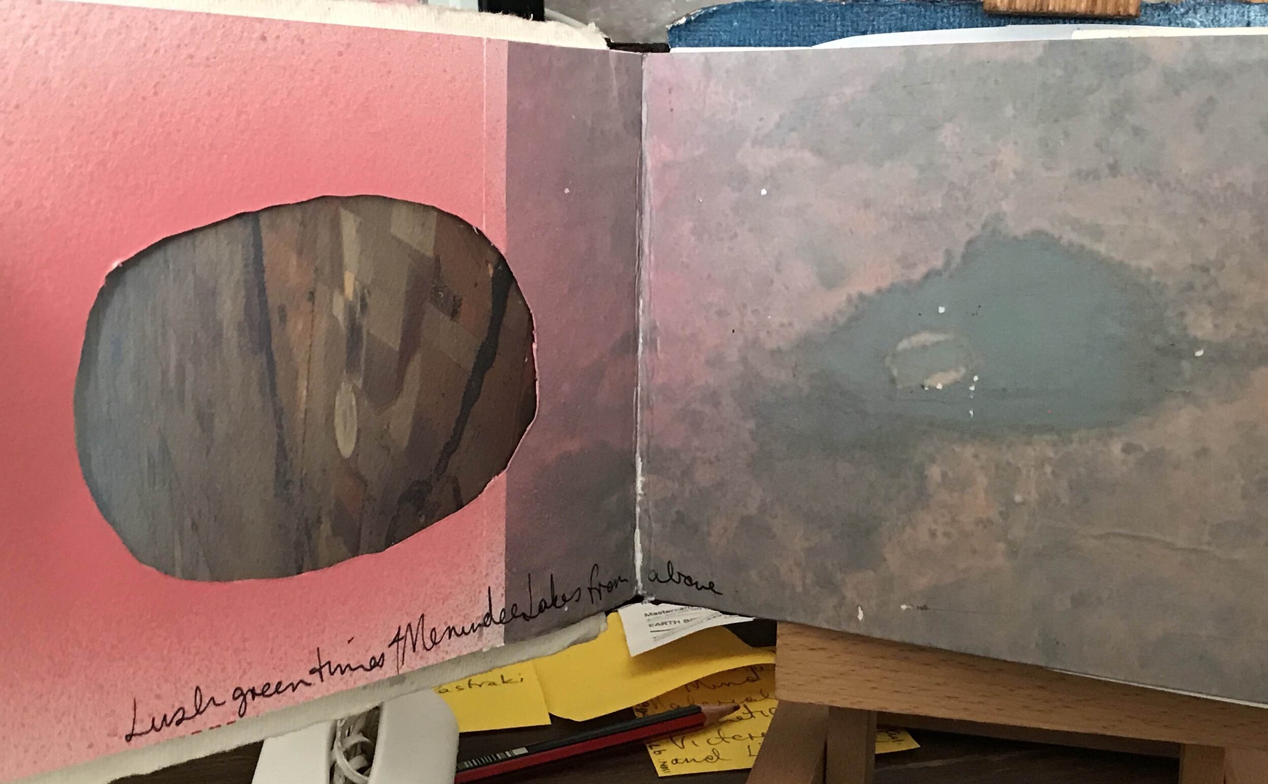
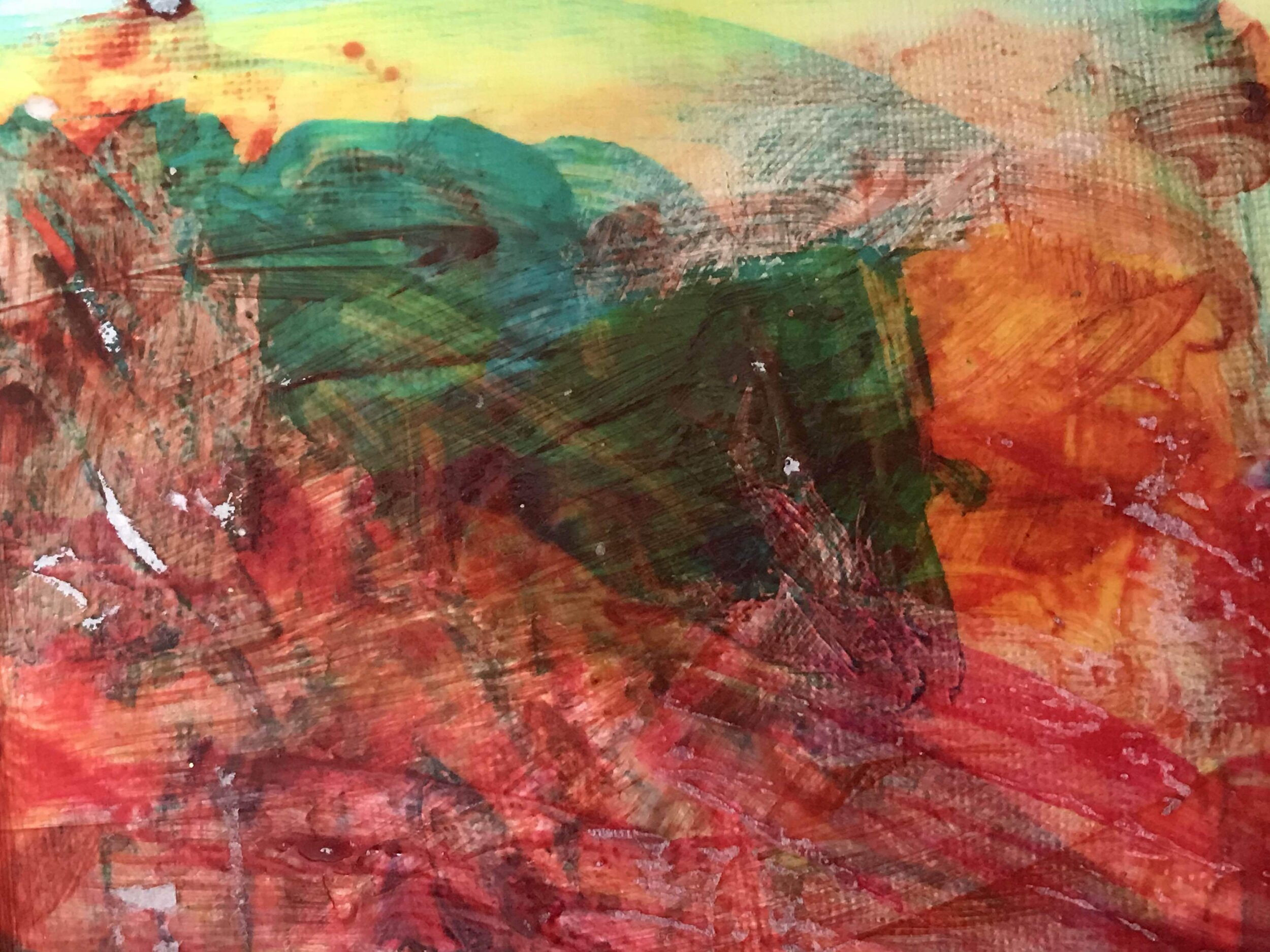
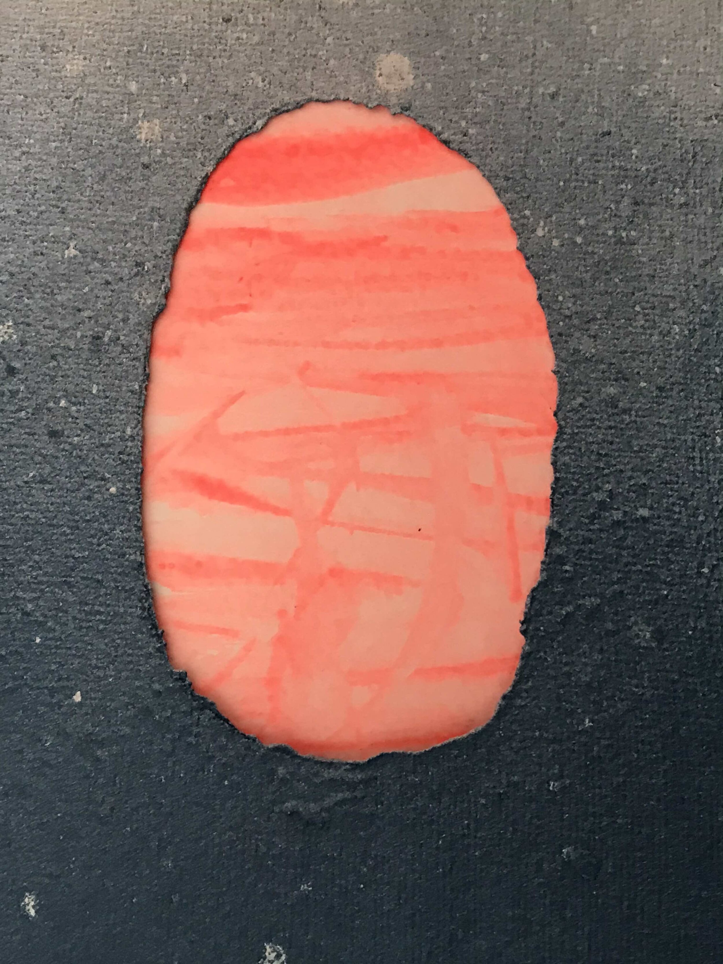
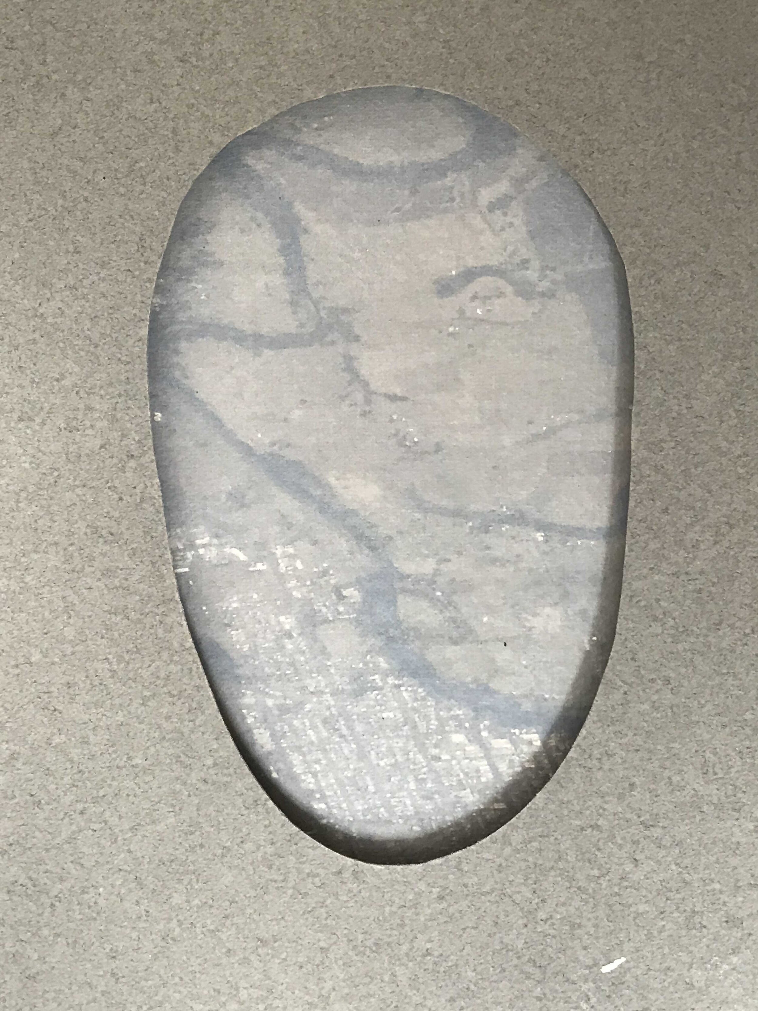
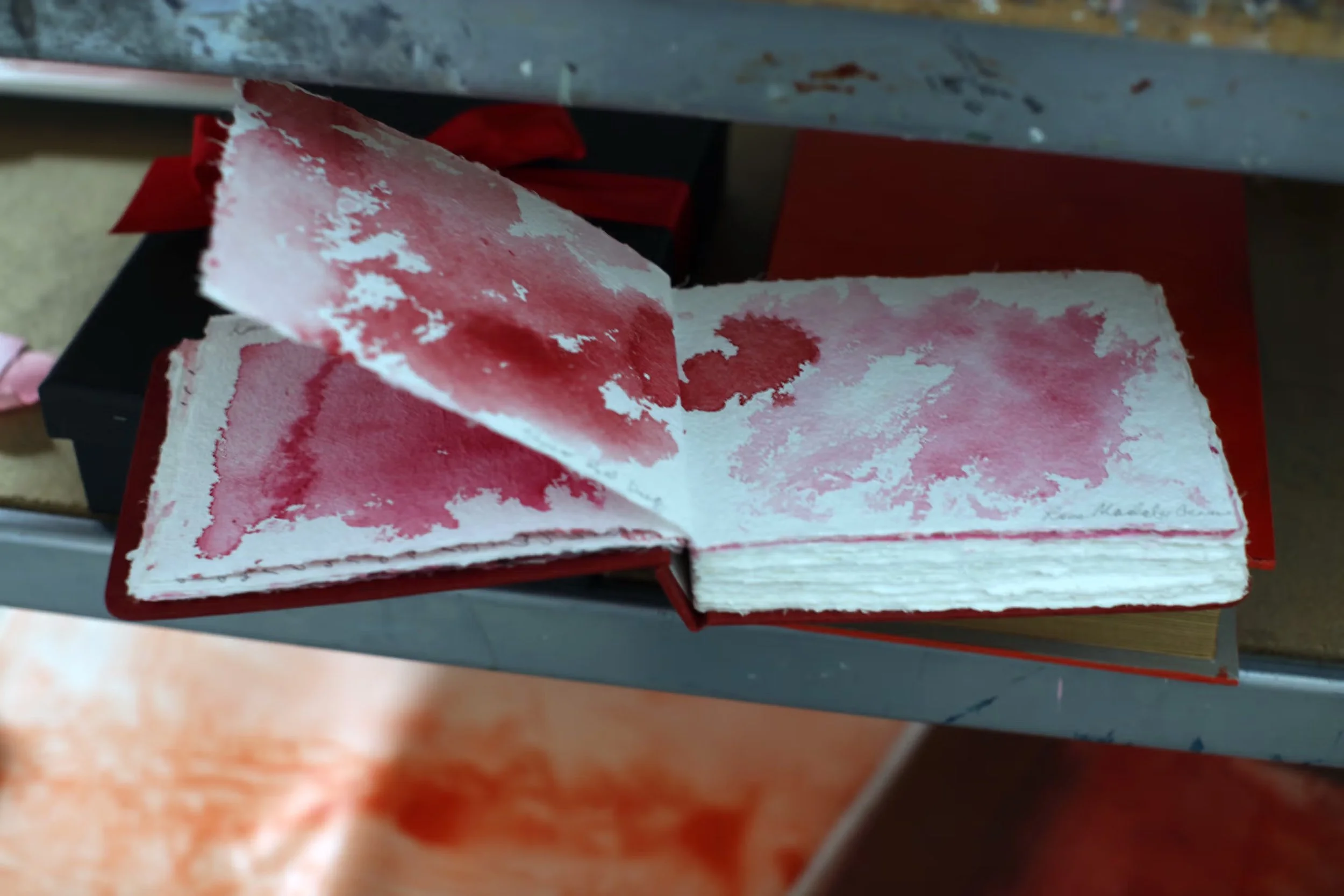
The Mungo lunettes are a 35-kilometer series of dunes going around Mungo, and each one of those sand dunes have been eroded through sheep farming. The erosion actually revealed all this knowledge and life that existed underneath the layers, and right at the very bottom, there’s a red layer called the Golgol Unit. When I first went there, I was told by the archeologists that this is the demarcation layer of life—that there were no living organisms found in it. When I looked at that red and it was so hard and really, really “hot”—what I imagine Mars would be like—I sat down on the ground in the middle of this circle, and my son took a photo of me with my hands stretched out. I thought, ‘That was the oldest thing I've ever touched in the world. What color red in my palette do I choose to paint that?’
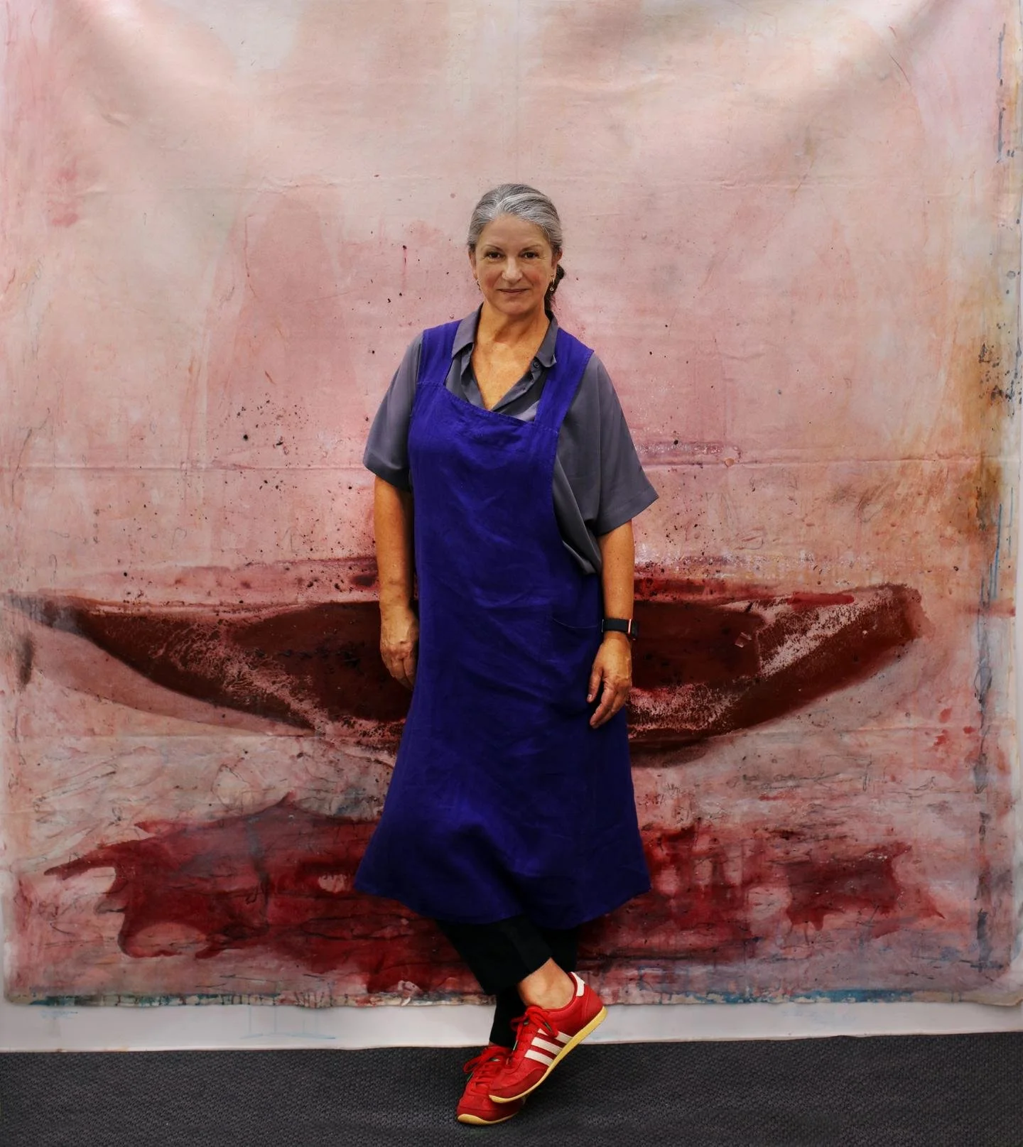
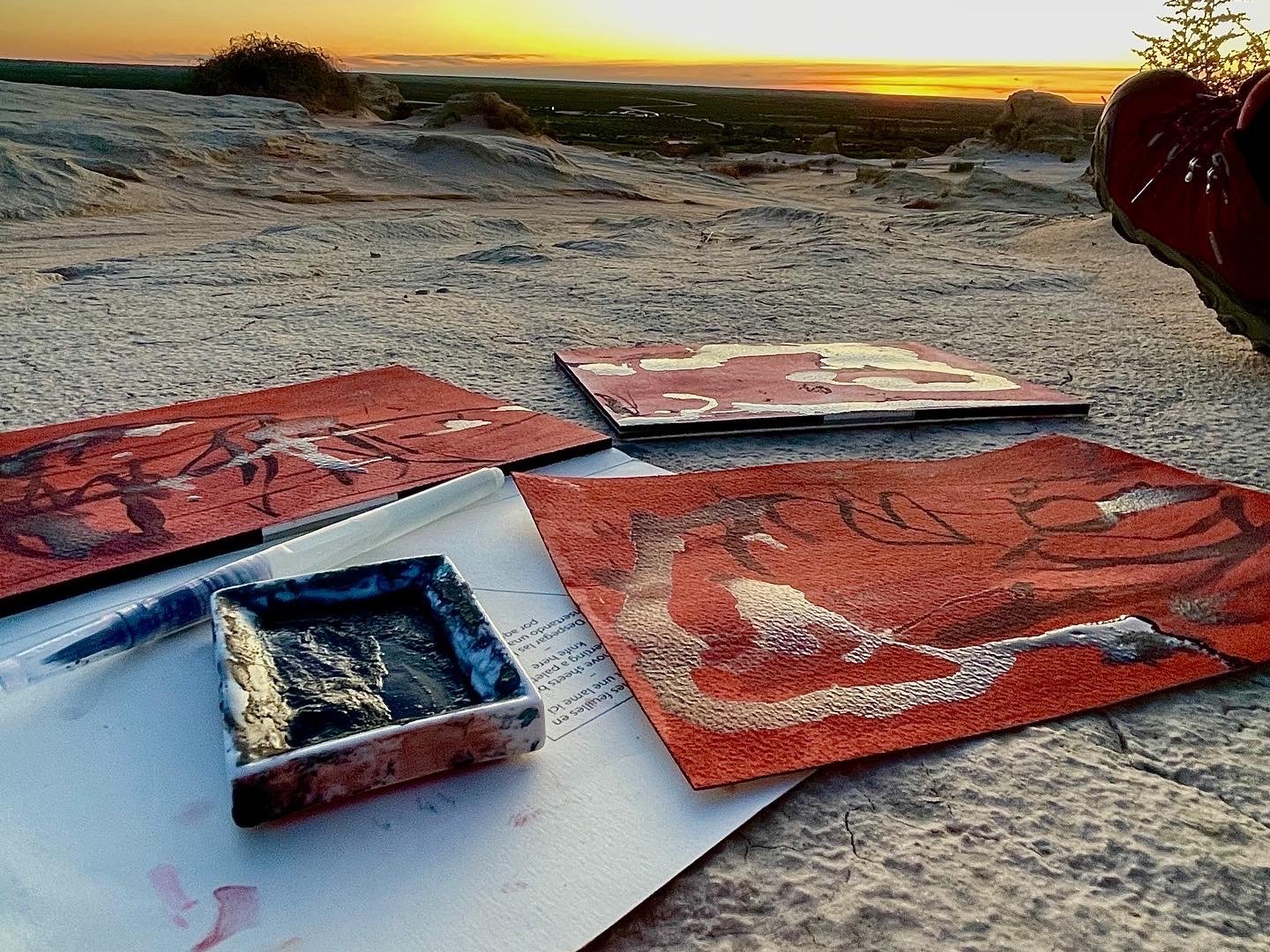
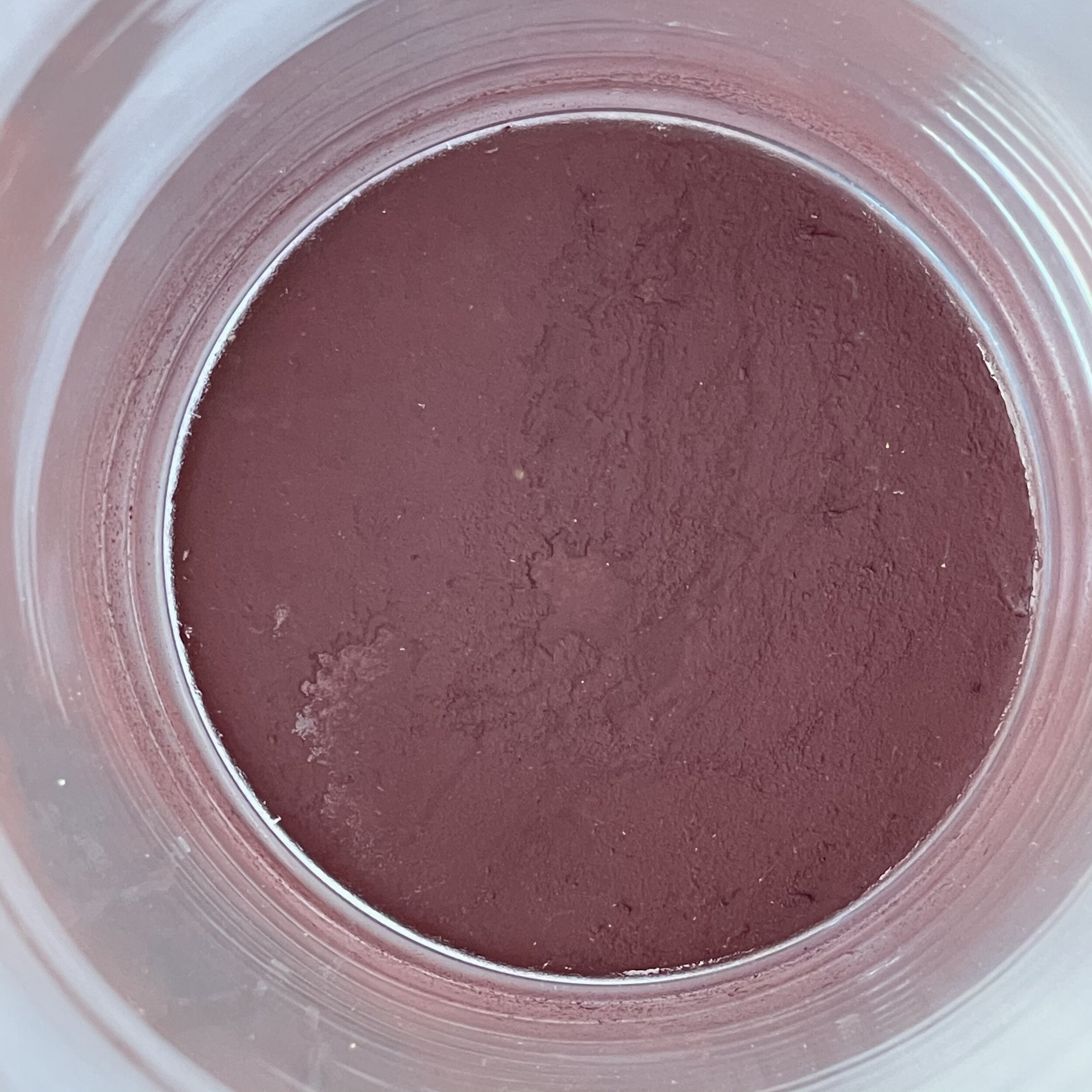
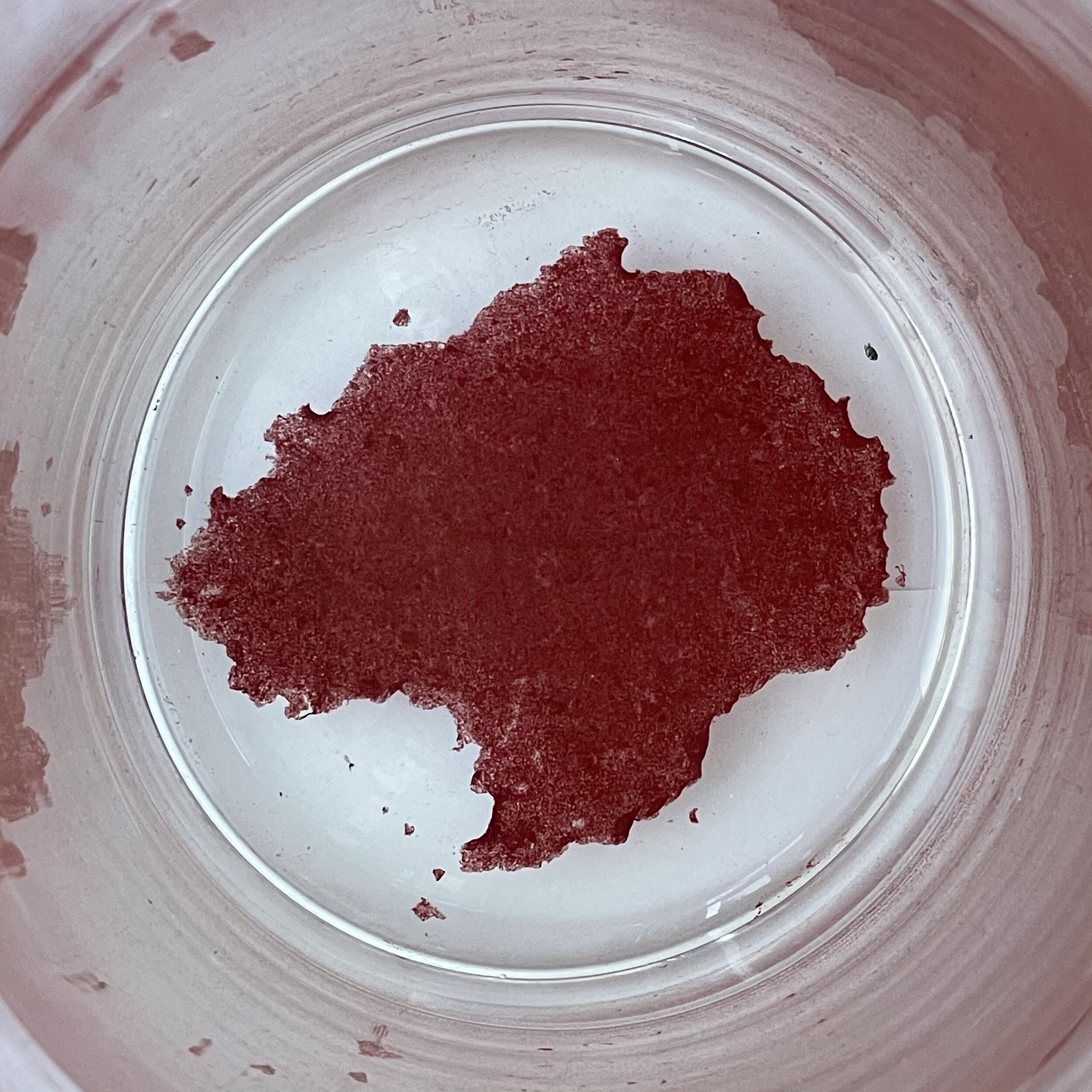
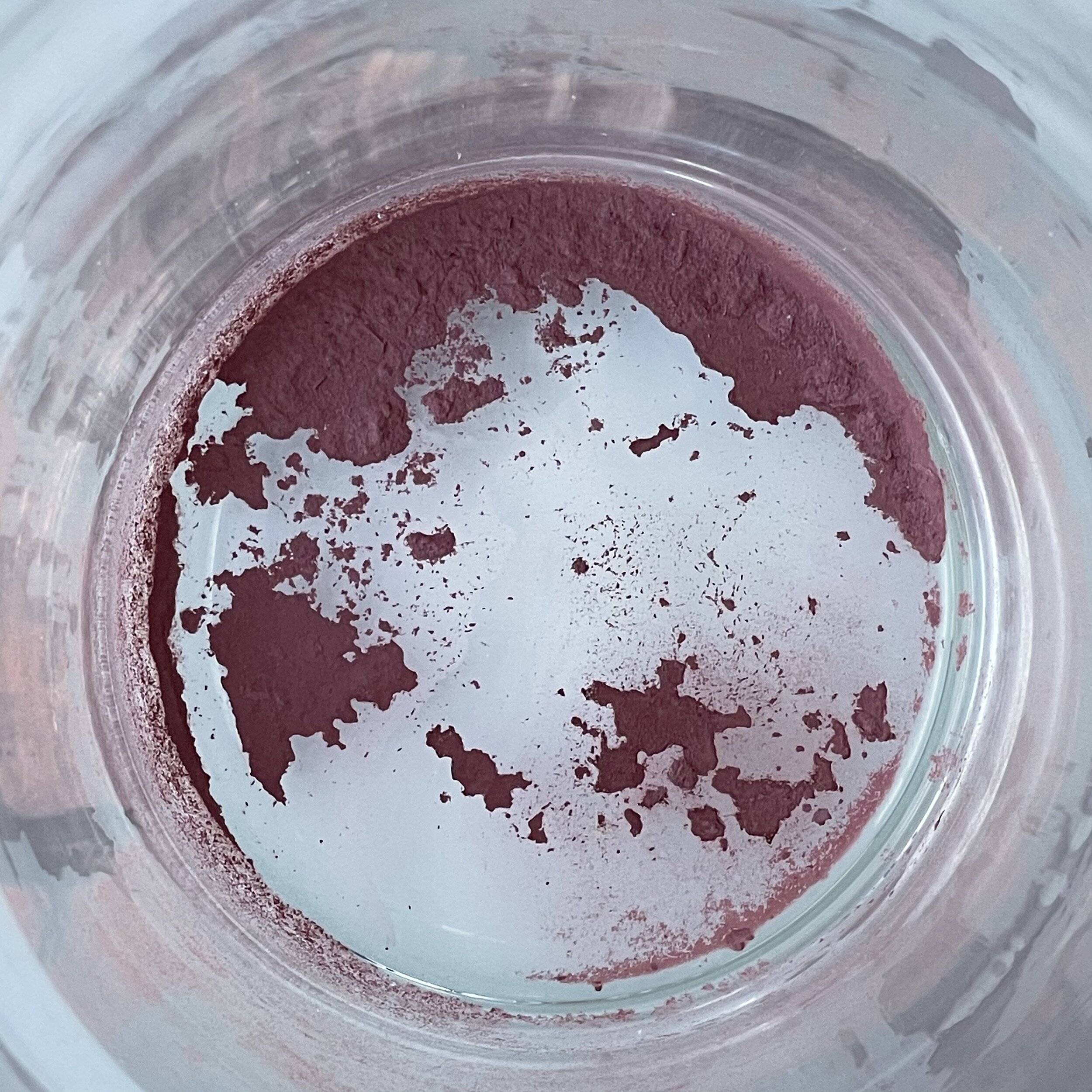
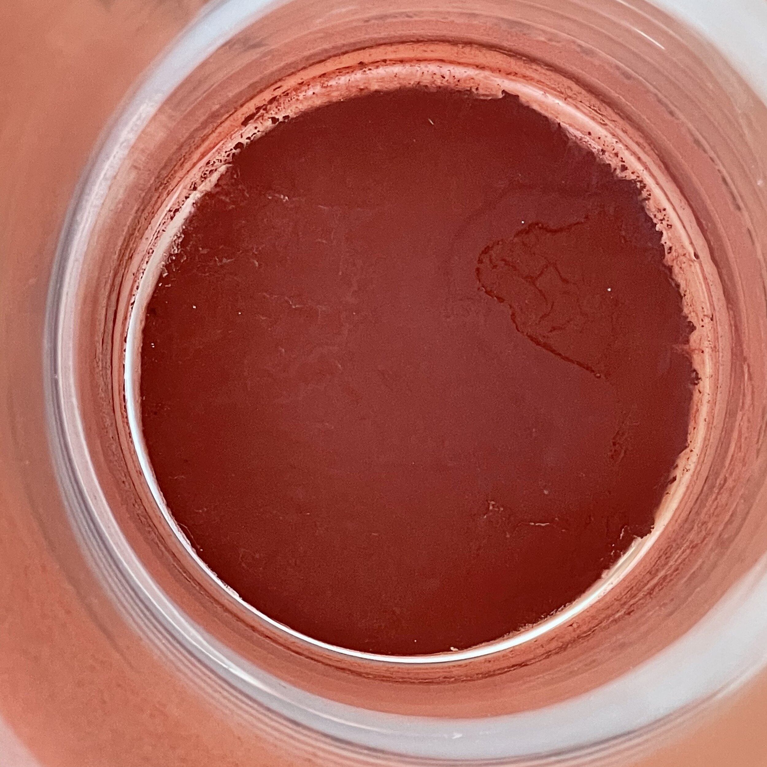
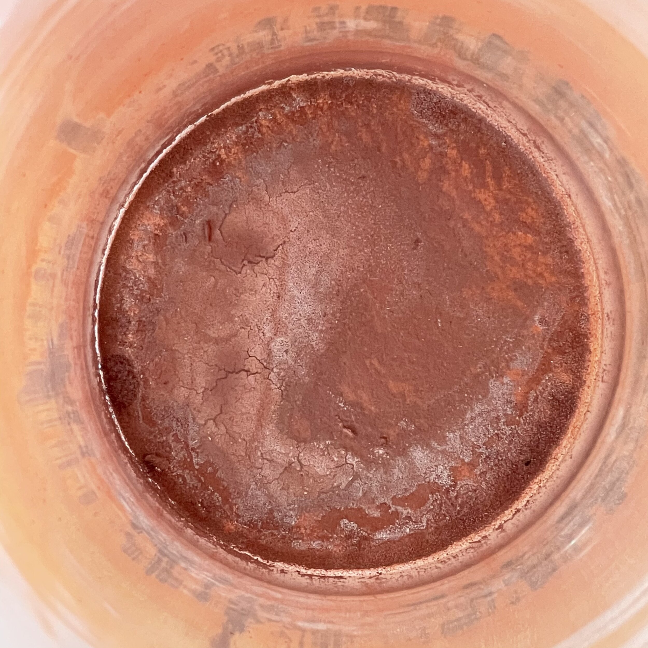
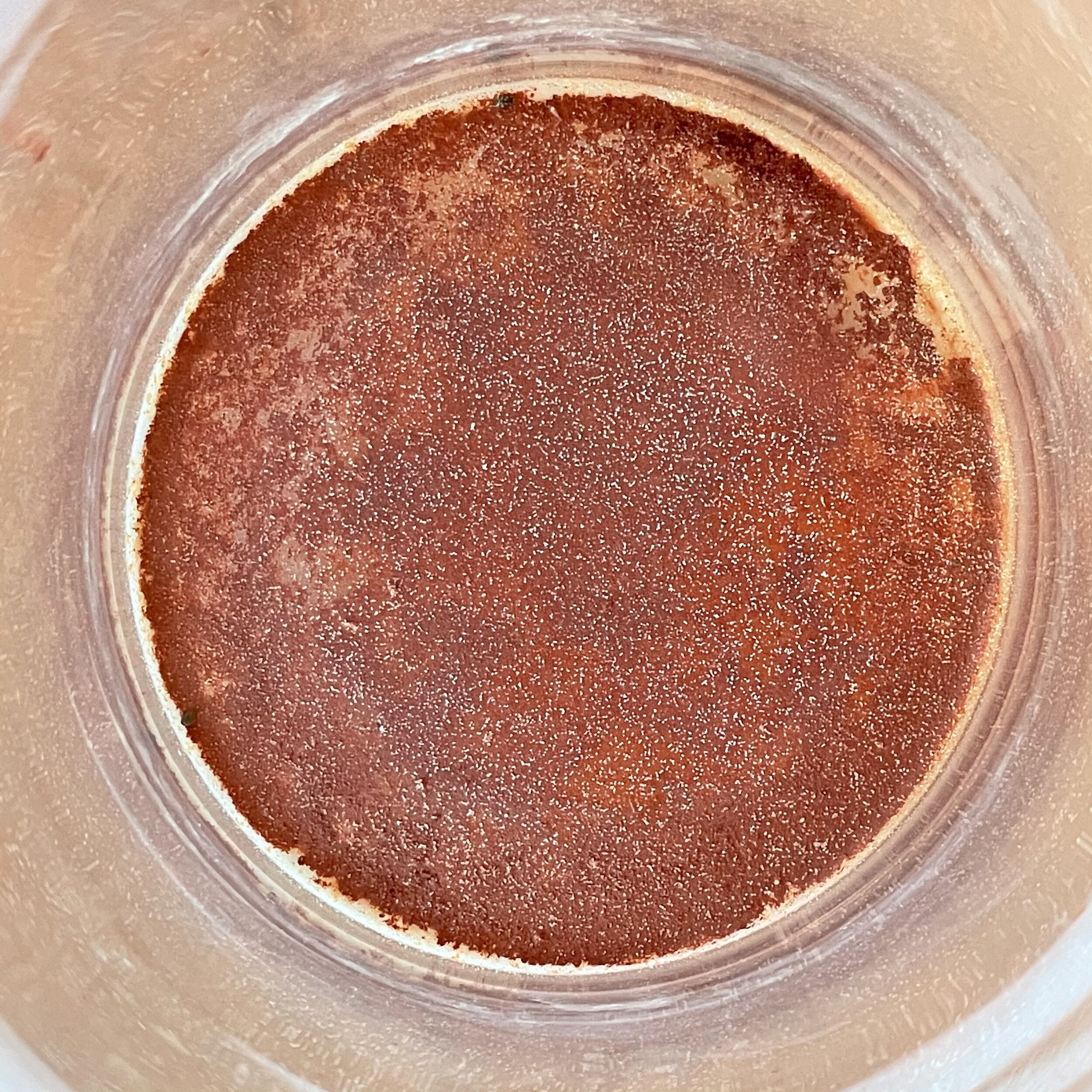
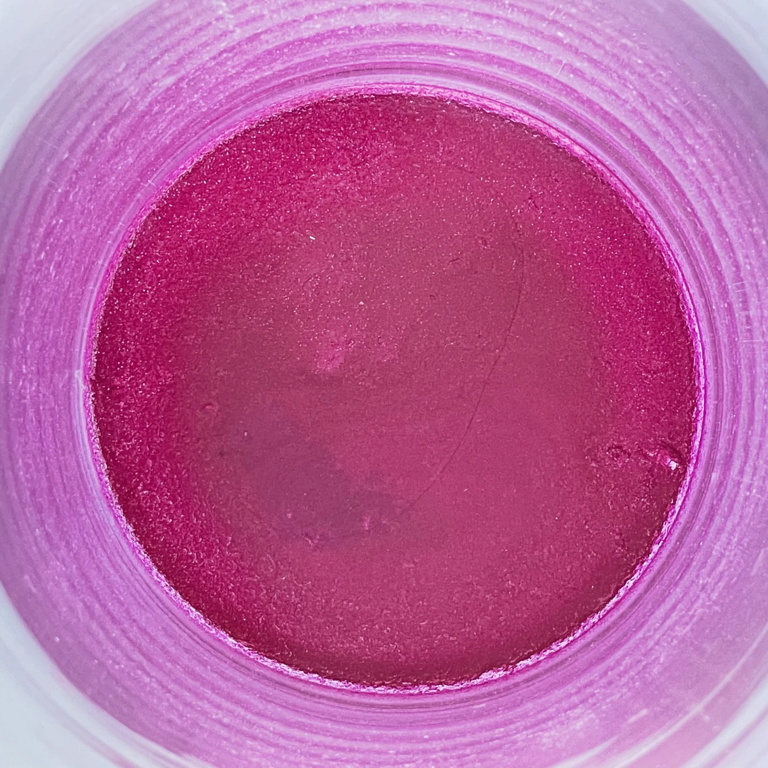
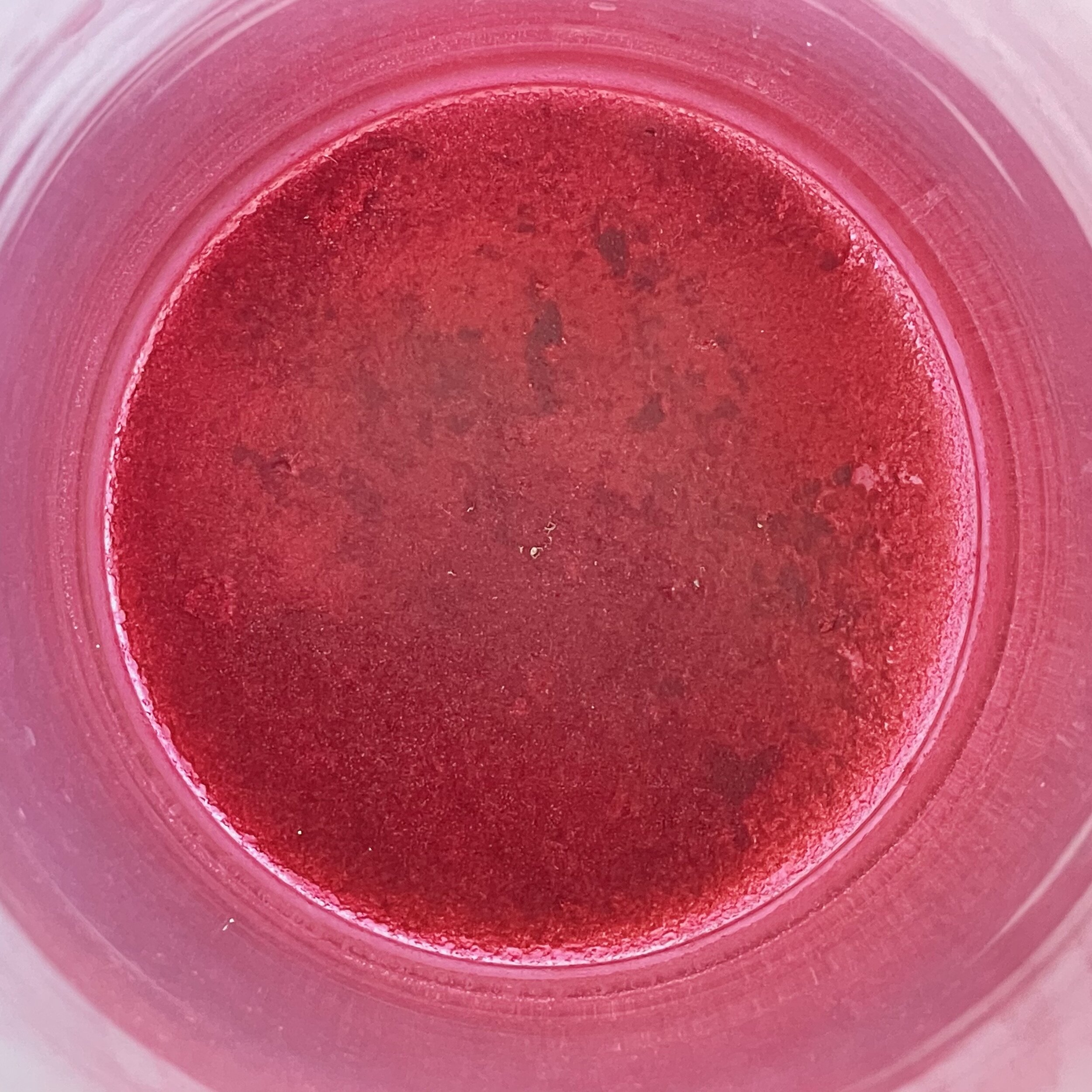
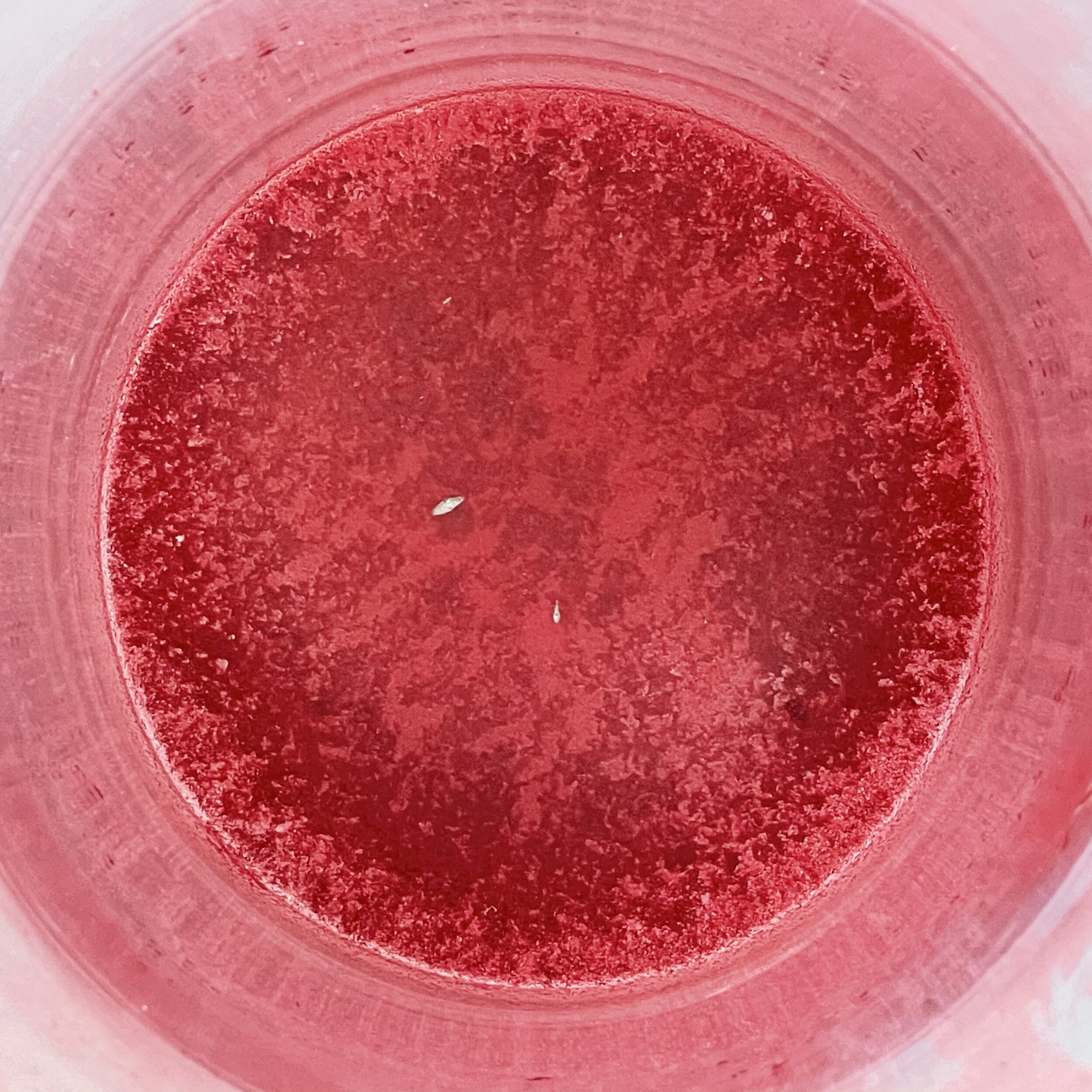
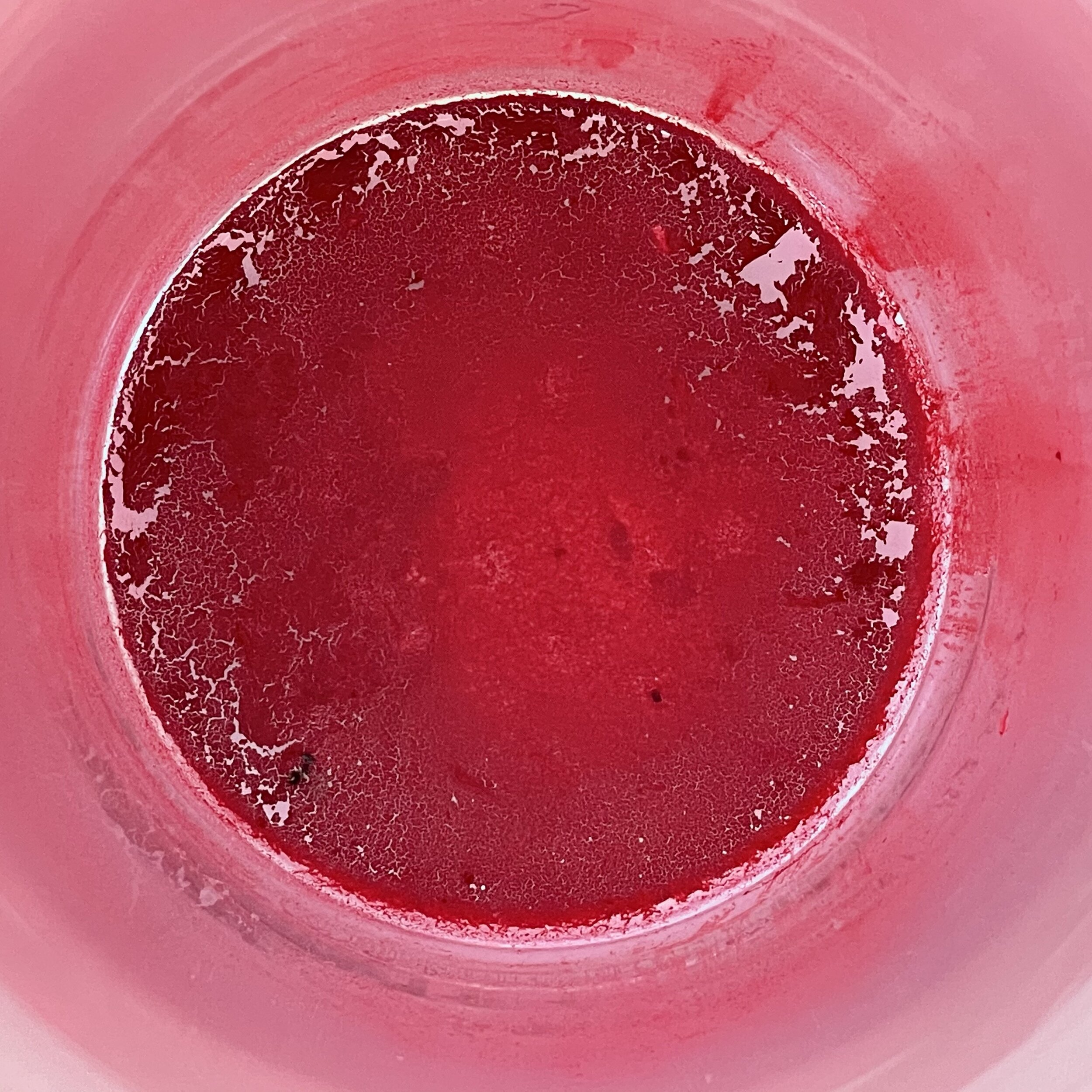
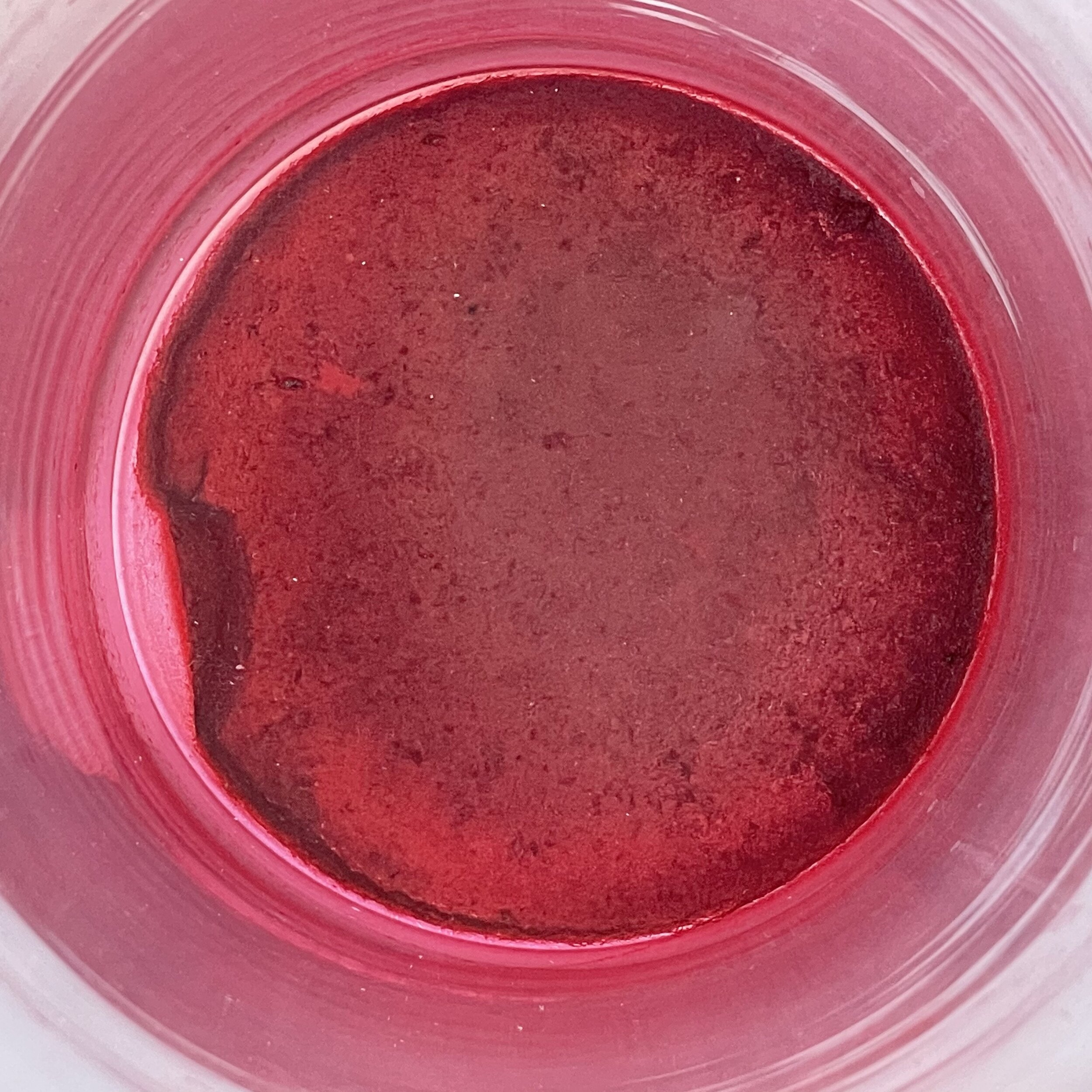
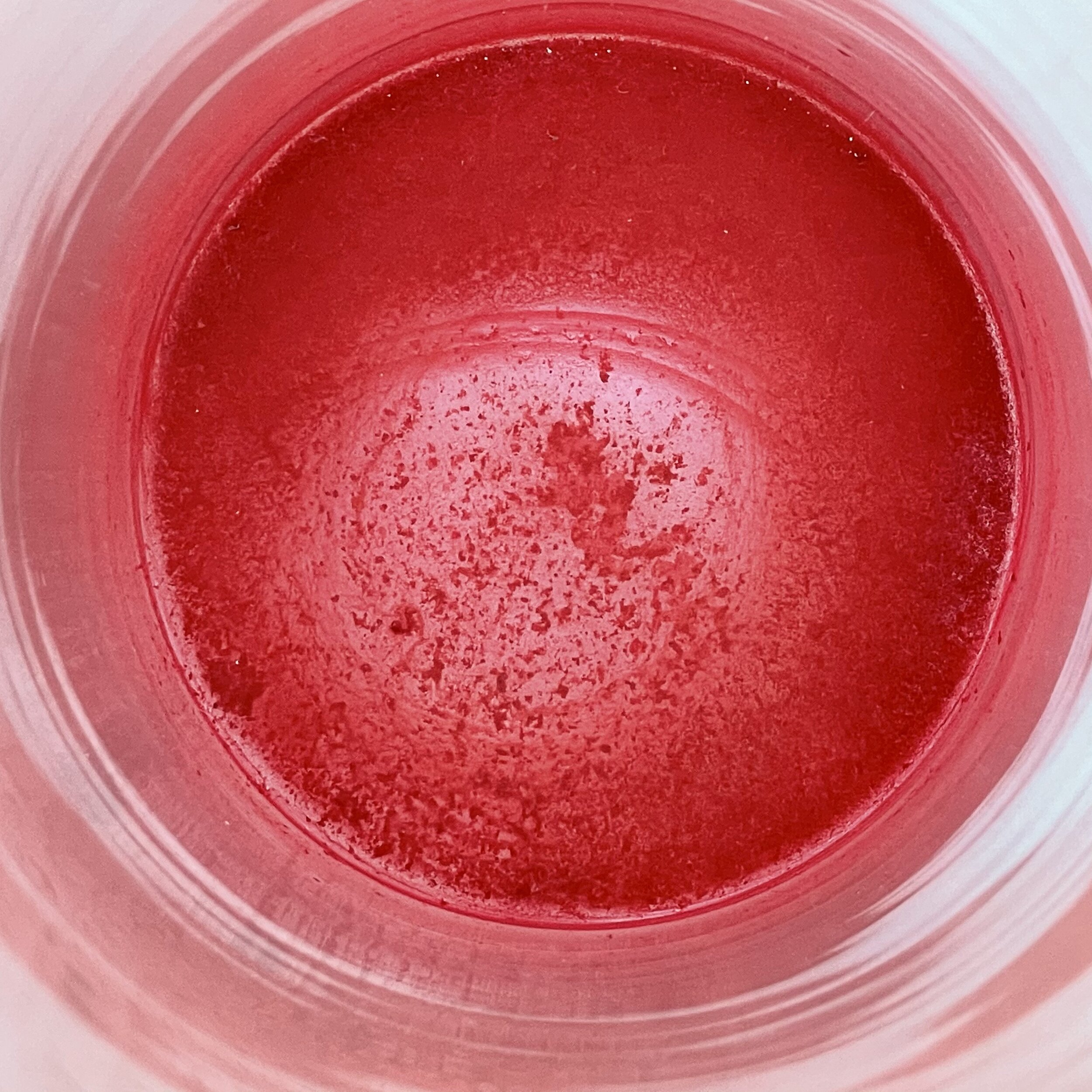
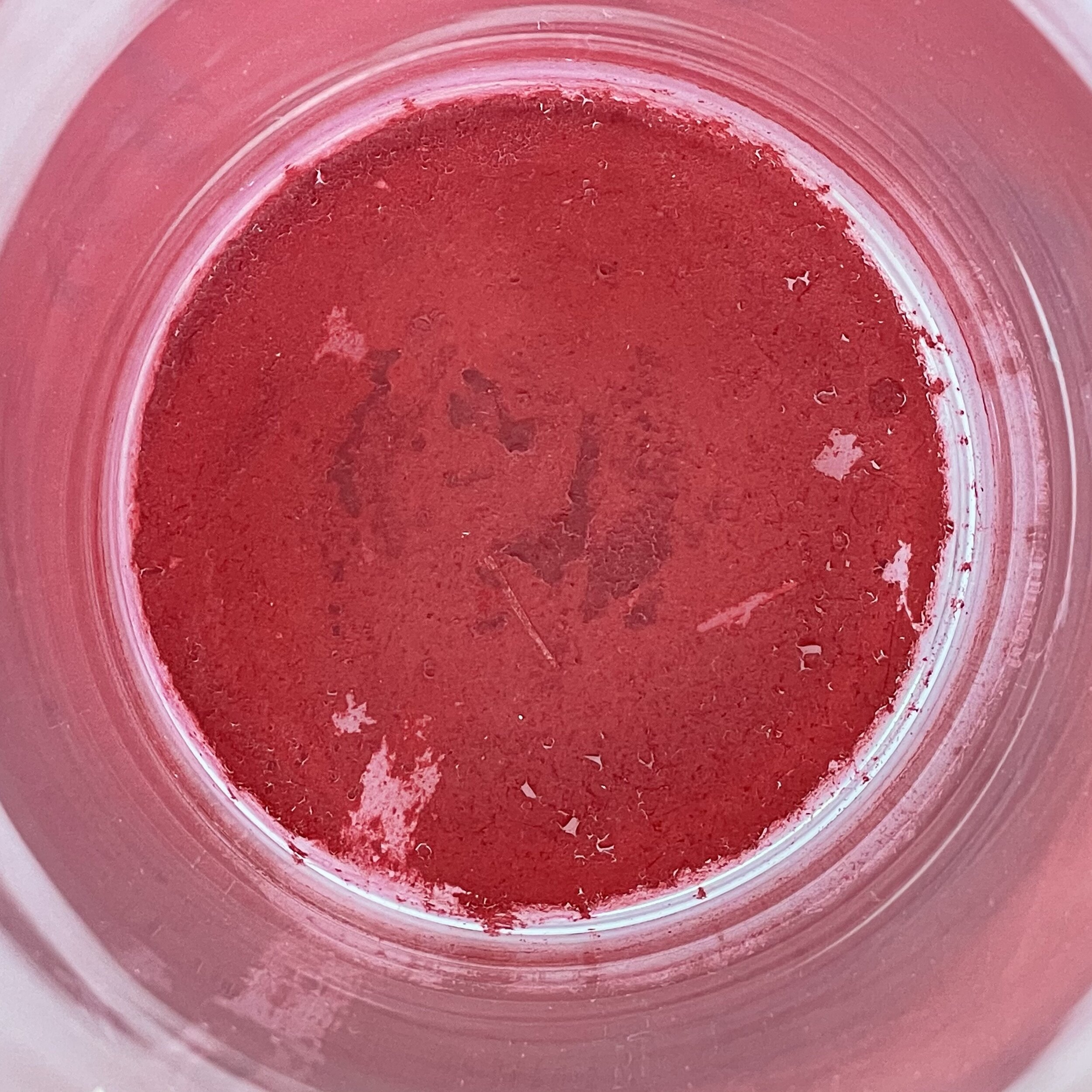
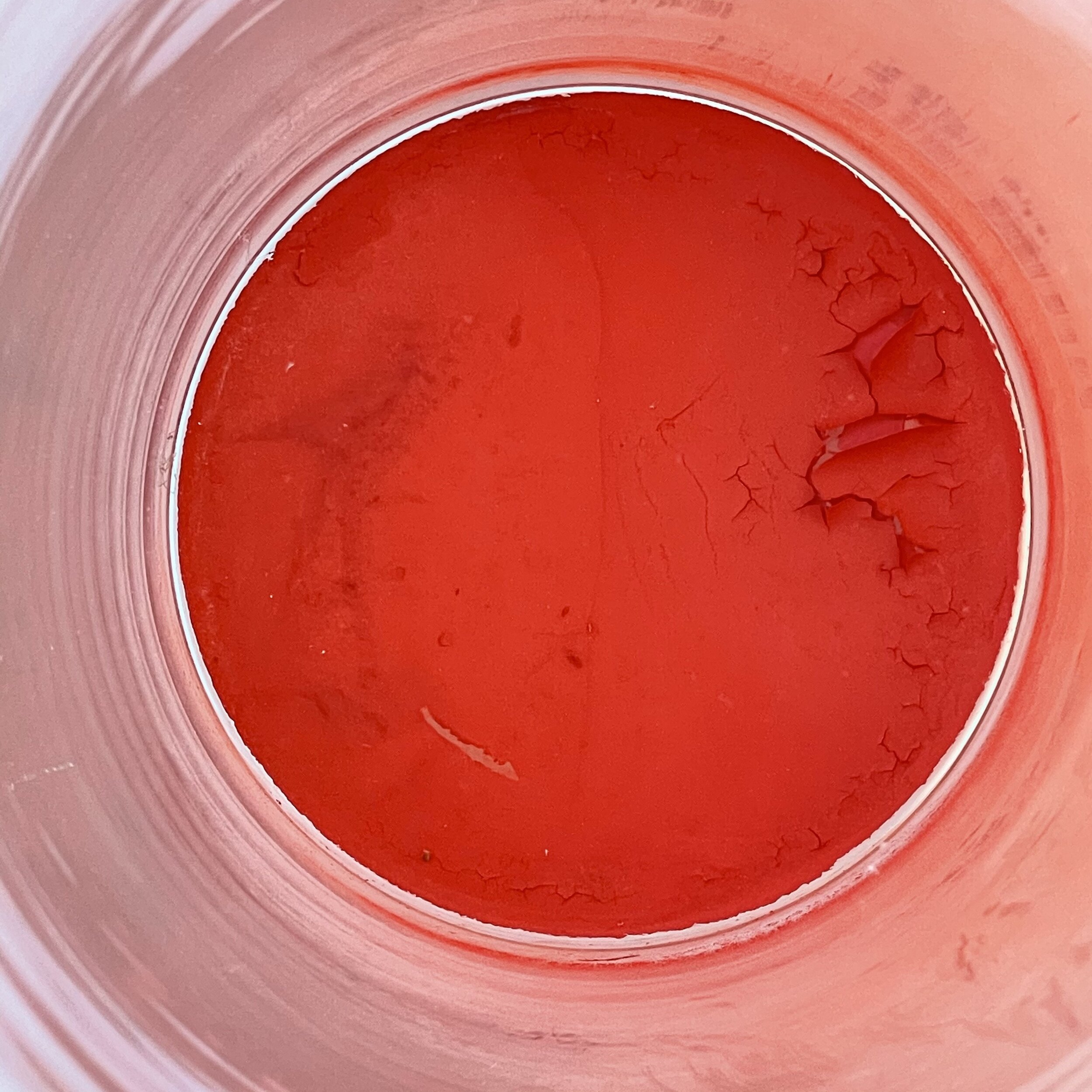
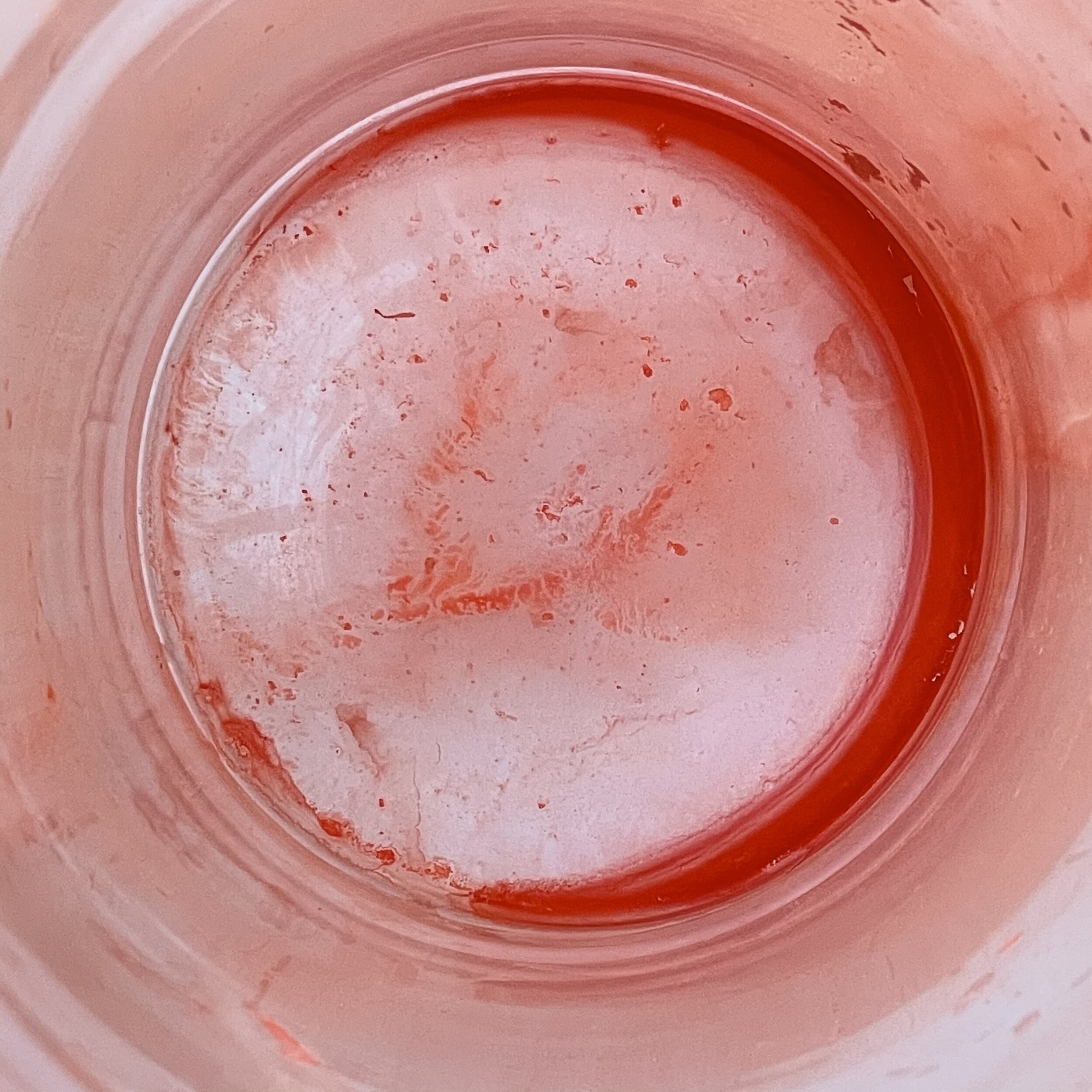
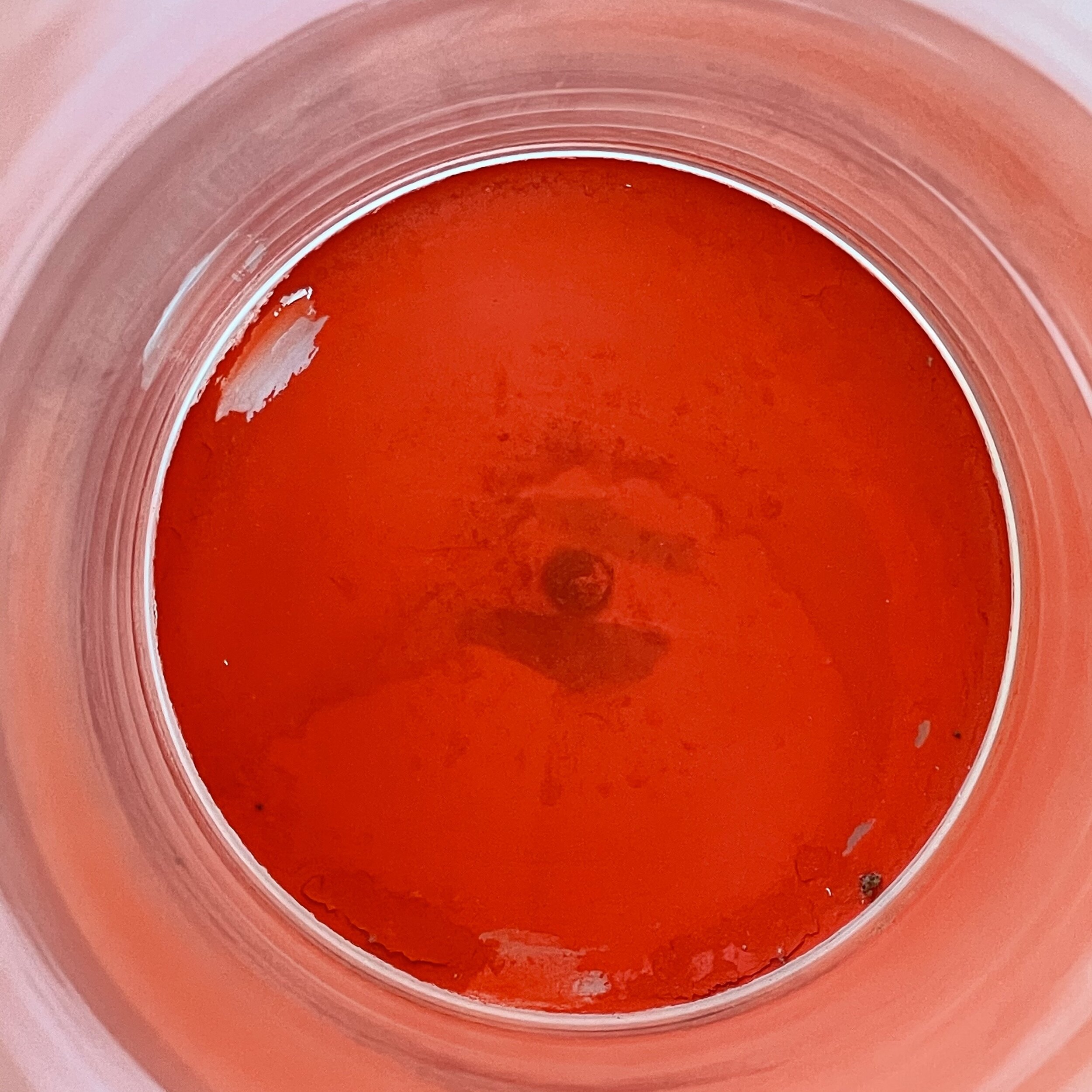
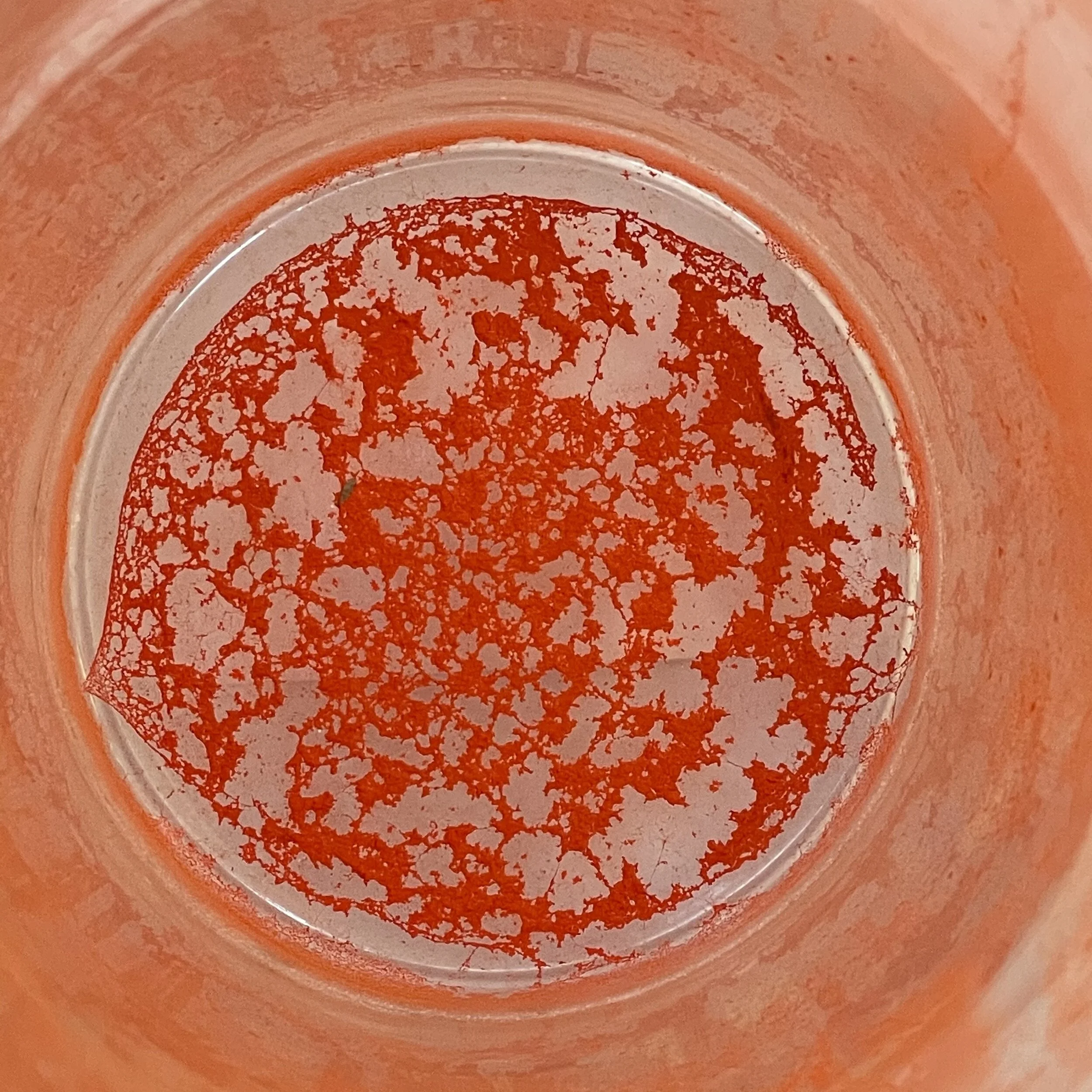
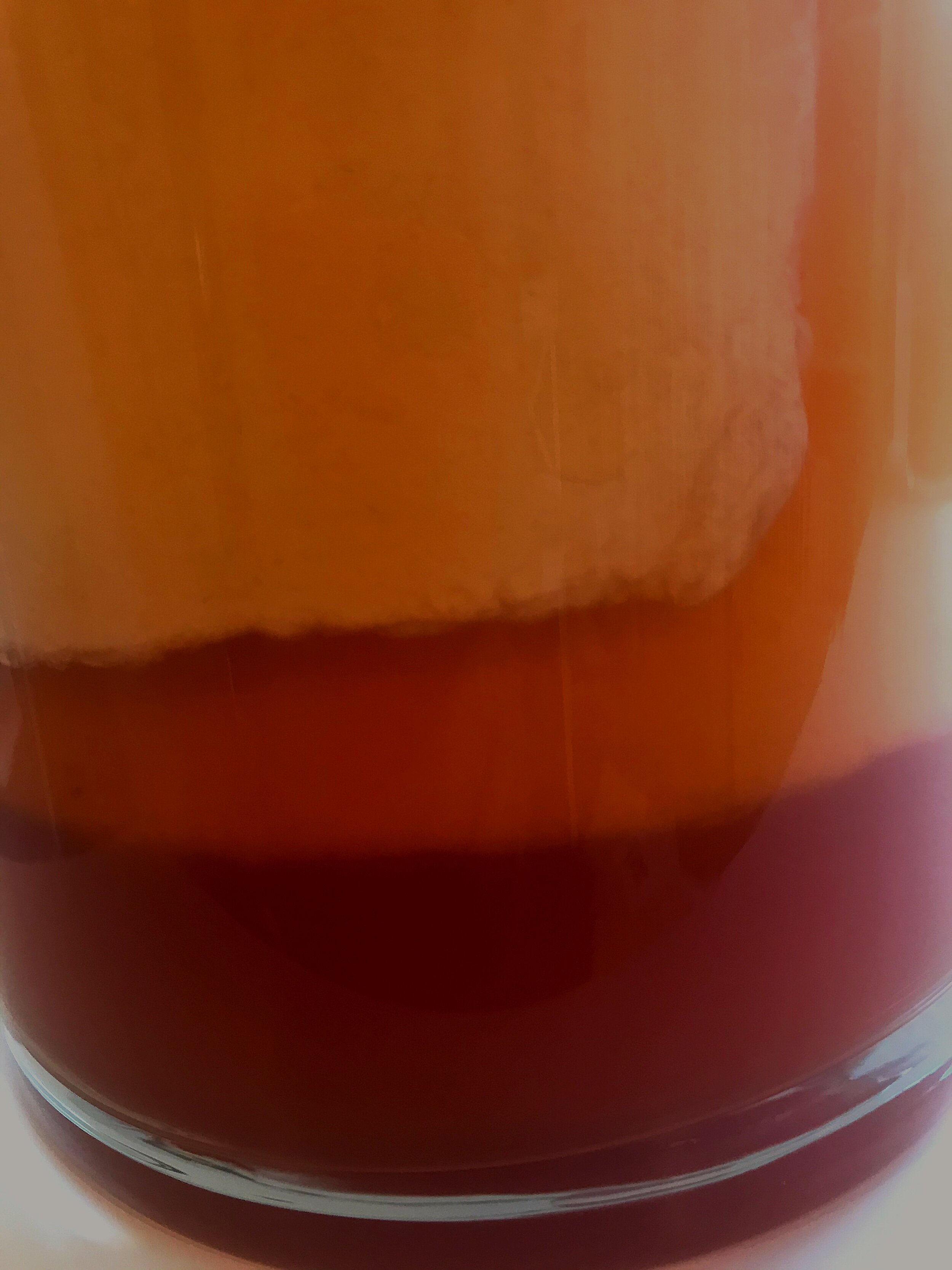
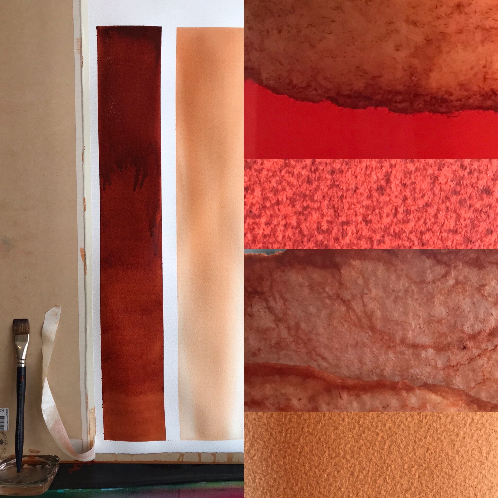
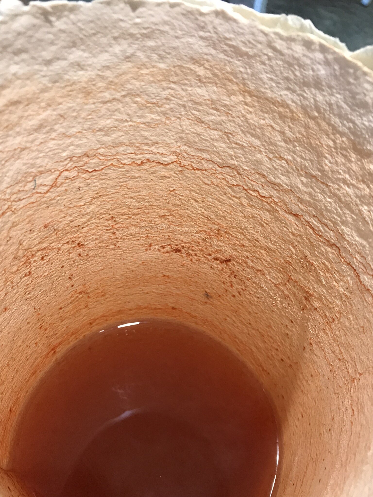
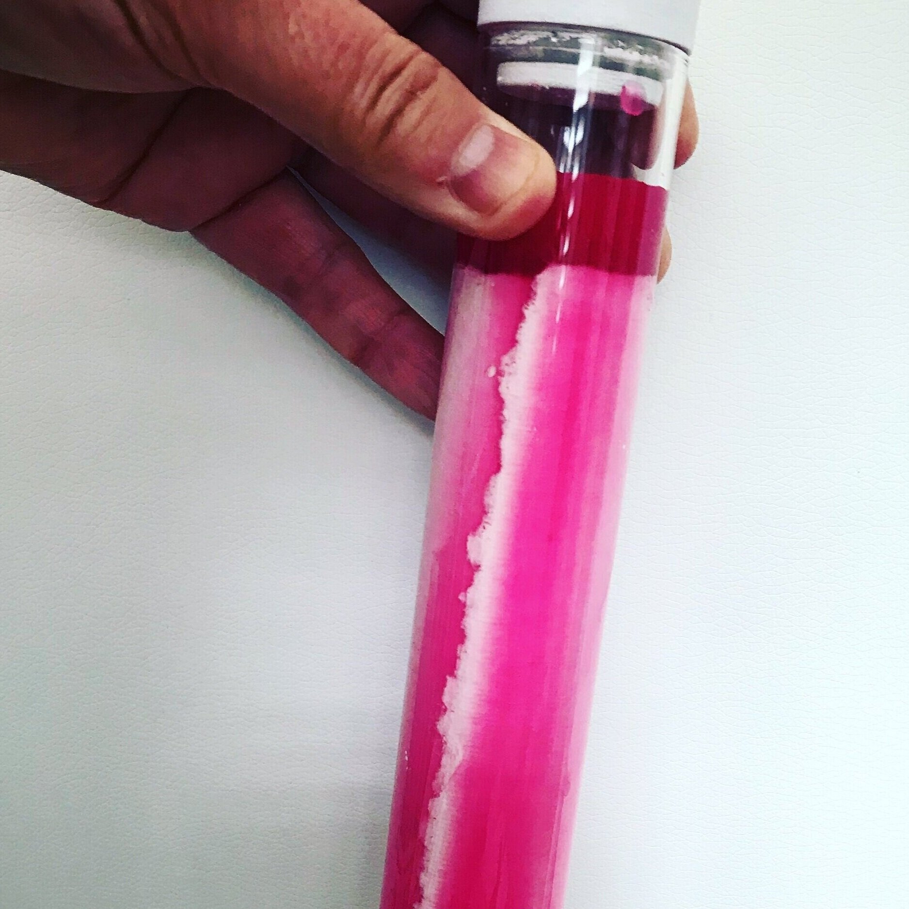
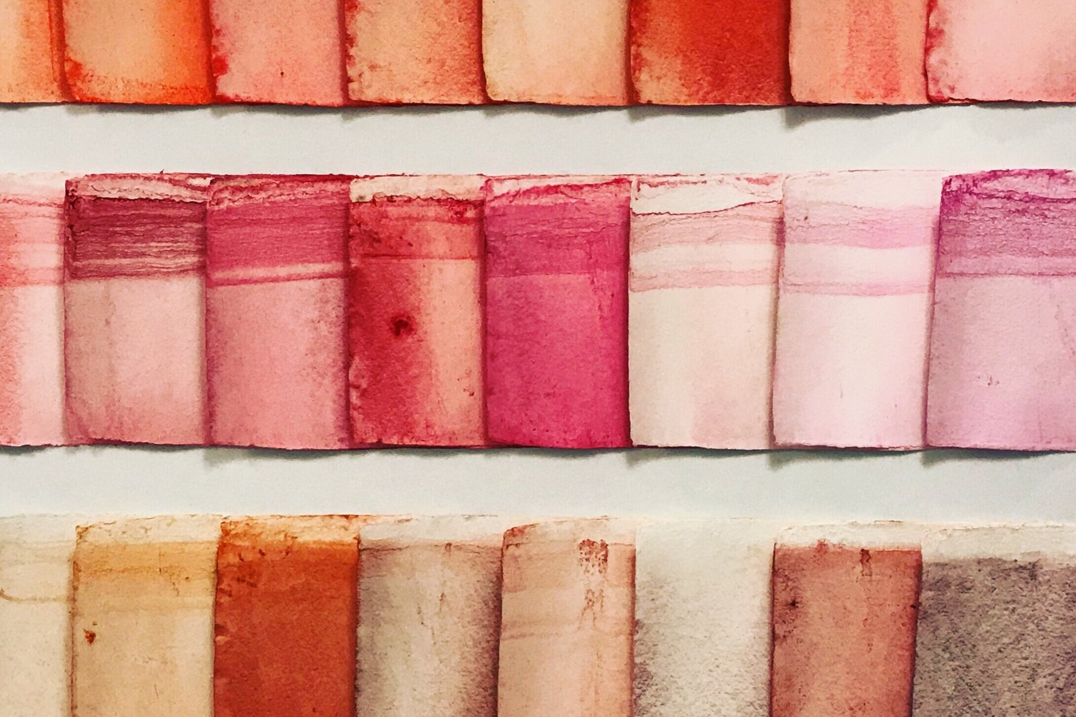
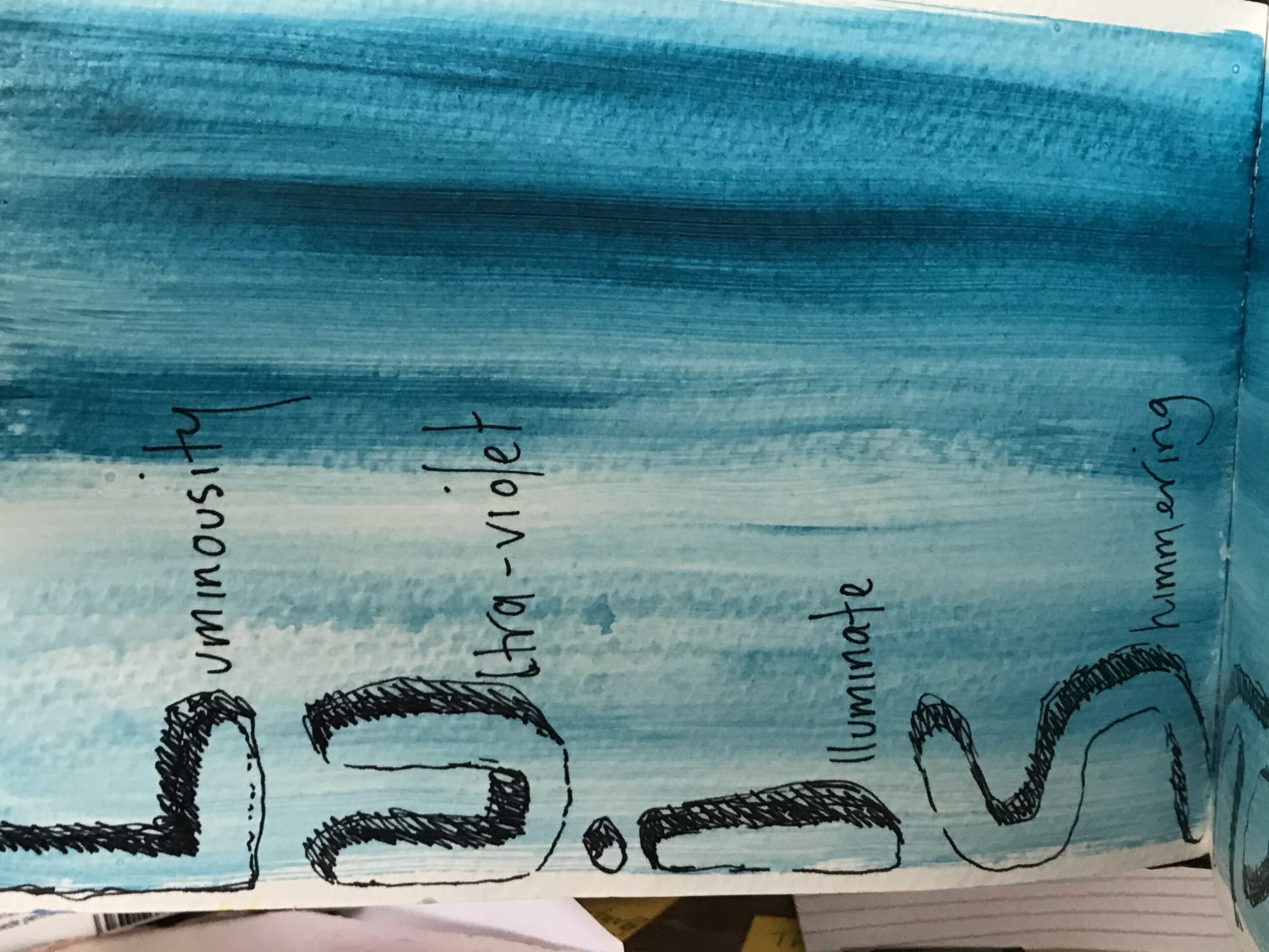
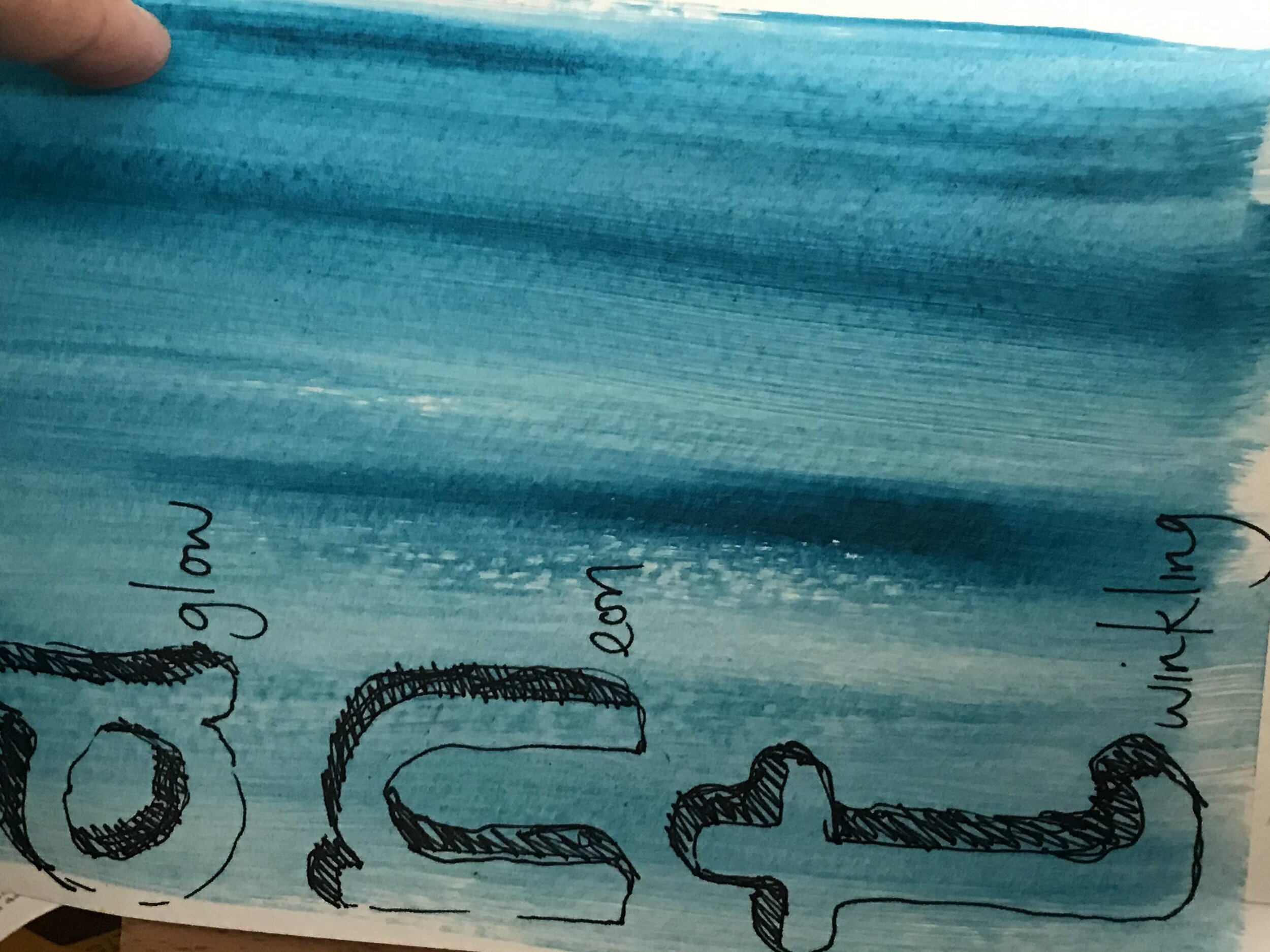
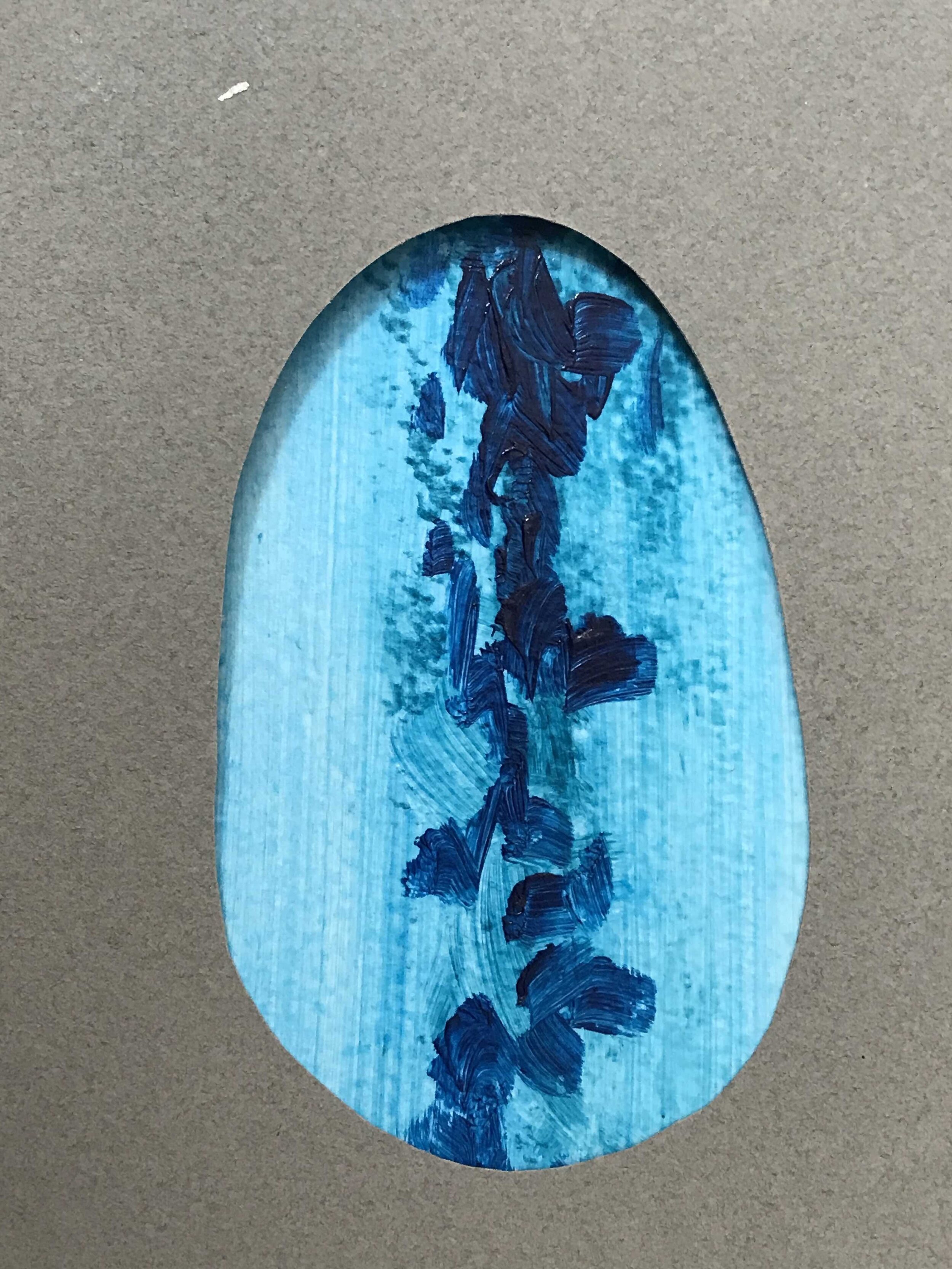
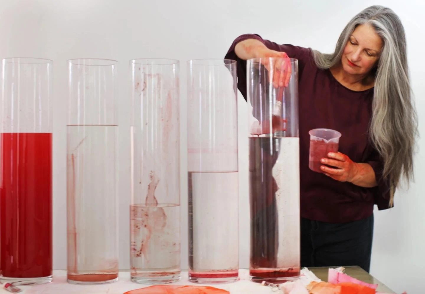
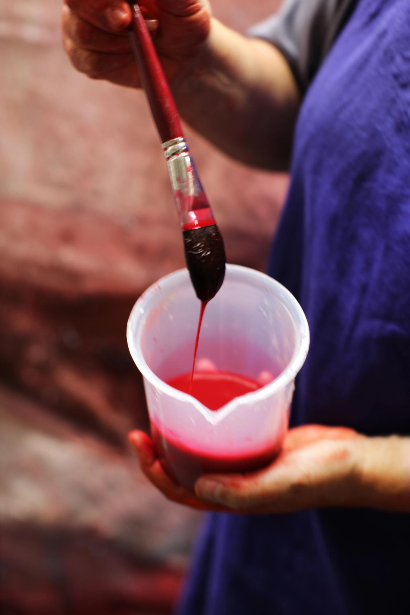
Watercolor allows you to play with this idea of dryness and different states, but it’s also the paint I say that has the truth. It's naked color. When you work with oil paints, the oil predetermines the way in which it feels. And acrylics have a plasticity that takes you away from the feeling of the color. But watercolor, you feel the particle you have there, and you can't fight it. You have to understand its inherent properties. So that became my whole mission: to work out what is red.
This article is an extract from Margot Magazine Issue 11- The Color Issue.
Photography by Eryca Green at Green Street Studios. Text by Laura Neilson. Many thanks for the opportunity to Margot Magazine founder/editor Simone Silverman