As part of my PhD research writing, Ive been re-visiting burnt sienna Pigment Red 101 of late. I know this colour well, or should I say, I’ve worked with this colour for forty years and I’m still learning from it. Burnt Sienna has played an integral role in my paintings, particularly as an underlying warm ground colour but also as a glaze that can unify a painting with the sheerest of veils.
The colour named, Burnt Sienna, can have different visual appearances and working properties. I am working with Winsor & Newton Professional Watercolour, the Burnt Sienna and it is classified as Pigment Red 101. This colour is identified as an earth replacement using a transparent synthetic iron oxide with a lightfastness rating of 1 and a AA permanence rating.
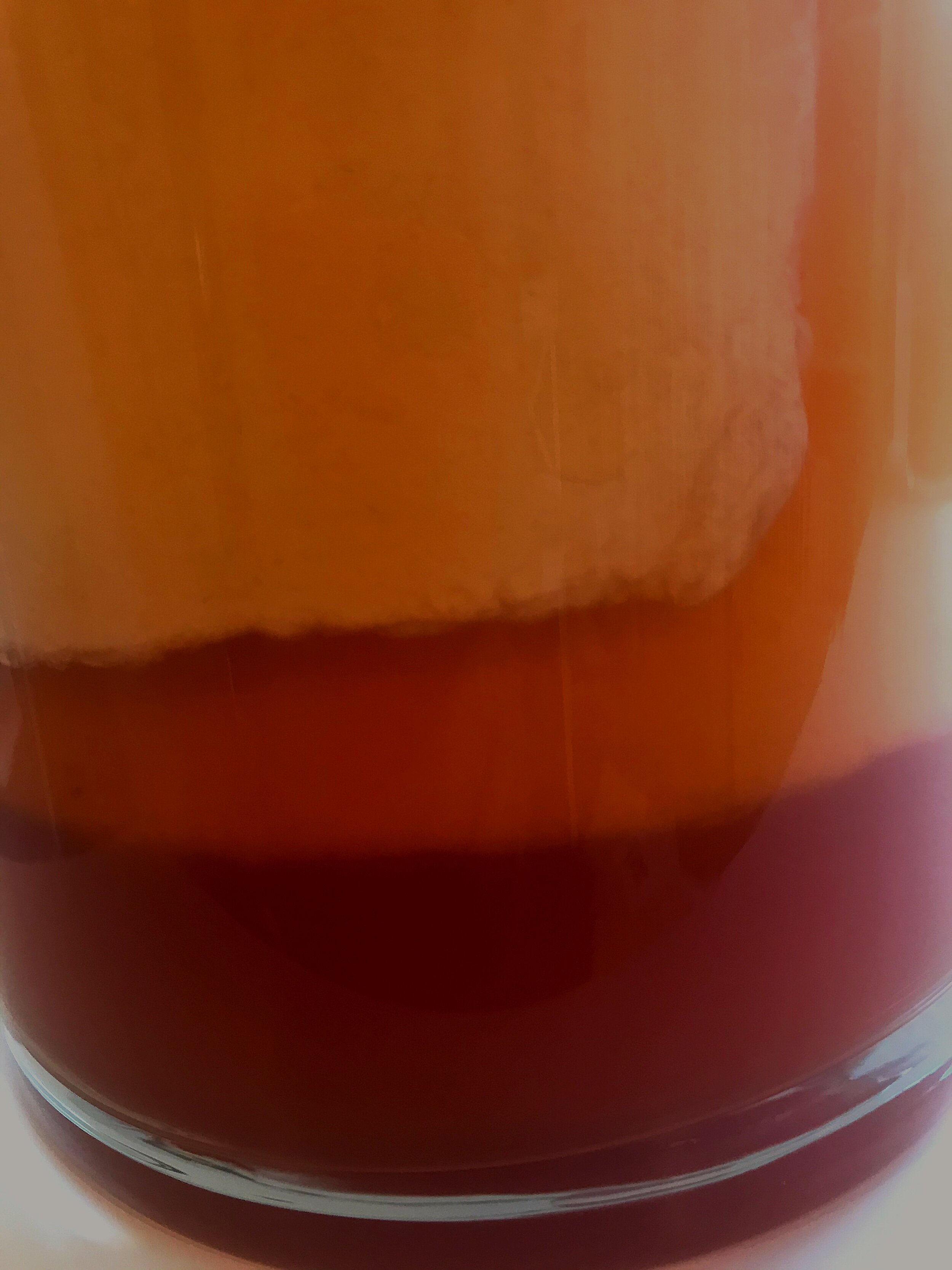
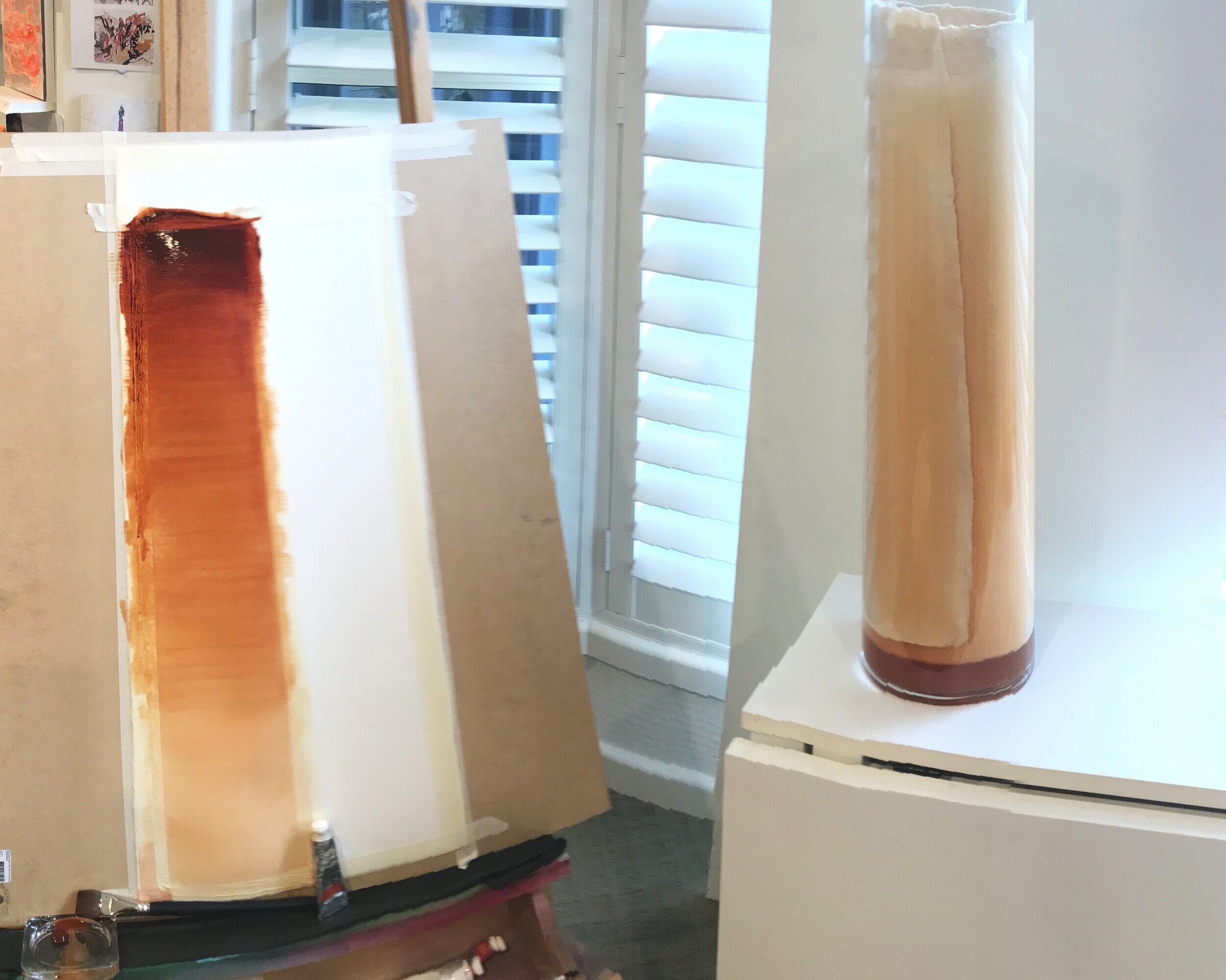
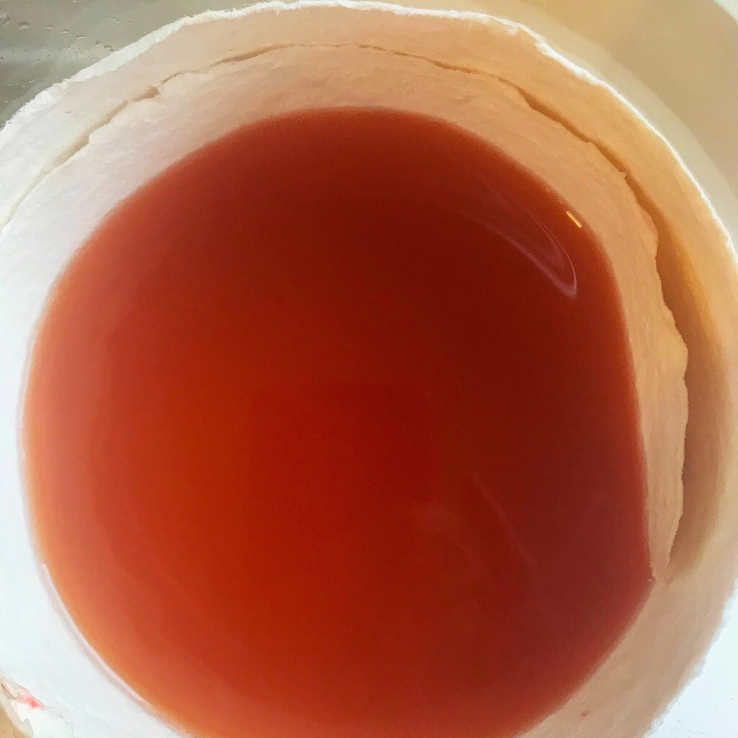
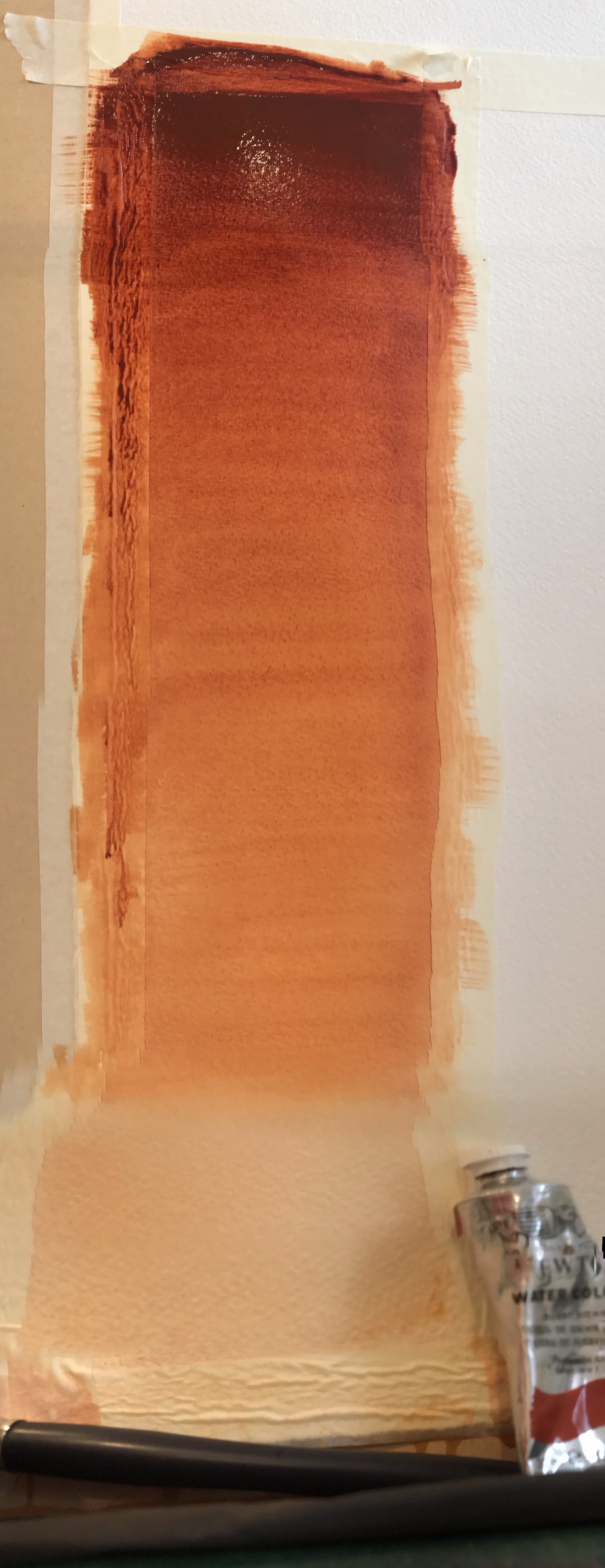
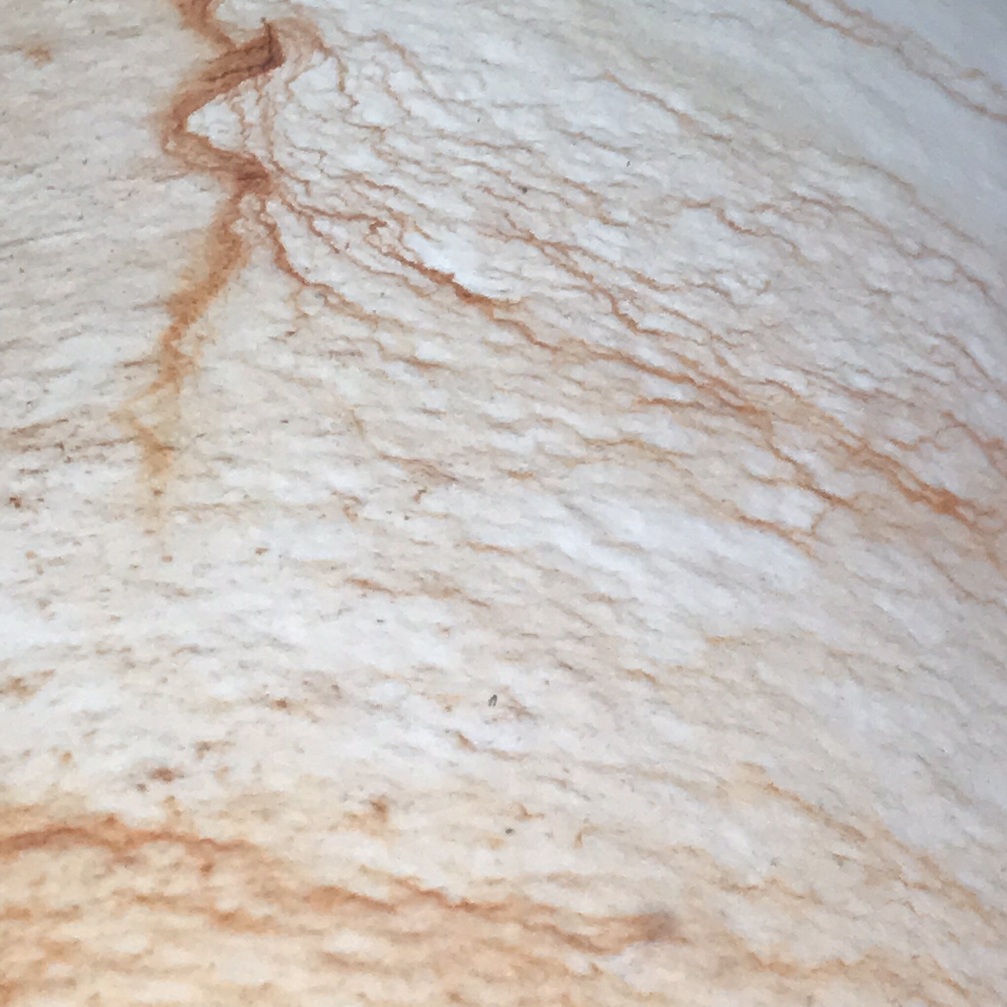
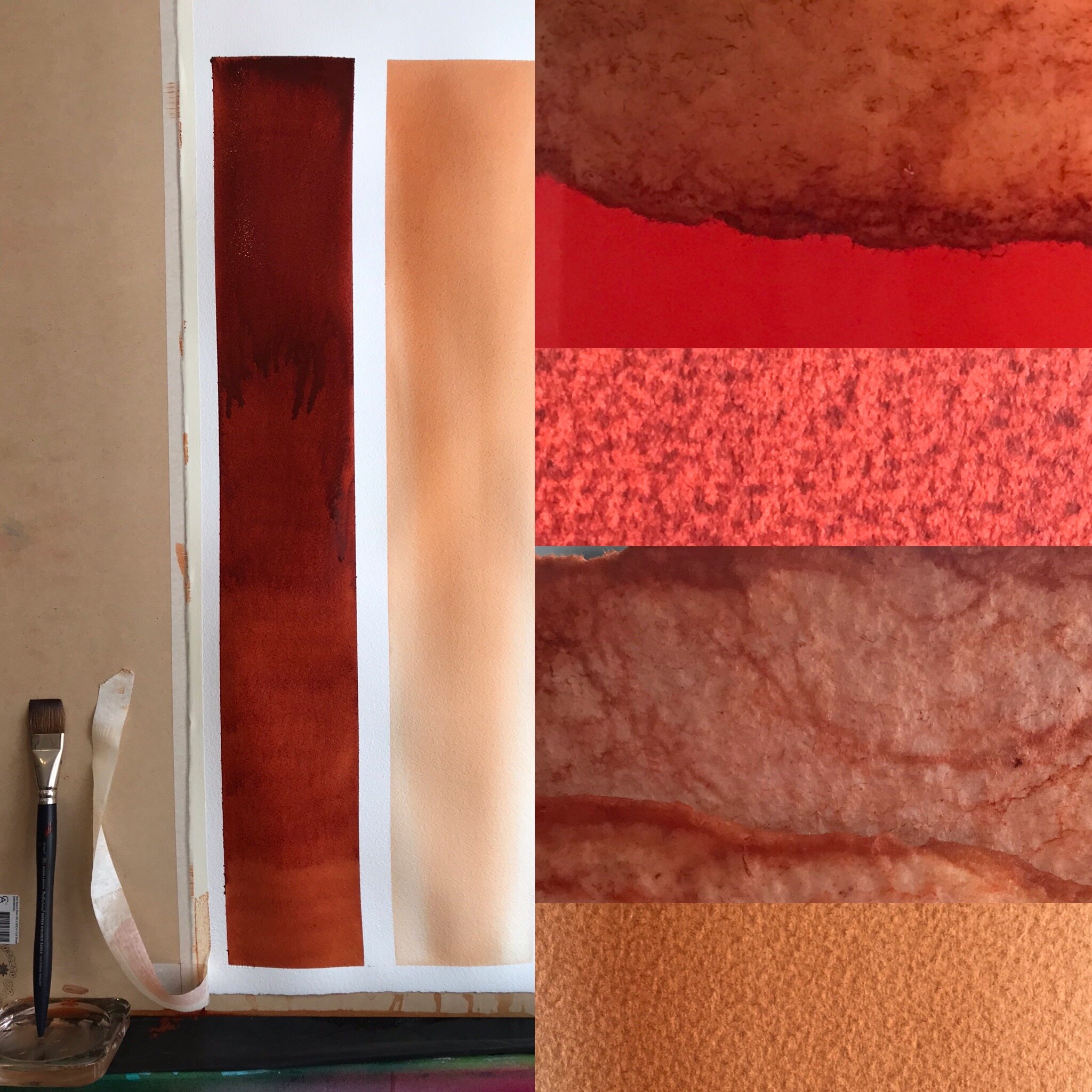
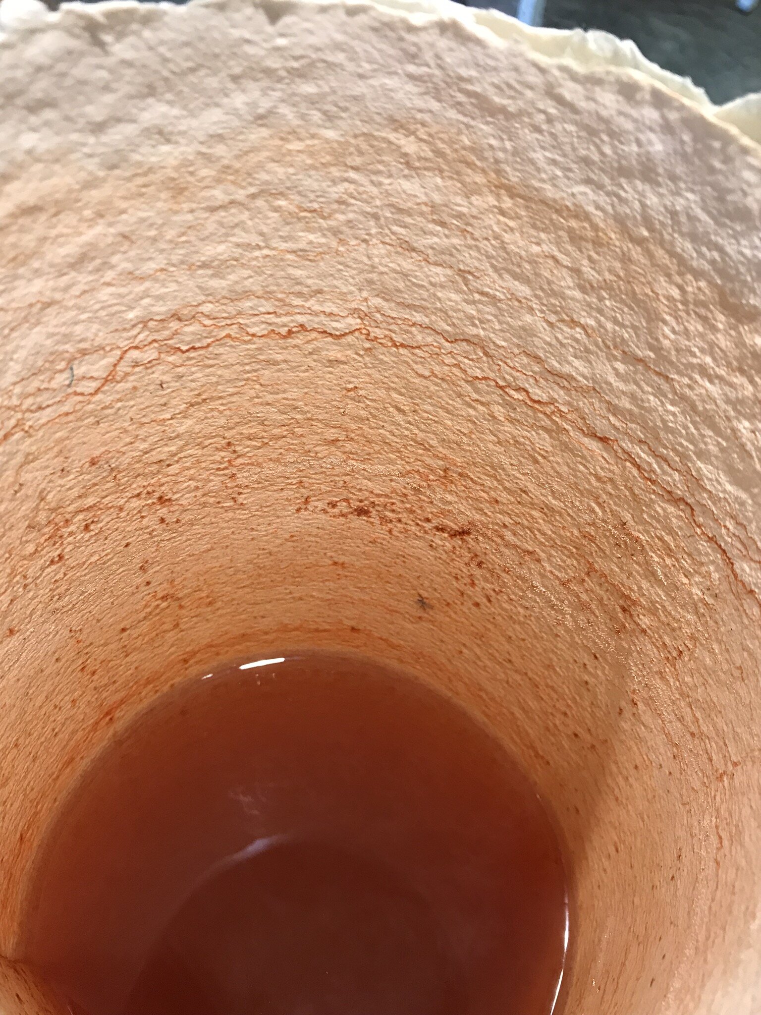
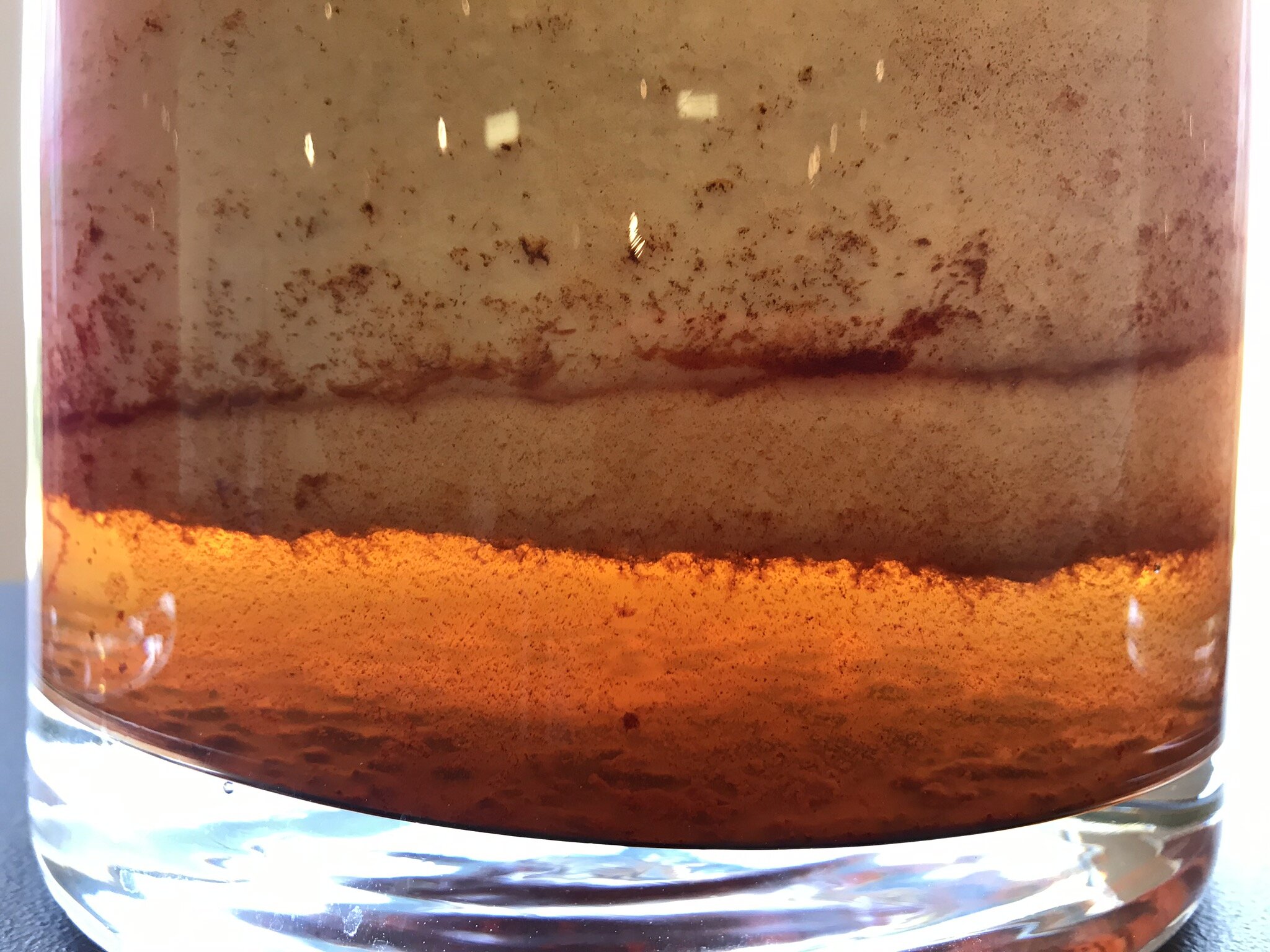
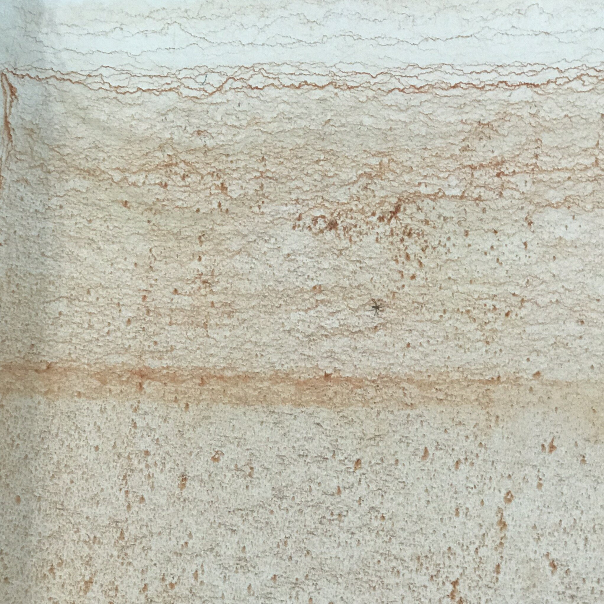
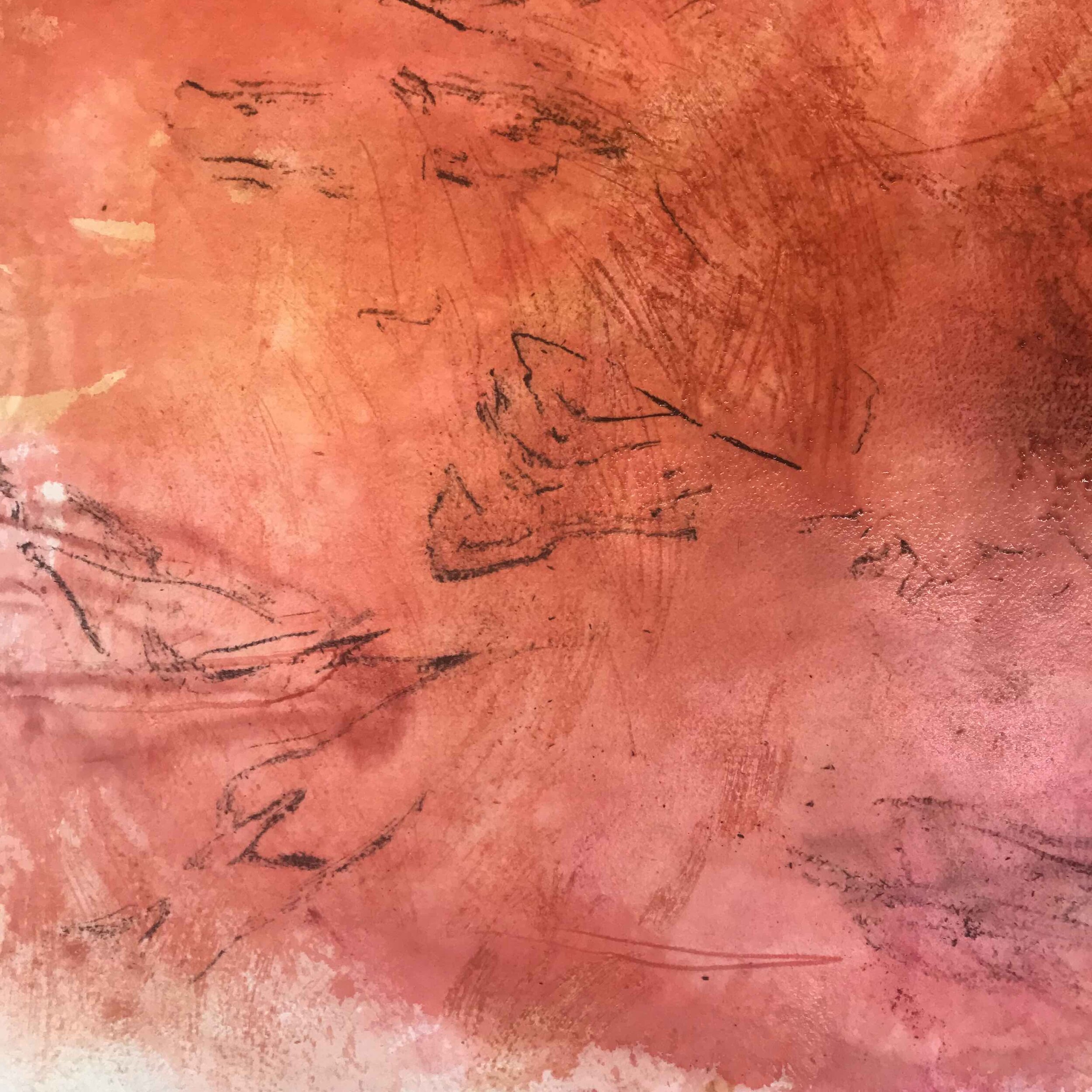
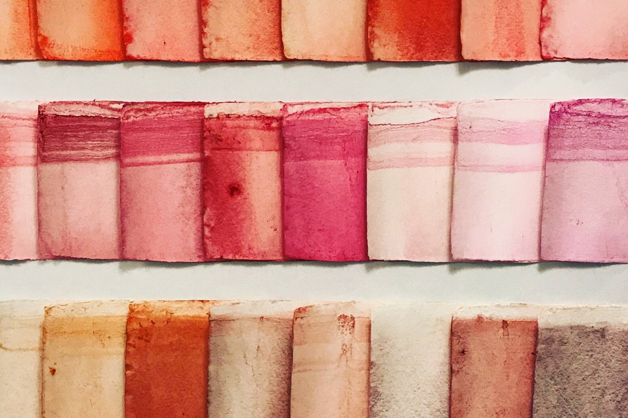
When I presented Gol Gol Layer Colour Observation #5 and #6 at Hazelhurst Regional Gallery, I included burnt sienna as part of the installation, as it is classified as a red pigment and its beauty can be seen in the Gol Gol Layer at Lake Mungo. The paper that was revealed after 2000 hours was much gentler in its saturation than I expected and the undertone of the wet colour in the glass vessel was closer to yellow than red. As seen in the video and images (below), I am repeating the study with Burnt Sienna for closer observation.
I have been working with Winsor & Newton Professional Watercolour Burnt Sienna since I received my first paint box when I was 11 years old. Burnt Sienna, in 1979, was a natural pigment that possessed the subtle qualities of transparency for glazing and mixing but in 1988, Winsor & Newton colourmakers could no longer expect the same qualities from the naturally sourced pigment and the introduction of a synthetic earth replacement became what I know is Burnt Sienna today.
Whilst conducting an acrylic colour comparative study in 2005 (where I used Burnt Sienna as a sample colour across five different colourmakers) I became unaware of how my understanding of the inherent qualities of the pigment, Burnt Sienna, was not a generic expectation for all Burnt Siennas. All its expected and inherent beauty of colour: its brilliance; sureness; depth and transparency; that I love to play with, were heavier, sitting with a more matt finish on the painting surface, and the colour mixing outcome provided me with a very different dark when mixing with french ultramarine. It is not that these Burnt Siennas are not good… but they are different, and their difference brings about an entirely different outcome.
So I could get trapped considering these behavioural differences across colourmakers and ponder the historical changes to the colour, but all of this seems inconsequential when I am standing in the studio, have the tube in my hands and I’m about to squeeze out a colour.
The 19th Century British colourmaker, George Field wrote,
… those pigments are most beautiful which possess the most colour, whether they be light or dark, opaque or transparent, bright or subdued. There are some which exhibit all their colour at a glance: there are others that the more they are looked into the more colour they are found to have - containing, as they do, an amount of latent colour.
So I am now observing more closely, this red called Burnt Sienna to know more about its’ beauty: sureness; brilliance and depth….its earthly power.